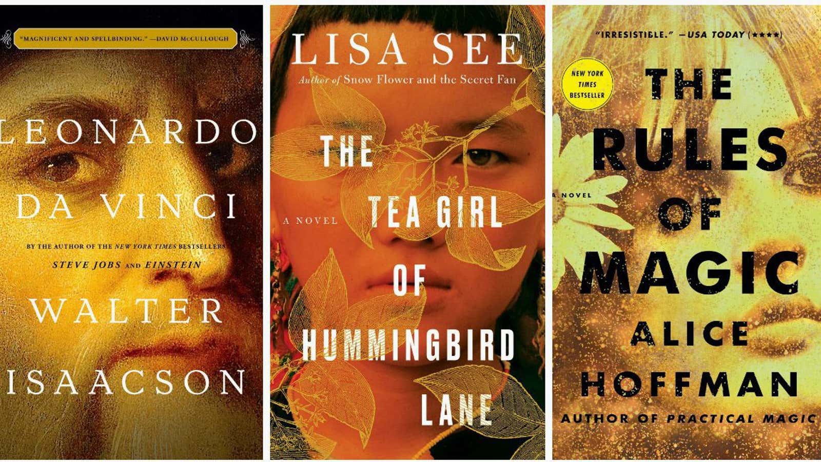
Two years ago, the aesthetic was super flat and pastel. Last year, we saw a striking profusion of birds on yellow backgrounds and pencils on white. This year, US book cover designers were crazy for paintbrush letters and enigmatic faces bathed in gold.
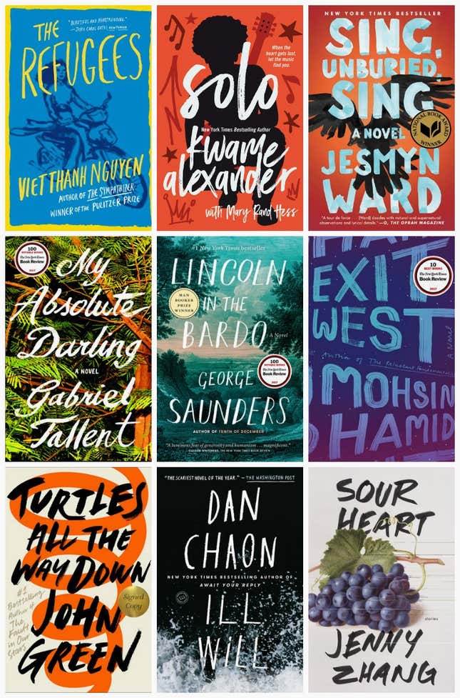
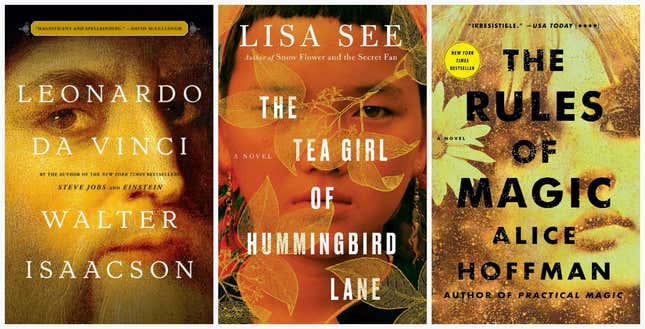
As Amazon points out in an analysis of 2017’s books and its customers’ reading habits, the appearance of hand-painted letters dominated US book cover designs this year. So did orange-red covers with black and white font and close-ups of a half-occluded face awash in gold and shadows.
At least nine popular or acclaimed works of fiction that came out this year had hand-rendered paintbrush type:
The homespun font has been going strong for some time now: Chad Harbach’s 2012 novel, The Art of Fielding, and Jonathan Safran Foer’s 2002 novel, Everything Is Illuminated, both had the look.
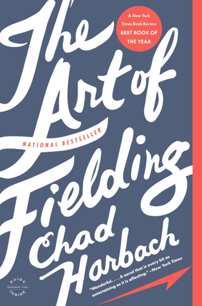
Covers such as The Art of Fielding, says Oliver Munday, a designer who worked at Knopf for three and a half years before starting his own studio, “had a nice, organic quality, and still felt big and powerful.”
“There are only so many things you can do with a title, so stepping outside the digital fonts that are available on a computer, a paintbrush treatment can be bold and has that human quality,” says Munday, who designed the covers for Colson Whitehead’s The Underground Railroad and Nathan Hill’s The Nix. “This is something that is often used at marketing meetings, in terms of what’s missing on a cover: ‘We want it to have ‘the human element,”” he says.
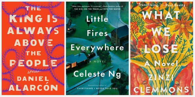
This year cover designers also went for aggressive orange-red covers, seemingly inspired by Mark Manson’s self-help book from last year, The Subtle Art of Not Giving a F*ck.

Perhaps off the success of Lauren Groff’s 2015 novel, Fates and Furies, quite a few fiction books this year had a bright background with a foregrounded title in bold white font. Smaller fonts are getting less common, as art departments have to now consider what the cover will look like shrunken down on a phone. At the same time, especially in literary fiction, says Munday, publishers want the “big book look,” that elusive quality that makes a book look important on the shelf.
For whatever reason, 2017 also got a few half-hidden faces covered in gold. “Mysterious compositions of a face, pieces of faces—this is a tried and true way of evoking mystery and pathos,” says Munday.
Especially at big publishing houses, book covers are not produced by lone designer-auteurs. The many stakeholders in each design include editors, publicists, marketing representatives, and, of course, authors. Sometimes big booksellers like Barnes & Noble can even weigh in on what they think will sell, and threaten to buy fewer books if they disagree with the direction. So it makes sense that when publishing houses see a bestselling book with a distinctive cover, the designs that follow can get awfully derivative.
“If we all had free reign to explore covers in the way we wanted to, the bookstore would look very different,” says Munday. “But it’s a commercial business. These things have to sell. As a designer you have to put your vanity to the side.”
