Nike has unveiled a new set of NBA jerseys meant to reflect the character and culture surrounding the team wearing it.
The swoosh is undoubtedly hoping the new jerseys will be a hit with fans by highlighting the aspects of their teams and cities they take pride in. Nike could certainly use the win right now. Its first year as the NBA’s official apparel provider has not gone well. Its jerseys, which it touted as fitting and wicking sweat better than any previous NBA uniform, have been ripping noticeably during games, and Nike left people miffed by not supplying special Christmas Day uniforms. The holiday uniforms have become a tradition, and it was the first time in years teams didn’t wear them.
The new City Edition jerseys offer Nike an opportunity to get fans excited again. Nike’s designers worked directly with the league and each of the teams to find things that represent the places and the franchises.
“With City Edition, we felt like this could be really compelling to make a true connection of, still the organization, but the organization in reflection to their city and their community,” Elesban Montoya, a senior graphic designer at Nike and the art director of the uniforms, told USA Today Sports. “What does it mean to be a Chicago Bulls fan? What does it mean to be a part of Chicago?”
Several of the jerseys also pay tribute to diversity and unity, a message Nike has been pushing particularly hard since Donald Trump entered the White House.
So far Nike has revealed the looks for 26 teams of the 30 teams. Many could satisfy fans—but probably not all. Reviews so far have been mixed. (Jerseys for the Houston Rockets, Miami Heat, New York Knicks, and Toronto Raptors are still to come.)
Here’s a look at the new uniforms and how Nike describes the inspiration for each:
Atlanta Hawks
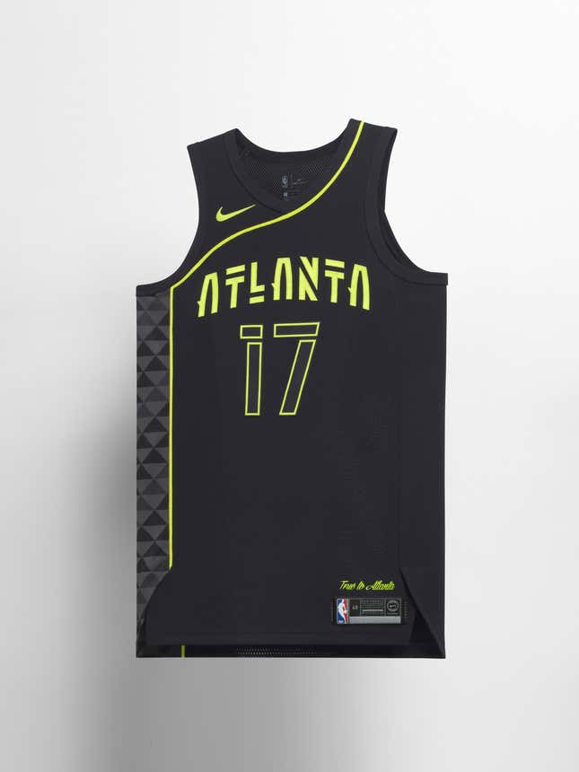
The asymmetrical lines and bright yellow “volt” accents are a reference to the Hawks’ uniforms in the 1970s, while Nike says the font and design are inspired by Atlanta’s present-day music scene.
Boston Celtics
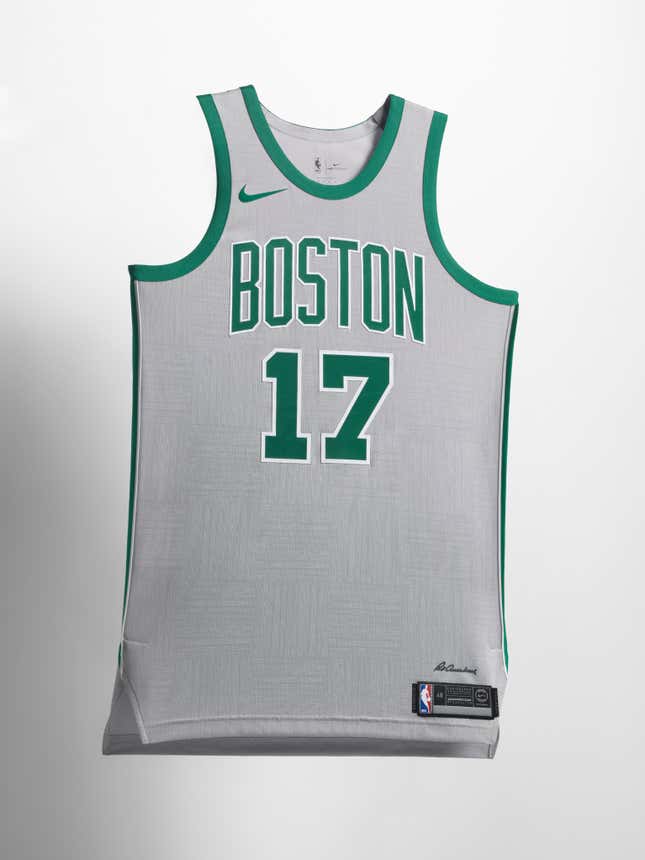
The subtle cross-hatch patterns in the body of the jersey are a tribute to the signature parquet floor of the Celtics home arena, “The Garden,” and to Red Auerbach, the architect of the legendarily successful franchise. The grey in the jersey represents unity, Nike says, and signifies “the large regional fan base spread across New England that rallies behind the Celtics year in and out.”
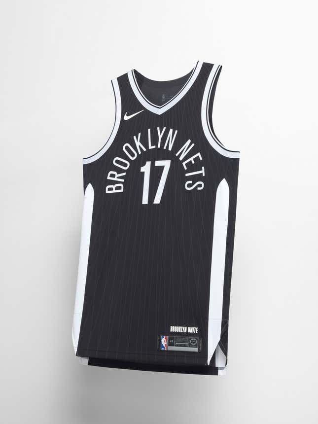
Brooklyn Nets
The unmistakable steel suspension cables of the Brooklyn Bridge stand out in the Nets’ jersey. Nike also added “Brooklyn Unite” just above the jock tag to call out the borough’s diversity.
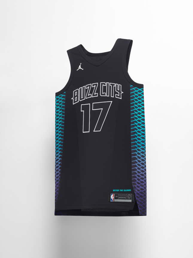
Charlotte Hornets
Nike went with an obvious reference point for the hive-like pattern on the jersey. The colors, meanwhile, play off a hornet’s iridescent wings, and the team’s anthem, “Enter the Swarm,” lettered above the jock tag, finishes the hornet theme. This one is less about Charlotte and more about the team.
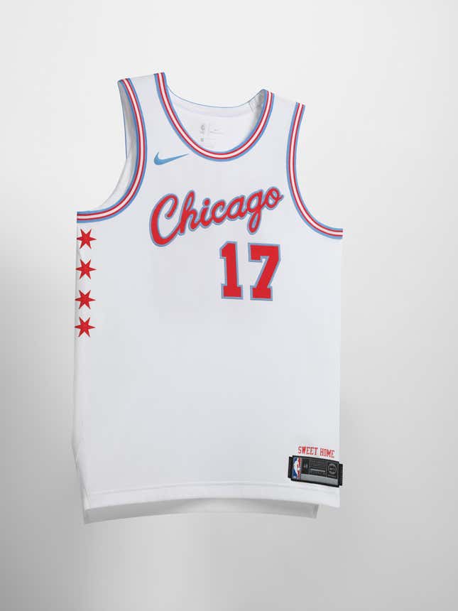
Chicago Bulls
The colors and the four six-pointed stars on the Bulls’ uniform are pulled directly from the Chicago city flag. Unlike Charlotte’s jersey, Nike opted to skip plays on bulls and focus entirely on Chicago pride. “Sweet Home” above the tag is a nod to the city as a storied home to blues music.
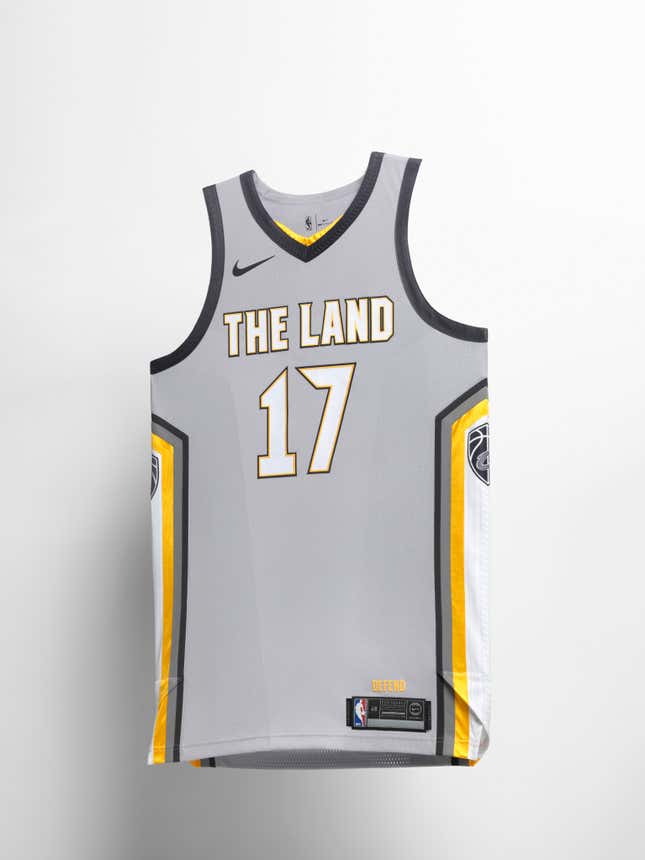
Cleveland Cavaliers
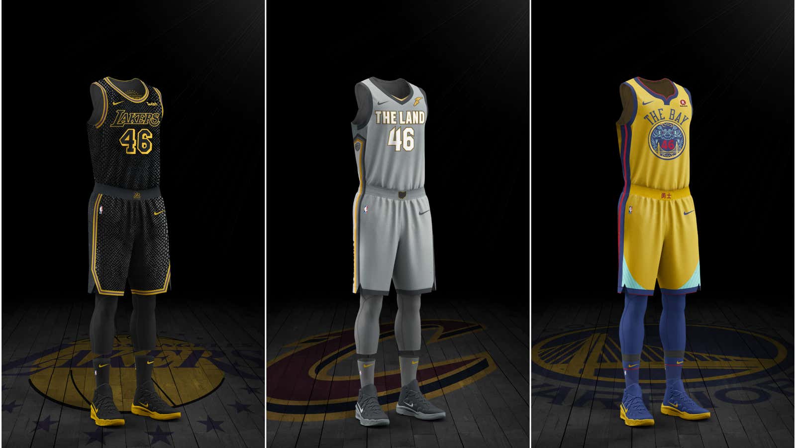
The jersey’s graphic side panels allude to the “Guardians of Transportation,” a pair of giant sandstone sculptures standing on either side of Cleveland’s Hope Memorial Bridge, except the Cavs’ shield logo takes the place of their faces. “The Land” in bold lettering across the chest refers to the Cavs’ slogan, “Defend the Land.”
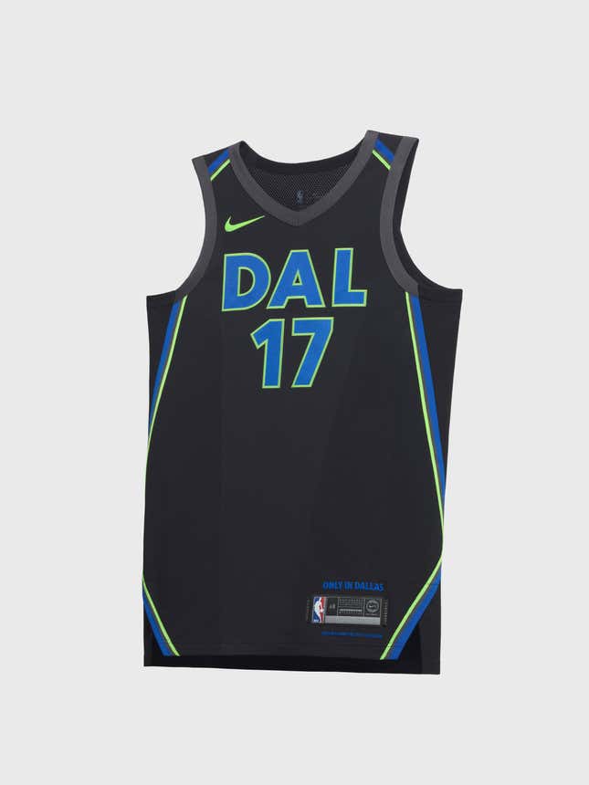
Dallas Mavericks
The neon lettering and piping play off the neon lights in downtown Dallas at night. The jerseys, Nike says, reflect “the swagger of the Big D.”
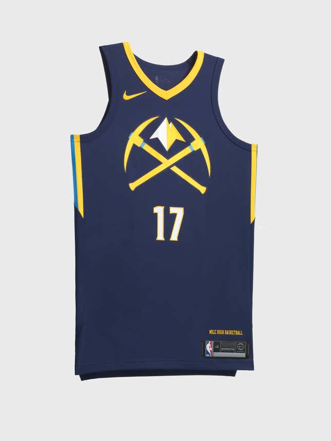
Denver Nuggets
The altitude of the Mile High City was apparently the inspiration for the Nuggets’ jersey, while the metallic gold accents “symbolize refinement in the club’s journey to new heights.” Sure it’s not all about the gold mines, Nike?
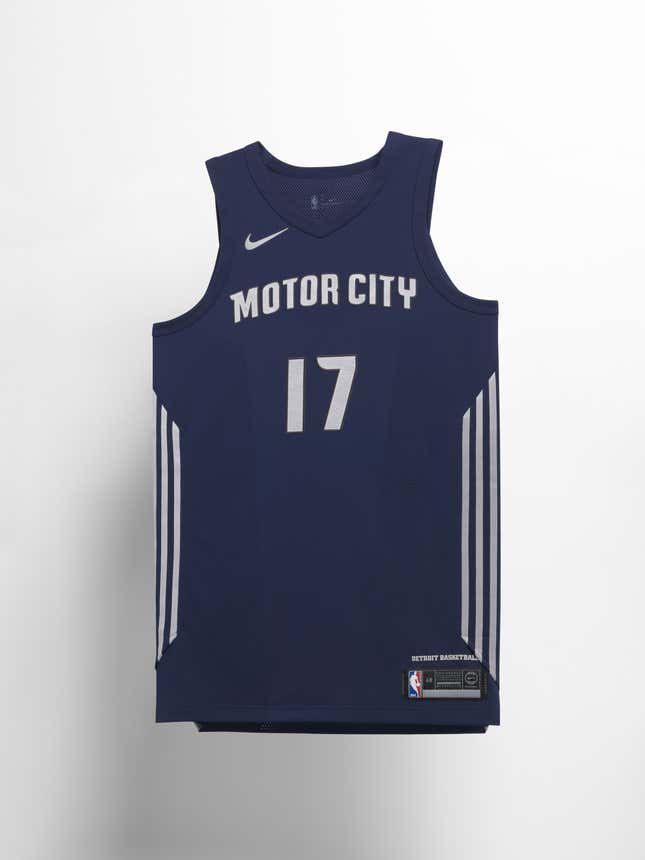
Detroit Pistons
The lines and chrome detailing in the Pistons’ uniforms pay homage to the Motor City’s automotive history. The aim was a “modern and clean look.”
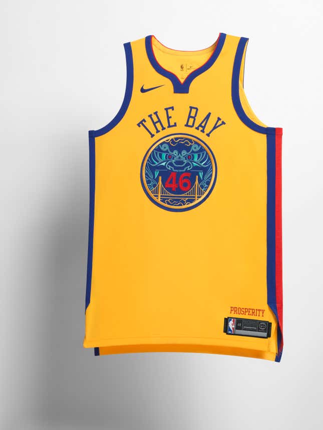
Golden State Warriors
The centerpiece of the jersey is a tribute to Chinese culture in the Bay Area, centered in San Francisco’s famous Chinatown, combined with an image of the iconic Golden Gate Bridge. Adding to the theme, on the waistband of the shorts that go with the uniform, the Chinese characters for prosperity stand out in red, and note the subtle outline on the jersey’s neck.
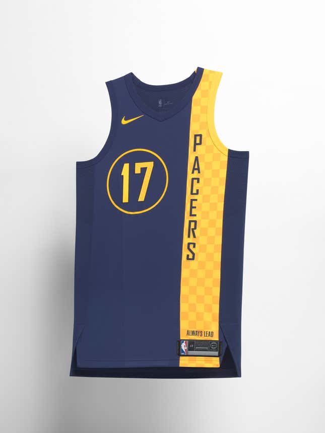
Indiana Pacers
There’s no missing the checkerboard pattern, borrowed from the flag and finish line of auto racing, running down the jersey. One cool detail: the player number copies the style of the numbers on classic Indy race cars.
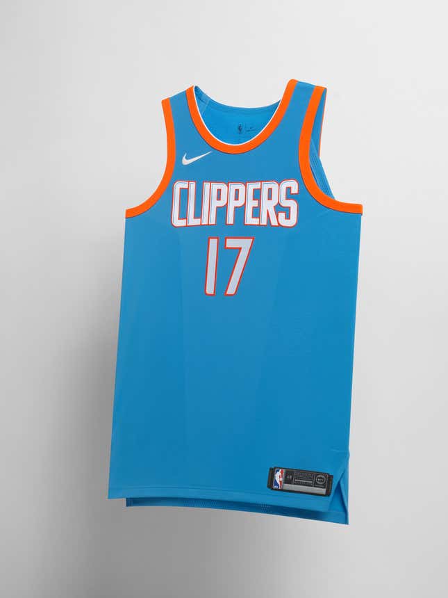
Los Angeles Clippers
The centerpiece of the Clippers uniform isn’t a graphic element, but the color. The bright, rich blue ties into the team’s nautical namesake.
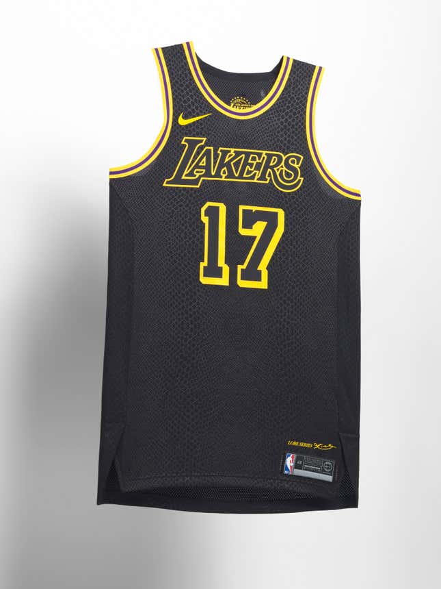
Los Angeles Lakers
What does a black snake print have to do with LA or the Lakers? The jersey is a tribute to the recently retired superstar Kobe Bryant, whose nickname was Black Mamba. Bryant, perhaps unsurprisingly, helped design the look. He’s a longtime Nike athlete, after all.
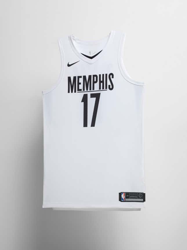
Memphis Grizzlies
According to Nike, the ‘I Am A Man’ slogan of the 1968 Memphis sanitation workers strike inspired the design of Memphis’ team look. The strike is what brought Dr. Martin Luther King Jr. to Memphis, where he was assassinated, and Nike says the stark-contrast look of the jersey “reflects on the events, circumstance and losses surrounding the movement.” The Grizzlies will wear the uniforms when the play the Lakers on Jan. 15, King’s birthday.
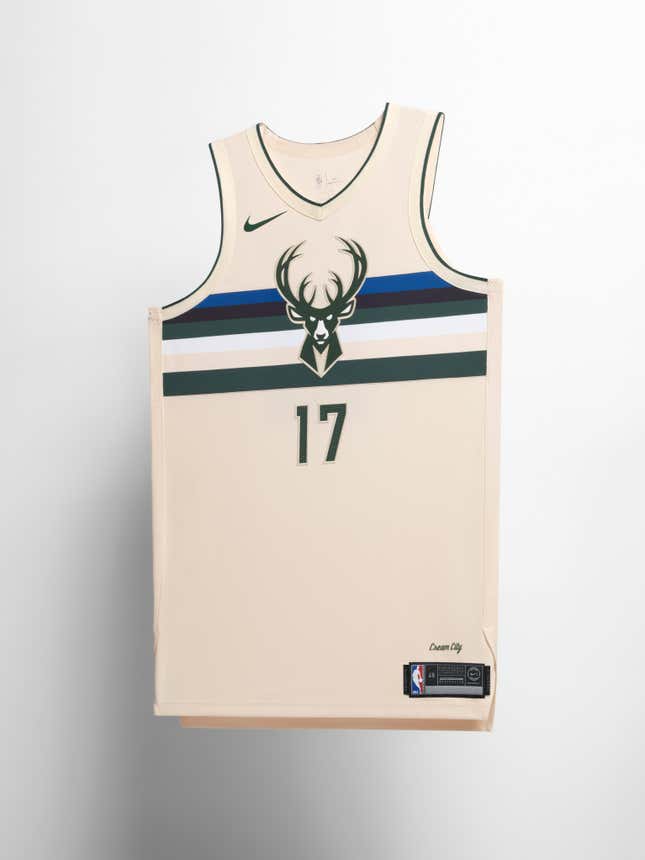
Milwaukee Bucks
“Milwaukee is defined by two things: the cold winters that roll in off the edge of Lake Michigan and Cream City brick, formed from the clay found in the Menomonee River Valley,” Nike says. The colors of the jersey are all symbolic of the city: the cream background points to the brick, the green references Wisconsin’s “lush landscapes,” and the blue comes from the city’s name itself, which is believed to derive from an Ojibwe word loosely translated as “gathering place by the water.”
Minnesota Timberwolves
The tonal gray coloring of the jersey has a clear origin: the coat of a wolf. The white, meanwhile, is a nod to the snow cover seen across the northern region.

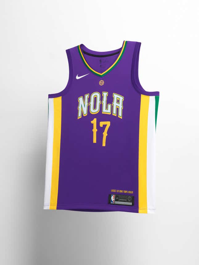
New Orleans Pelicans
Mardi Gras is what New Orleans is probably most famous for, and it’s the reason for the color choice of the Pelicans’ jersey. The player numbers are meant to look like they’re dancing, and Nike says the neckline “takes inspiration from classic Carnival ducal decoration.” The team will only wear the uniforms during the Carnival season.
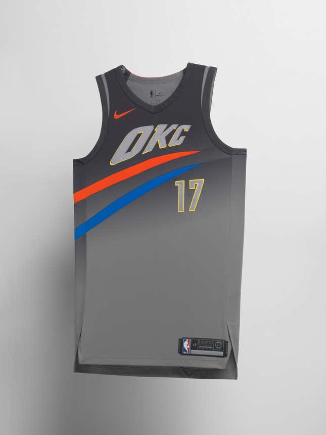
Oklahoma City Thunder
The City Edition look keeps the “sunset and blue twist” around the jersey, representing a coming storm, but also tries to reflect the team’s style of play, which according to Nike, is “fast, bold and dynamic.”
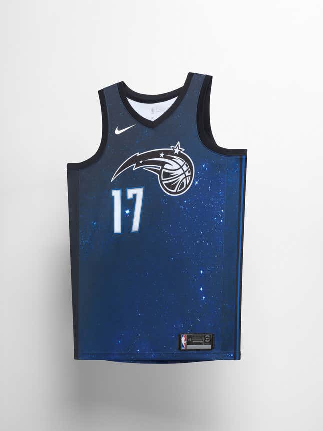
Orlando Magic
The “magic” theme must have really spoken to Nike, because it describes the jersey as “emblematic of the desire to achieve more…to break boundaries, push our outer confines and find something greater than our individual selves.” That inspiration takes form as a shot of stars in outer space.
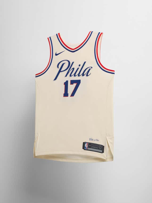
Philadelphia 76ers
Parchment is the color of the jersey’s body, while the font resembles the script on the Declaration of Independence. What better way to trim the shoulders and neck than red and blue for an all-American theme? “Unite or Die” finishes the look at the jock tag.
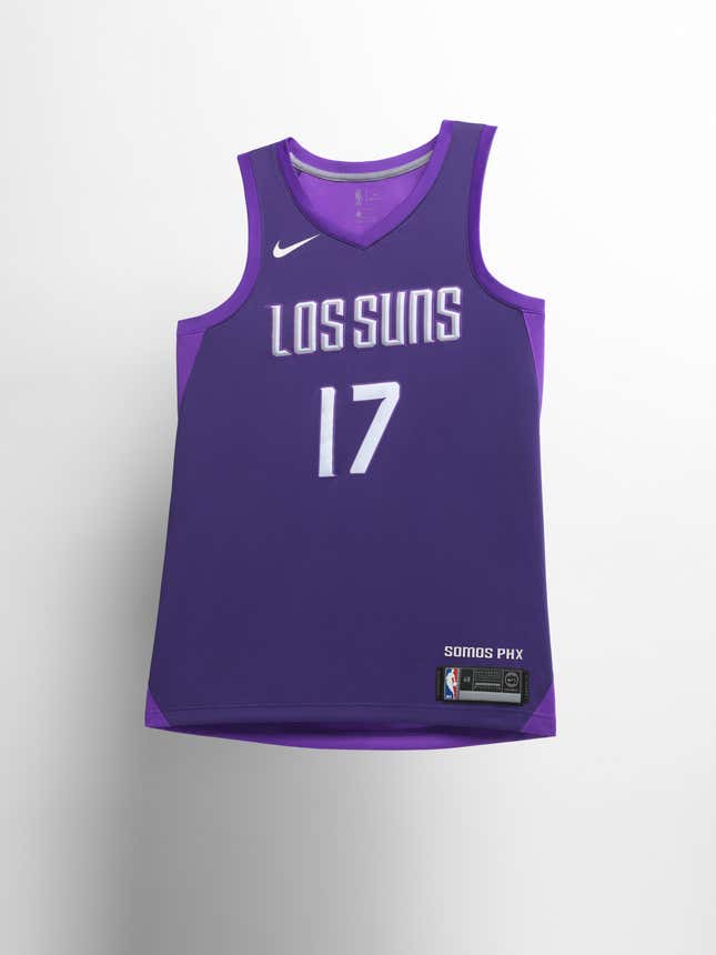
Phoenix Suns
Nike put Phoenix’s Hispanic heritage front and center by dubbing the team “Los Suns” right across the chest. The back of the jersey also features a design inspired by the Phoenix constellation.
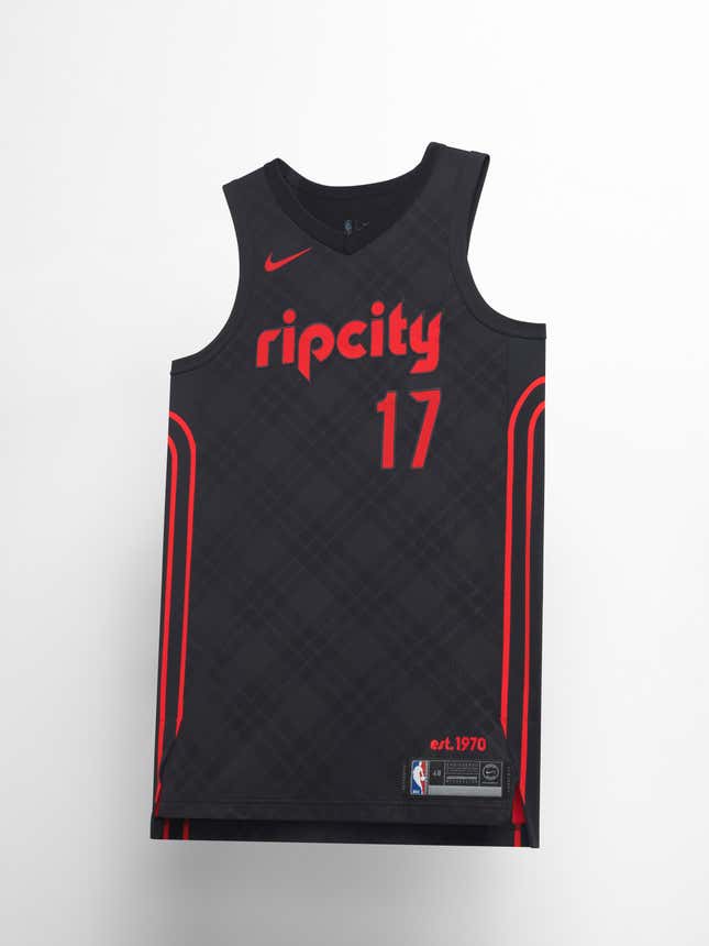
Portland Trailblazers
The wardrobe of Jack Ramsay, who coached the Trailblazers to a title in 1977, and the grungy plaid that the Pacific Northwest became known for in the 1990s are the two major reference points for the look of the jersey. The phrase “rip city” on the chest, meanwhile, is what the Blazers’ local fans call their town.
Sacramento Kings
This jersey marks the first use of the lion logo on the team uniforms, Nike says. At the same time, it calls back to the past with its color scheme, inspired by the team’s baby-blue 1985 uniforms.

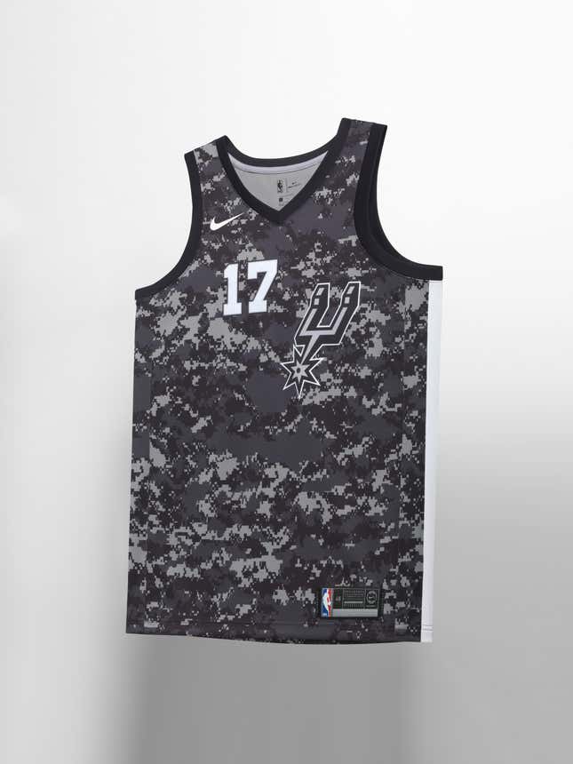
San Antonio Spurs
The Spurs’ traditional black and gray are turned into digicamo in honor of US military servicemen and servicewomen. It’s also a play on San Antonio’s nickname, Military City USA.
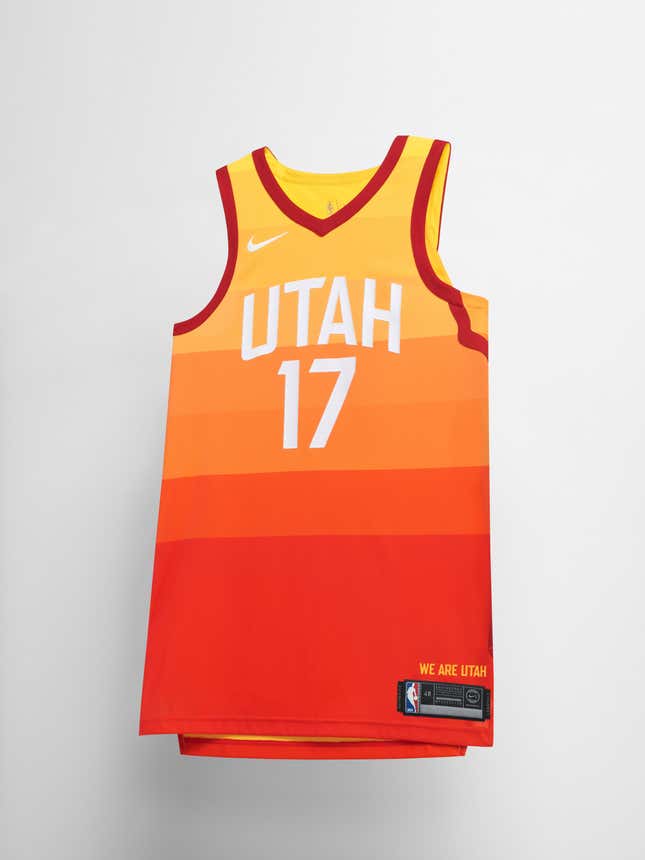
Utah Jazz
The stunning landscapes of Utah, including its red rock formations and desert canyons, are reflected in the color scheme. The sides of the jersey represent the state’s roadways, Nike says, and if you look close at the red trim around the arms you’ll notice they’re slightly different on the right and left side.
Washington Wizards
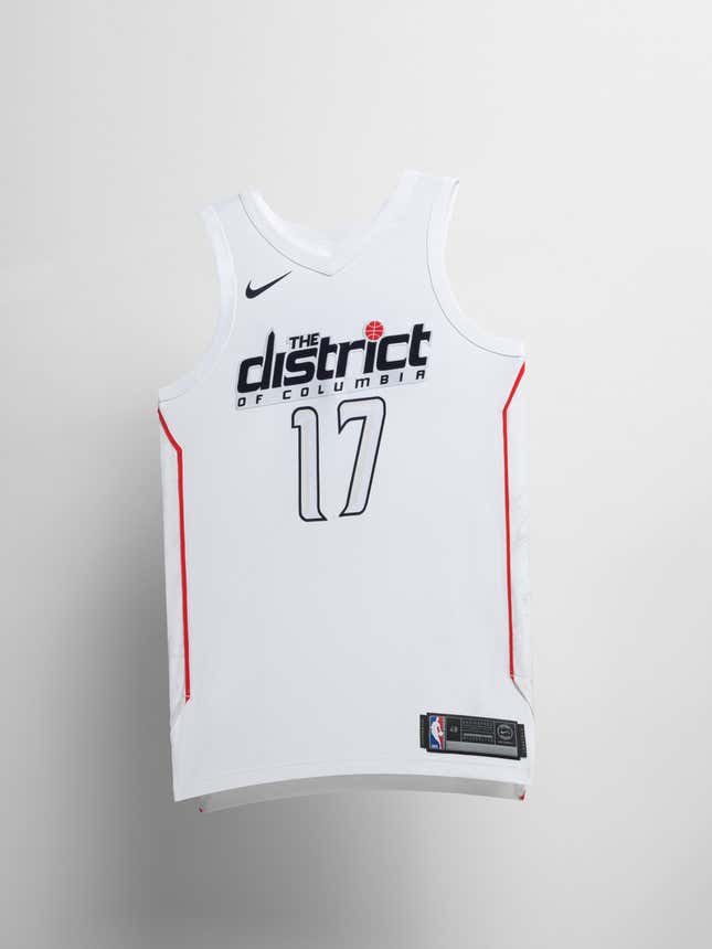
The jersey celebrates the nation’s capital with marble-patterned side panels in tribute to the Washington Monument, while the beveled edges on the numbers reflect the styling of DC’s other monuments.
