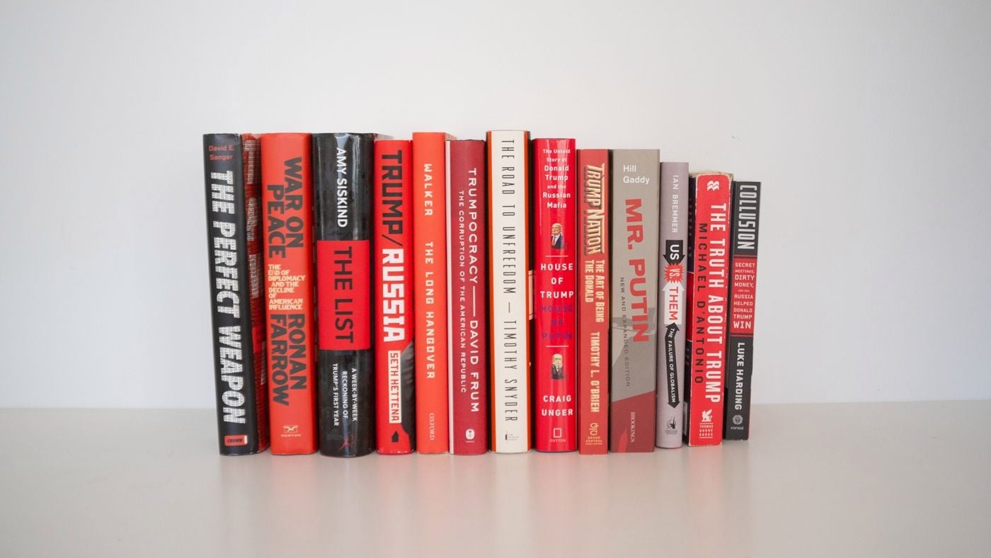
The trend in book design that’s contributing to America’s neurosis
This may be the most light-hearted piece I write all year—and it’s a desperate plea for help.


This may be the most light-hearted piece I write all year—and it’s a desperate plea for help.
My job, as my Twitter bio has it, is to cover “Trump, Russia, Trump-Russia, and global corruption.” These are challenging, fascinating, riveting subjects. Cheery they are not.
I’m filled with empathy for my acid reflux-plagued readers, aware they’re suffering the same palpitations I experience as I write the news. My evenings are spent perusing the finer points of special counsel Robert Mueller’s indictments. Walks to the subway are consumed by the puzzle of where Paul Manafort fits in the all-encompassing web of global kleptocracy. Moments set aside for sleep become overwrought by the question of whether US attorney general Jeff Sessions or Mueller will be fired—and what it means if they are.
All this I endure without complaint.
Tensions start to rise, however, when something happens like, say, the president’s longtime fixer and his former campaign chair both being convicted of federal crimes in the space of a few minutes. As the internet explodes and I start bashing my keyboard, I might need to reference something from Trumpian history. I turn to my shelf for one of the slew of books already written on the subject—only to be knocked back by a sea of violent red and black covers. My fragile resolve takes yet another dent.
On a recent such occasion, my anguish exploded into a tweet:
Totalitarian red-and-black
“Despair” is a natural response to being surrounded by these shades, says Jean Davis, an art therapist and associate professor at the Pratt Institute in Brooklyn: “It’s obviously sinister—it’s trying to be provocative. It’s trying to upset people. It’s trying to create discord. It’s definitely trying to conjure up negative feelings.”
The color scheme covers a lot of ground for designers, says Steven Heller, a professor of design at New York’s School of Visual Arts. Before the 1930s, black and red signified radical, dynamic progress—as used in the Bauhaus art school and by the Russian Constructivists. That changed with German Nazis’ use of the swastika in the national flag and the West’s increasing alarm about the “red scare” associated with the Soviet Union.
Beyond evoking fears of encroaching totalitarianism and a return to the Cold War, this scheme has an added bonus for publishers: the colors “scream out from the shelves in a book store,” says Heller, author of Iron Fists: Branding the 20th Century Totalitarian State.

The colors also invoke a visceral alarm in humans. Red is the color of blood and fire. Black, its partner in crime, “means doom, death, the bad cowboy,” says Heller. Almost as alarming as the color is the sans-serif font used for the books’ titles. “These point to a certain sensationalism,” Heller says. “They need to act as headlines on supermarket checkout counter magazines.” (Equally discombobulating is the Cyrillic abuse title design used on books like David Corn and Michael Isikoff’s otherwise excellent Russian Roulette, which my Russian-speaking brain can’t help but read as “Yaussiaee Roulette.”)
Color contagion
Exposing a populace that’s already plagued by anxiety to these colors can breed contagion, Davis says: “It’s a snowball effect. Your experiences get heightened by your environment, the books you’re reading and everything you’re taking in. It’s like a layer cake of negativity.”
Unfortunately, designers also suffer from contagion. As Quartz’s Thu-Huong Ha has written, publishers can be “awfully derivative” in copying successful covers—meaning this early Trumpian trend is unlikely to ease any time soon. Look no further than legendary reporter Bob Woodward’s Fear: Trump in the White House, to be released on Sept. 11. In case the title—and release date—weren’t alarming enough, publisher Simon & Schuster has adorned the work with our favorite color scheme.