You aren’t imagining it—every brand logo looks the same now
Logos used to be distinctive. Historically, brands wanted to stand out with unique stylish scripts that signaled they were different. Not so anymore.


Logos used to be distinctive. Historically, brands wanted to stand out with unique stylish scripts that signaled they were different. Not so anymore.
In 2019, you can expect to see branding increasingly turn into “blanding,” as The Fashion Law puts it. And there’s sound legal reasoning for the trend.
By making the plain language of a logo—the name or word—the basis for a trademark, instead of a unique font or color in combination with a specific word or name, brands may be able to better protect their intellectual property. The distinctiveness of their marks “will rest on the word(s) rather than any stylization of those words,” London intellectual property lawyer Birgit Clark tells The Fashion Law.

There are other practical reasons for the minimalist trend. By choosing a simpler logo that’s easy to recreate across digital and physical platforms, companies can represent themselves uniformly in all contexts. Luxury sales especially are increasingly taking place online, where brands rely on recognition over distinction.
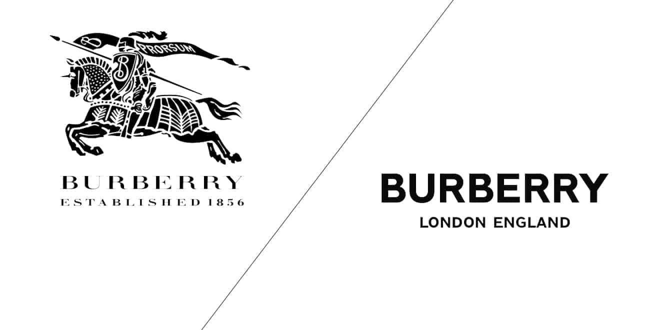
Perhaps that’s why fashion brands in particular are adopting plain, bold, all-capital-letter logos that make them barely distinguishable from one another. Everyone from high-end companies, like Burberry, Balenciaga, and Yves Saint Laurent, to more accessible brands, like Nike, have gotten in on the simplification trend.
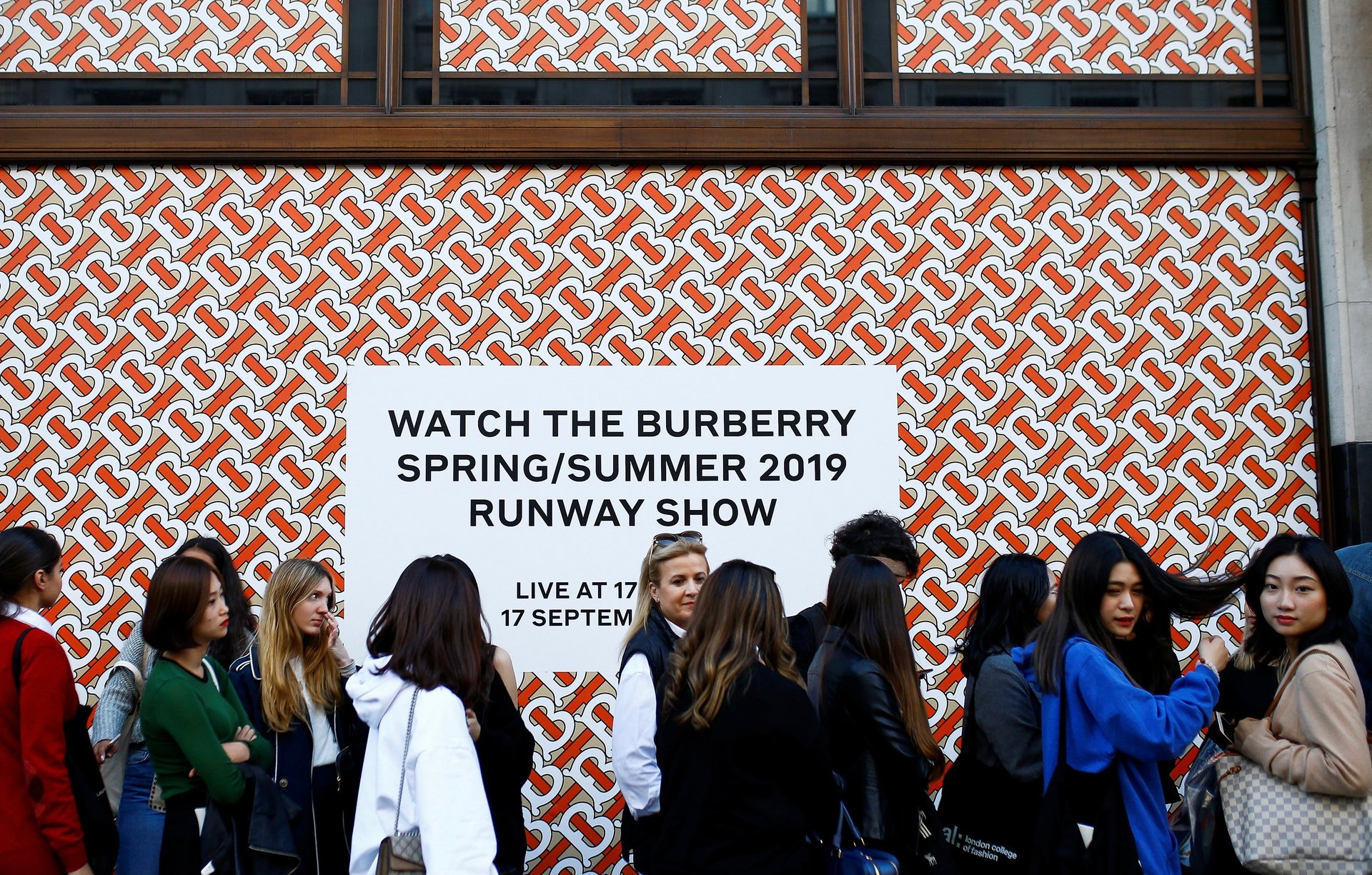
The new Burberry logo, for example, changed for the first time in 100 years in November. The new logo was designed by Peter Saville, who told Bloomberg (paywall) that the company wanted a mark that could look as good on a blouse as on its classic gabardine trench coats. By choosing a simple font, Saville was trying to evoke “modern utility…[something that] looks like it’s been there forever, but it’s still contemporary.”
A less generous assessment of the minimalist trend is that fashion brands may just be getting less creative and more formulaically corporate. Today many different design houses are often joined under a single corporate roof, like the behemoth LVMH, which owns 70 fashion brands ranging from Christian Dior to Marc Jacobs to Louis Vuitton. This may be, perhaps unconsciously, contributing to “blanding.”
Fortunately, the rush to uniformity is also giving rise to a budding counter-trend in logo design, dubbed “serif redux.” LogoLounge, a subscription-based inspiration gallery where graphic designers share ideas, has for the past 16 years published an annual report that assesses the contemporary state of logos. Founder Bill Gardner told Quartz’s Anne Quito that the glut of simple logos seems to be inspiring a “resurgence of detail” among some contrary designers.
Underwhelmed by logos that strip “brands to their visual bone,” Gardner says he is “starting to see the near rebellion of a group of designers that have been on a fat-free diet too long. Mouths are whetted for an opportunity to binge.”