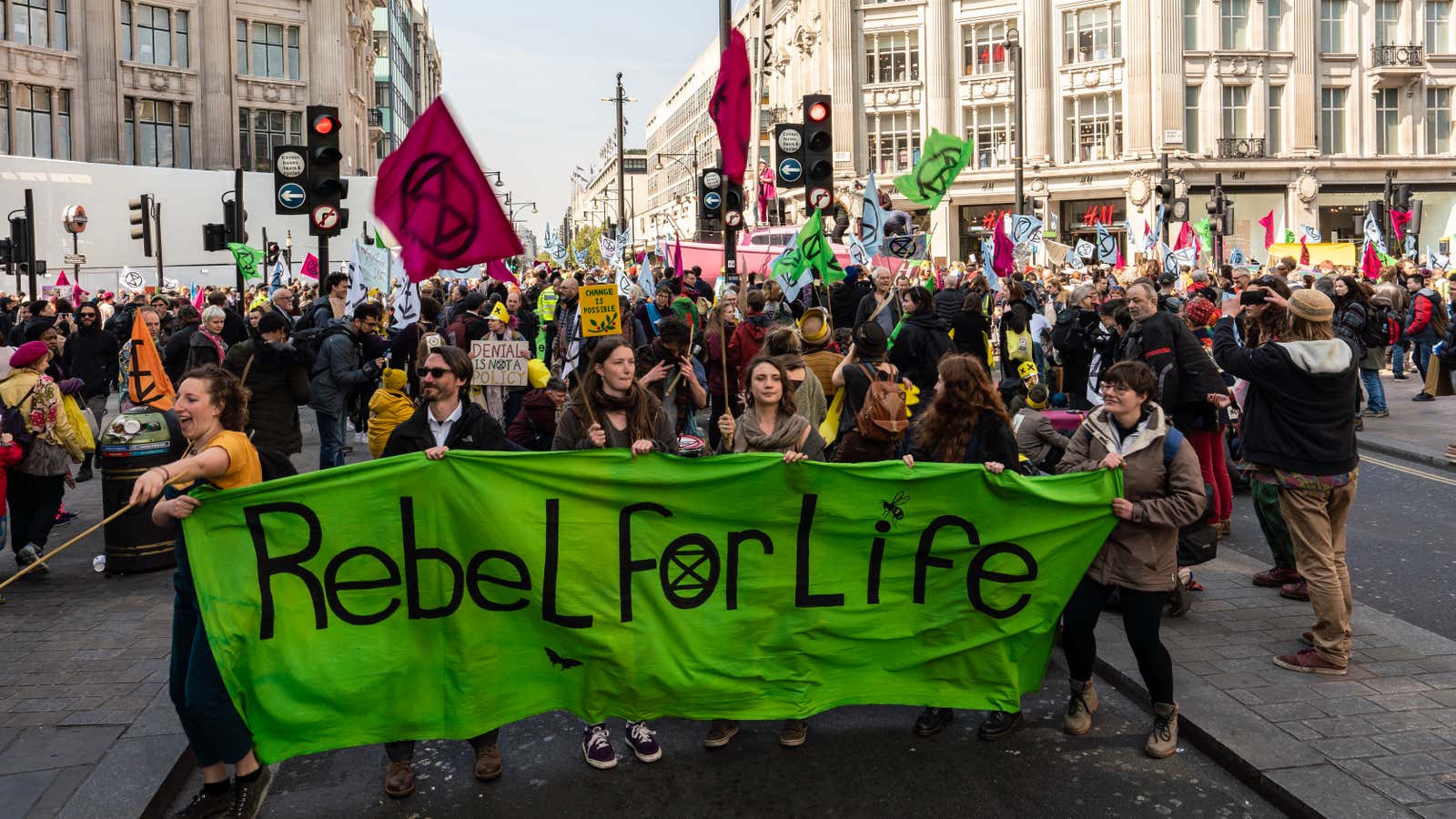
In the streets of central London today, you’ll see angry commuters and beautiful art.
Starting April 15, protestors with the environmental group Extinction Rebellion have been disrupting the functioning of the capital. It began with thousands blocking traffic in five iconic locations. Then the protesters escalated to spray-painting the headquarters of the oil giant Shell. Today they are threatening to delay trains on the rail and underground network.
Reactions on social media have been divided, with many supporting protests while others would prefer no disruption to daily lives. The London mayor Sadiq Khan noted that he was “extremely concerned” about the safety of citizens.
So far, at least 290 people have been arrested, and more arrests are expected today. Still, the mood at most sites of protests has remained festive and peaceful. Some of that may be a credit to the art.
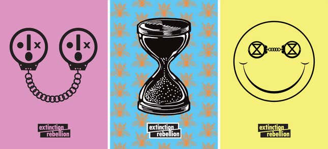
A group of four designers have been responsible for creating the bold art posters that have defined the scene. The group volunteered to help after someone from Extinction Rebellion reached out.
The design process began with the extinct symbol, which you’ll see used in place of the eye of the smiley on the yellow poster above. It was designed in 2011 by someone who wishes to remain anonymous. The simple design has an hourglass in the middle, a visual representation of time running out, and a circle that represents the planet.
“We met the creator of the symbol, who is very supportive of our cause,” said Clive Russell, a design director at the agency This Ain’t Rock ‘n’ Roll, and one of the designers of Extinction Rebellion’s posters.
“We took inspiration from the posters of Paris ’68,” said Russell, referring to the strikes by students and workers that brought the country to standstill that year. The goal of the protests was to make France a more egalitarian society, and the posters, designed to reflect the grassroots movement, are iconic.
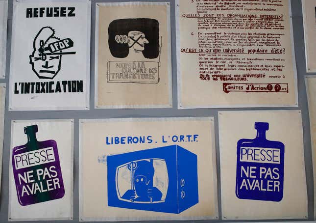
The process by which those French posters were conceived and printed, at the famous art school École des Beaux-Arts, has itself become legendary. “Someone would say ‘We need a poster that talks about immigration,’” Éric de Chassey, a professor of contemporary art at François Rabelais University, told the New York Times. “Then someone would propose a design, someone else would propose a slogan and then it would be discussed by a committee.”
In the 2019 version of this process, Extinction Rebellion held art and design workshops across London and other UK cities to include those “who usually don’t do art,” Russell said. The workshops start with a talk about the motivation for the protest, then divide attendees into groups to discuss a topic. Each group is then expected to come up with a message and some thoughts on how to translate that into design. The workshops led to “paint the streets” events held in Bristol and London, where participants used their ideas to make graffiti.
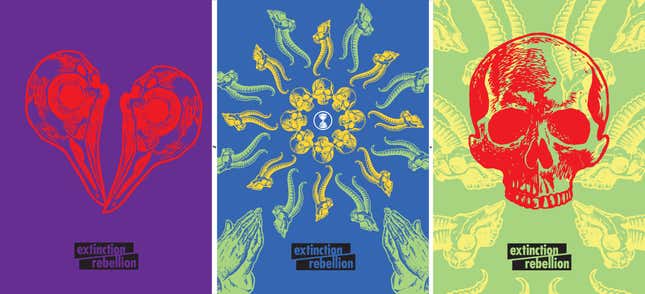
The posters that Extinction Rebellion shares on its website, however, were designed by a small group. Russell worked with his business partner Charlie Waterhouse, fashion designer Clare Farrell, and designer Miles Glynn. The group got help from a few others, but Russell said they didn’t want to be named.
“We looked at the previous eco movements, but we wanted our posters to be different.” Russell said. He wanted the posters to show both the enormity of the threat that climate change poses and the anger at the lack of action so far.
“We also wanted the design to be easy to replicate on streets,” Russell said. That meant using a block-printing style. The elements chosen are easy to connect—bees, butterflies, trees, human skulls, and other animal bones—and those elements are placed against a bright background chosen from a palette of 10 colors. (Green is one of them, of course, but is not as dominant as it has been in past environmental movements.)
“The font is based on an old wood type,” he told Dezeen. “We took something retro and made it modern. The lettering is slightly mismatched.”
Russell himself designed the “shock face,” the smiley face with an X replacing one eye, and a gaping mouth as the dot at the bottom of an exclamation mark. “I wanted it to reflect my emotions after I heard about the likely impacts of climate change,” he said.
“We made some things relatively ambiguous,” he said, to leave room for people to interpret the meaning.
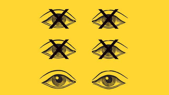
One example of ambiguity was the poster pictured above, of six eyes with four X-ed out. I interpreted the poster as people dying—the “extinction” referenced in the movement’s name—but Russell’s interpretation was that most people’s eyes are closed to the growing impacts of climate change.
Is making paper posters an apt choice for an environmental movement? “We always tried to reuse as much as possible,” Russell told Dezeen.
Keep up with Quartz’s coverage of climate change by signing up for The Race to Zero Emissions newsletter to receive regular updates.
