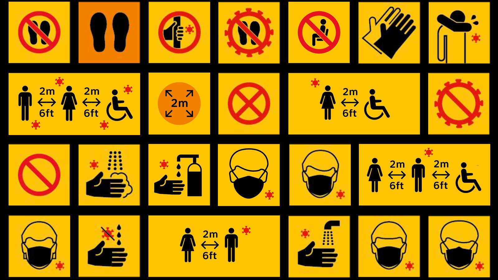
A well-made sign is a potent weapon in the effort to fight the spread of Covid-19. As businesses reopen, signs can choreograph pedestrian flow, remind customers to keep six feet apart, and help coworkers navigate new social greetings.
There is already a vast catalog of pre-made coronavirus-themed signage available online. They range from no-nonsense safety warnings to cheeky handwashing reminders to cartoony office posters from the Centers for Disease Control and the World Health Organization. But before purchasing or printing multiples of these stock options, know that some signs are more effective than others.

For a seemingly simple analog device, a lot goes into designing a good sign. Coronavirus signs typically suggest a change in behavior—discarding old habits for safer practices—and that’s never an easy thing, explains Tim Fendley, creative director of the London-based consultancy Applied Wayfinding. Each public sign is a distillation of human psychology, cultural anthropology, urban design, user design principles, and graphic design, on top of the politics of its constituents.

The good news is that we already know what works, says Fendley, whose firm has developed signage systems for clients around the world. They include New York’s Metropolitan Museum of Art, Seoul’s downtown fashion district, the city of Vancouver, and a widely-admired pedestrian street signage system for central London called Legible London.
“We don’t have to learn by doing it wrong,” he explains. “We’re not starting from scratch.”
It’s not about branding
The biggest folly is conflating sign-making with branding. Creating a good sign isn’t about matching colors or fonts to complement a corporate logo. It’s not about being unique to differentiate yourself from your competitors. “You’ve got to focus on its objective, which is to change behavior,” Fendley explains. “You can’t let the graphic design get in the way.”
He says that businesses that display inconspicuous signs in soothing pastels are doing it wrong. A good warning sign needs to be visible, direct and clear above all. “Some businesses want to create a pleasant environment, but this is a crisis. It’s not about being nice. This isn’t about advertising slogans,” he says. “The quality of the information needs to be as unambiguous as possible. It needs to be as consistent as we can get it, so we’re teaching one language to everybody.”
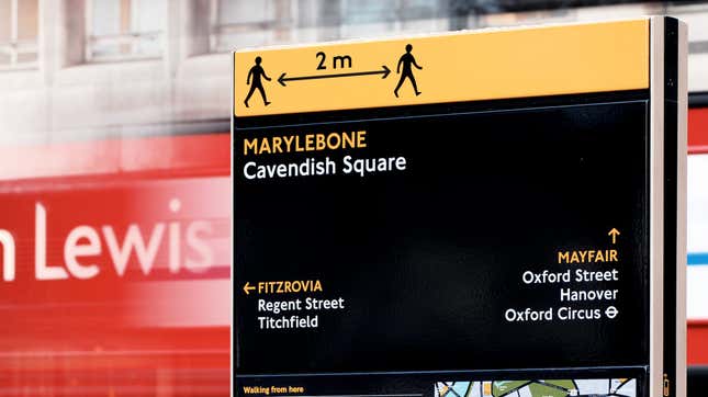
“It can be a guidance sign, but the language can still be quite commanding,” he adds. “This is about, ‘please behave in this way because that’s what’s going to keep us all safe.'”
Design for “fast thinking”
If you have to think about what a sign means, it’s already failed. Citing economist Daniel Kahneman’s 2011 book, Thinking, Fast and Slow, Fendley says that warnings must be designed for “thinking fast”—messages that are understood instantly and intuitively.
This work entails tuning in to the audience’s vernacular. One example is the male and female bathroom symbol. As much designers have tried to introduce politically-correct, gender-neutral icons, Fendley admits that there’s nothing that communicates faster than the traditional male/female pictograms. “It’s because it’s already wired in your head,” he explains.
For Covid-19, Applied took the CDC’s widely-circulated red coronavirus ball and translated it into a graphic. They used it across the signage system to indicate where the invisible virus might be present.
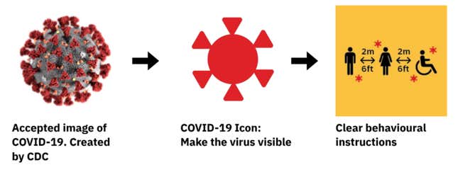
To make sure graphic depictions are quickly understood, Applied showed the designs to small focus groups, following the UX practice of testing with five users at a time. The so-called “golden rule of five” suggests that a small sample set will likely identify 85% of the potential problems.
The principle of progressive disclosure
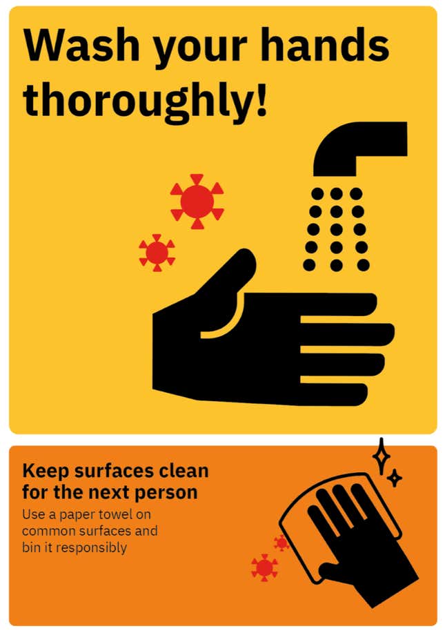
Signage is not just about what you say, but when you say it. Instead of creating a big poster listing all the rules at the front of an office, it’s better to guide people through a space with a series of cues. This means creating visual prompts for hand washing near sinks or sanitizing instructions in the kitchen area, for instance.
Introducing information in small chunks follows the principle of progressive disclosure, a web design practice used to “lower the chances that users will feel overwhelmed by what they encounter,” according to the Interaction Design Foundation.
A system not just a sign
Ultimately, the most effective signs are consistent with the other signage that people encounter during their daily routines. Learning from their work in London and Madrid, Fendley recommends coordinating efforts with neighboring businesses and local governments. Like road signs, having one consistent design lets users get accustomed to a signage system’s look, tone, and parlance, so they’re more likely to use them.
“I believe there should be a system for all the shops in the country,” argues Fendley. “The government should have commissioned this, designed it and tested it … The problem [of changing behavior] is really, really complex. You can’t crack a complex problem with a simplistic solution. It requires a sophisticated solution that looks really simple.”
