For years, IBM has spoken in the language of Helvetica, an efficient, machine-like typeface designed to evoke a modern sensibility.
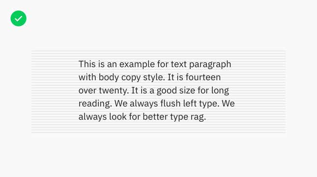
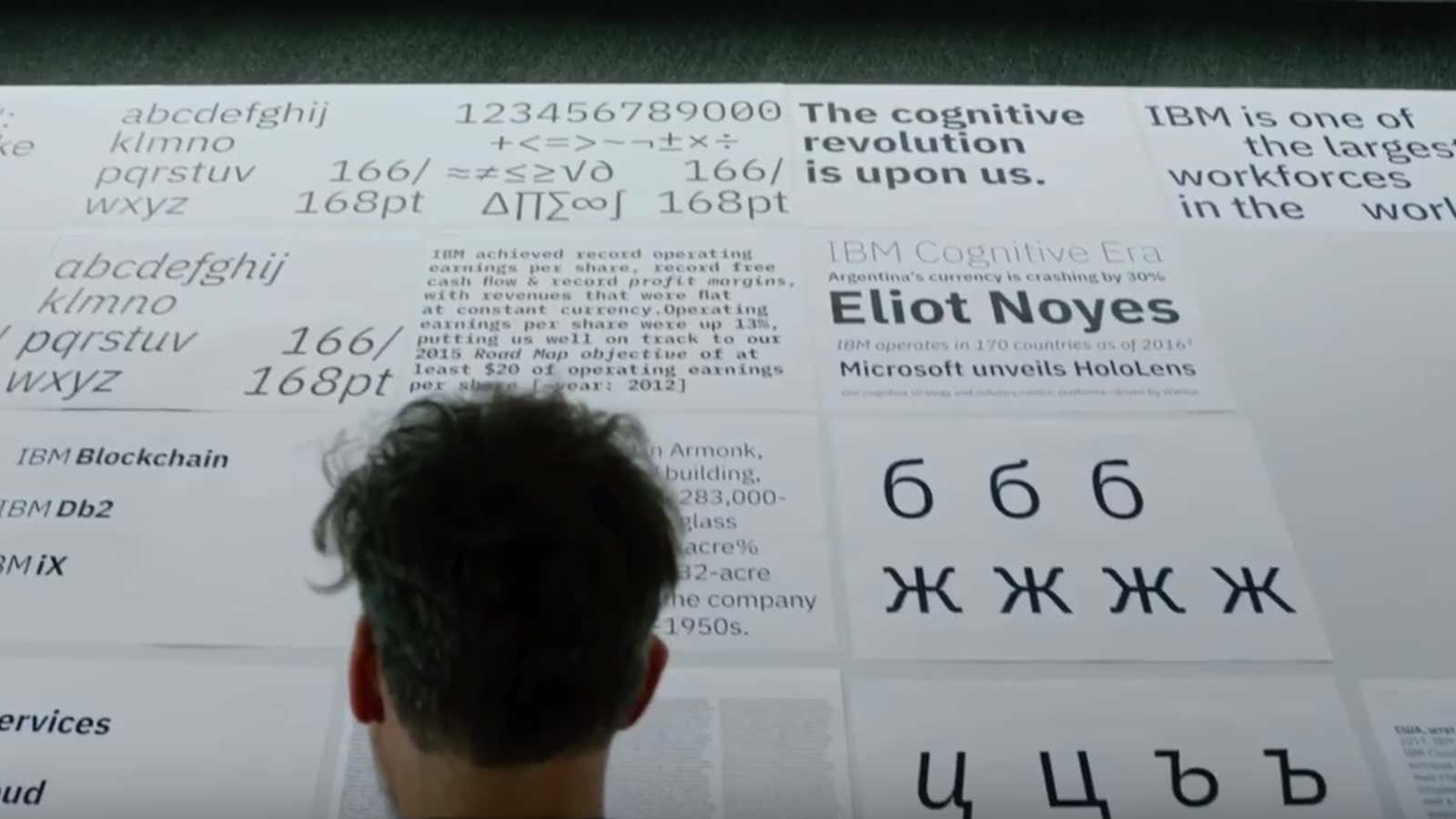
Today, the 109-year old company is freeing itself from the cold, modernist cliché and replacing Helvetica with a new corporate typeface called IBM Plex. A font update may seem like a small matter to outsiders, but the creation of IBM Plex—its first ever “bespoke” font—is a major milestone in IBM’s storied design legacy and will have ramifications throughout the company and its products. The typeface will be used in its software, websites, signage, PowerPoint presentations, business forms, and marketing initiatives. IBM Plex will be available in 110 languages, in serif and sans serif versions, and in eight weights.
IBM has also decided to make IBM Plex available for anyone to download and use for free.
Beyond Helvetica
IBM is obsessed with good design; by the end of last year it had put 100,000 staffers through design training. Its creative leaders have been clamoring for a unique corporate typeface for a while, but the project has languished. ”It’s difficult. You have to find the right type designer who really gets you,” explains Terry Yoo, vice president of brand strategy and experience design.
What changed?
The opportunity came when graphic designer Mike Abbink joined IBM in 2015. With stints at brand strategy firms Wolff Olins and MetaDesign, where he worked for the renowned typographer Erik Spiekermann, Abbink developed an acuity for translating a company’s values into letterforms. He designed the uplifting Inspira typeface for GE and the lively NBCU Rock for NBC Universal.

“When I came to IBM, it was a big discussion: Why doesn’t IBM have a bespoke typeface? Why are we still clinging to Helvetica?…Helvetica was a child from a particular set of modernist thinking that’s gone today,” explains Abbink in an internal video. Helvetica was right for the IBM of the 1960s, when the company wanted to change its image as a maker of meat grinders and cheese slicers to one as a producer of advanced business machines.
IBM’s business has since changed again. From selling PCs and computer hardware, the $162 billion company has gone to making most of its revenue today from enterprise software for companies and governments around the world. Its marquee AI project, IBM Watson is, at its core, a multi-faceted meditation about the relationship between humans and machines.

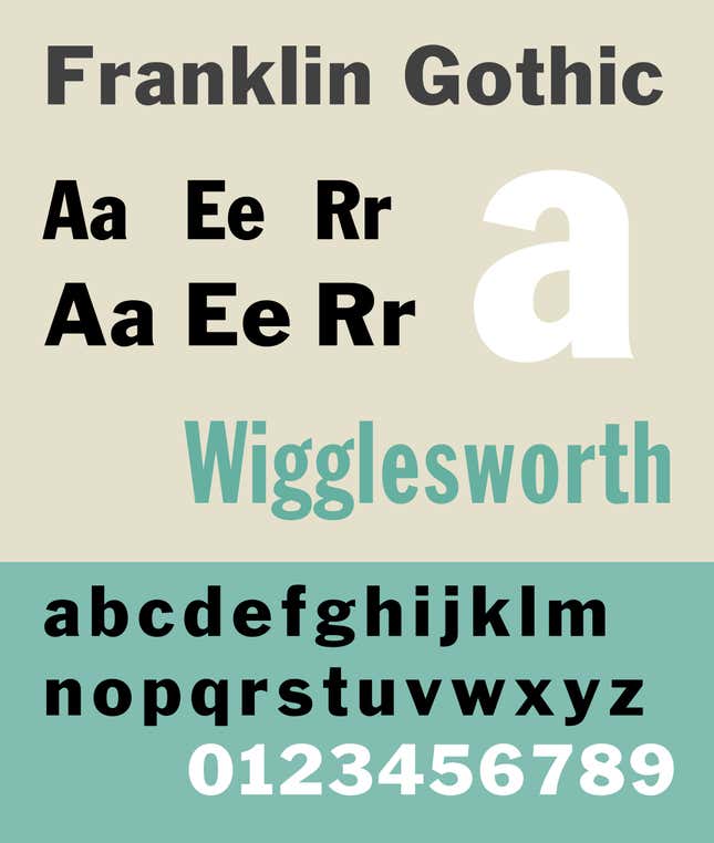
Abbink and his team have spent the last two years deliberating on a typeface that would capture IBM’s essential qualities. They were inspired by gothic fonts such as Franklin Gothic or Bell Gothic, which look modern but not soulless like Helvetica.
The final result: A graceful hybrid of blocky, engineered shapes with natural gestures from handwriting. ”Plex is about finding the quirkiness between manmade things and engineered moments and bringing that into letterforms,” explains Abbink.

Naming the font was a challenge too. IBM initially wanted to call it “Eliot” as a tribute to the founding architect of its design program, Eliot Noyes. When Noyes’s family declined to lend their name to the font, Abbink came up with “plex,” a four-letter construct that could be linked with other letters to form a word—like a metaphorical bolt. “Plex is being a part of something before it, like [the word] ‘duplex,'” explains Abbink. “It’s basically a component of IBM.”
Free fonts for all
For all its intangible impulses for ditching Helvetica, IBM also had a very pragmatic reason. Until recently, it was spending over a million dollars each year to license Neue Helvetica for the company. Fonts are digital assets that companies license on a per-user basis and the digital typeface company Monotype owns the rights to Neue Helvetica.
Because of the cost factor, not all 380,000 IBM employees had access to Neue Helvetica on their machine, explains Yoo. Creating a custom typeface solves that inequity. Plex is now installed in every IBMer’s computer and will eventually be used be in all its products, ending Helvetica’s reign there once and for all.

At this year’s SxSW technology festival, IBM created a grand homage to the then-unnamed typeface by wrapping the exterior of an 8,400 sq. ft (780,000 sq. m) building with it. It wasn’t ready to discuss the details publicly then, but the excitement and pride of the IBMers at SxSW was palpable. Employees gushed at how wonderful font looks on the interactive displays and debated on what it should be named.

The decision to share its corporate font with the public is strategic. Yoo explains that by making Plex open-source and sharing it widely, it can avoid headaches like not having the right font installed when firing up a PowerPoint presentation. “We didn’t want to be limited by our ability to use it,” she explains.
For Abbink, sharing a well-designed font with the world is an expression of IBM’s commitment to good design. ”Outside of a large enterprise, no one can really afford to create a beautiful, well-crafted typeface and not take money for it,” he explains. “For folks like Google and ourselves which are about transforming the world, I think it makes sense.…It would reach a lot of people, we feel it should be given away,” he says. ”I think if you’re going to stand behind ‘design’ as a cultural posture, then it’s your responsibility to make sure open source typefaces you’re sharing are good.”
Plex can now be downloaded via Github and will soon be available through Google’s free font library. IBM is also hopeful that Apple will include Plex as a system font in its next OS.
