What resonated with the internet community this year? For chart lovers, it was terrorism, the solar eclipse, new life, humor, and deception.
What resonated with the internet community this year? For chart lovers, it was terrorism, the solar eclipse, new life, humor, and deception.
In 2017, over 10,000 charts and maps were submitted to Reddit $RDDT’s popular data visualization forum r/dataisbeautiful. Most didn’t make much of a splash with the forum’s 12.6 million subscribers, receiving just a few upvotes—Reddit’s equivalent of Facebook $META likes. But some visuals went gangbusters, getting over 50,000 upvotes, and hundreds of thousands of viewers.
Join 500,000+ readers who start their day with Quartz.
By subscribing, you agree to our Terms of Service and Privacy Policy.
We examined the five most popular charts of 2017, based on upvotes, to see what they might tell us about our times.
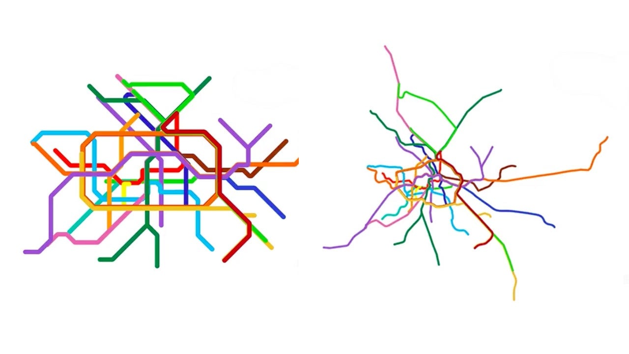
The most popular visualization of 2017 on Reddit was a schematic of of Berlin’s subway that morphs from the map used by the system into one with a version depicting its true geography. The map, created by Vinzenz Aubry (aka “vinnivinnivinni”) of the Berlin design studio Sansho, was part of a trend this year of cartographers pulling away the veil of distortion of subway maps around the world. Perhaps this was driven by a desire for the truth in 2017, when so many world leaders were telling us lies—these visualizations do seem to reveal the nature of the false abstractions we live with in our everyday lives. Or maybe we just like them because they look cool.
The second-most popular chart on Reddit was user valouhhh’s poignant and simple visual showing the number of people killed in terrorist attacks in Africa versus those killed by terrorist attacks in Europe, from January to October 2017. It makes the important point that the brunt of the world’s militant extremism is borne by those living on the African continent, though you would not necessarily know this from media reports in the US and Europe. Although not a particularly “beautiful” chart, it is an essential reminder that, in 2017, extremists targeted the most vulnerable.
Andrew Elliot’s gorgeous visualization of his daughter’s sleep patterns in her first four months was actually released in 2016 but remained wildly popular through 2017. It’s based on sleep data Elliot collected through the Baby Connect iPhone app. The inside of the circle shows the very beginning of his child’s life, and each full spin represents 24 hours—blue is sleep and yellow is awake.
The chart elegantly demonstrates how newborns slowly adjust to world’s sleep cycle, and the hellish experience of many new parents. It’s a reminder that some aspects of parenting are timeless; for many moms and dads, 2017 was not that different from 1817.
The fourth-most popular visualization of year was an elaborate joke. The user DR-ROBERT-J overlaid a map of current US locations of the fast-food chain Waffle House with a heat map of cardiac-related deaths in 2013. The overlap is undeniable; as Redditor PolarisOrbit wryly noted in a comment on the chart, “I know we are not supposed to mistake correlation for causation, but the implication here seems clear: cardiac deaths cause Waffle Houses.” This chart doesn’t say much about 2017, except maybe that humor is alive and well.
The fifth-most popular chart of the year was very 2017. On August 21, mainland US experienced its first full solar eclipse since 1979. Americans were excited to see the cosmic event, but many were nervous about what it might do to their eyes. Soon after the celestial event, Reddit user superpaow took to Google $GOOGL trends to pull data on search popularity for the terms “solar eclipse” and “my eyes hurt” in New York state on the day of the eclipse. Perhaps unsurprisingly, search traffic for “my eyes hurt” spiked immediately after the event. The trend is visualized powerfully in superpaow’s chart.
Thankfully, it seems that most people were careful—or lucky—as there does not appear to have been a rash of eye damage following the eclipse.