It’s no secret that we love charts here at Quartz. Earlier this year, we even built an online tool that anyone can use for making them.

It’s no secret that we love charts here at Quartz. Earlier this year, we even built an online tool that anyone can use for making them.
Just as we did at the end of 2012 and in the middle of this year, we asked each member of our editorial staff to submit his or her favorite chart of 2013. What “favorite” meant was left open—it could mean best designed, having the most interesting content, or some combination of both.
Join 500,000+ readers who start their day with Quartz.
By subscribing, you agree to our Terms of Service and Privacy Policy.
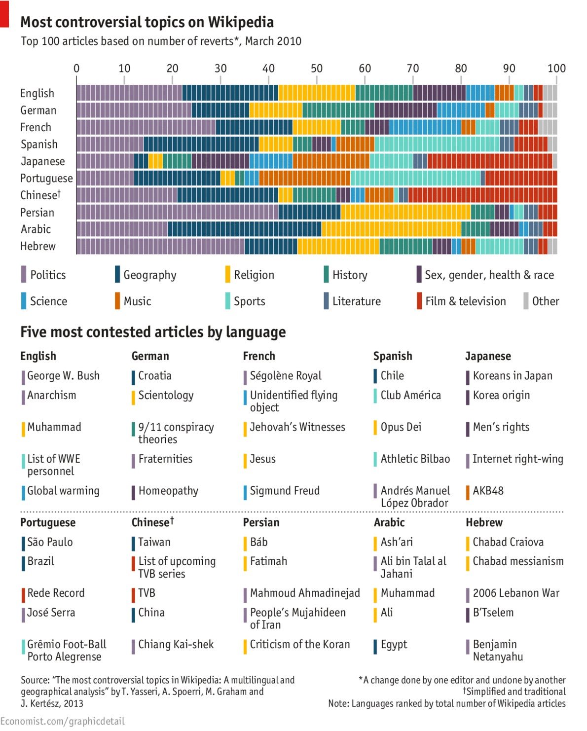
This chart by The Economist of the most controversial Wikipedia topics (paywall) in some of the world’s major languages is an interesting lens on what different cultures hold important. Not surprisingly, religion is a big issue in Islamic countries, and sport is contentious in Spanish and Portuguese-speaking ones. A bit more intriguingly, French-speakers are the most exercised about science, Arabic-speakers about geography, and the Chinese and Japanese about film and TV. English- and German-speakers seem to argue a lot about sex, health and racial issues, as well as about history. And Israelis and Iranians have one thing in common—they’re the most political. —Gideon Lichfield

One of the year’s biggest stories, Edward Snowden’s leaks about the US National Security Agency’s spying program, left the world wondering how exactly government spying works. This graphic by the Guardian focused on the nitty gritty: the fiber-optic cables that various governments use to mine top-secret intelligence around the world. In doing so, it boiled the complex and confusing scandal down to crystal-clear logistics.—Roya Wolverson
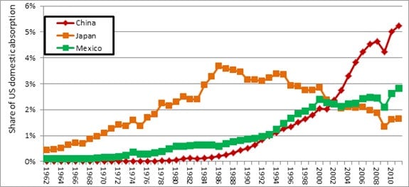
This chart from the Peterson Institute for International Economics shows just what a game-changer trade with China has been for the US economy, far more influential than trade with Mexico or Japan. In 2011, 5.2% of all goods purchased in the US economy were made in China, a higher level and reached far faster than trading partners like Mexico and Japan. In just one picture, you can see how China financed its catch-up growth through mercantilism and the US embraced free trade, punching a hole in its manufacturing workforce that still hasn’t been filled in.—Tim Fernholz
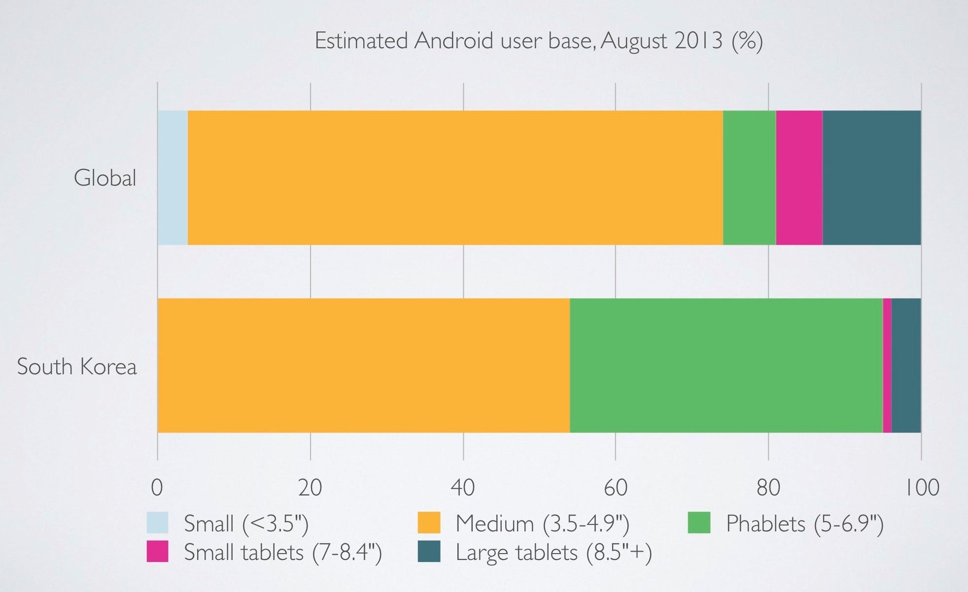
South Korea may be the first country where the market for smartphones and tablets has saturated, making it a good place to look for clues to how the rest of us will live in the future. While phablets, or oversized smartphones, haven’t quite caught on elsewhere, they are wildly popular among Koreans (41% market share compared to 7% globally). This chart—by Benedict Evans, using data from Flurry—is great because it reminds us that phones and tablets aren’t separate categories so much as a spectrum of screen sizes. They’re all glass-enclosed computers for consuming digital media. People will choose the devices that fit best into their lives, and if South Korea is indeed a bellwether, five to seven inches (13-18 cm) may prove to be the sweet spot. —Zach Seward
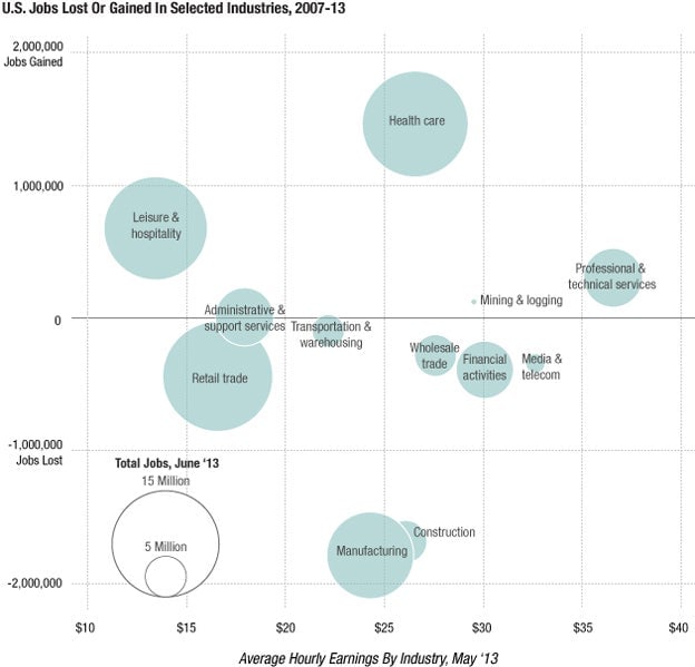
It’s almost impossible to talk about the US economy without discussing health care, manufacturing, and jobs, but rarely are the three piled together into a single chart. This one, assembled by our friends over at Planet Money, bundles the three together, and into a pretty telling graphic. Health care has seen the biggest job growth, and manufacturing and construction the biggest losses, since the financial crisis.—Roberto Ferdman
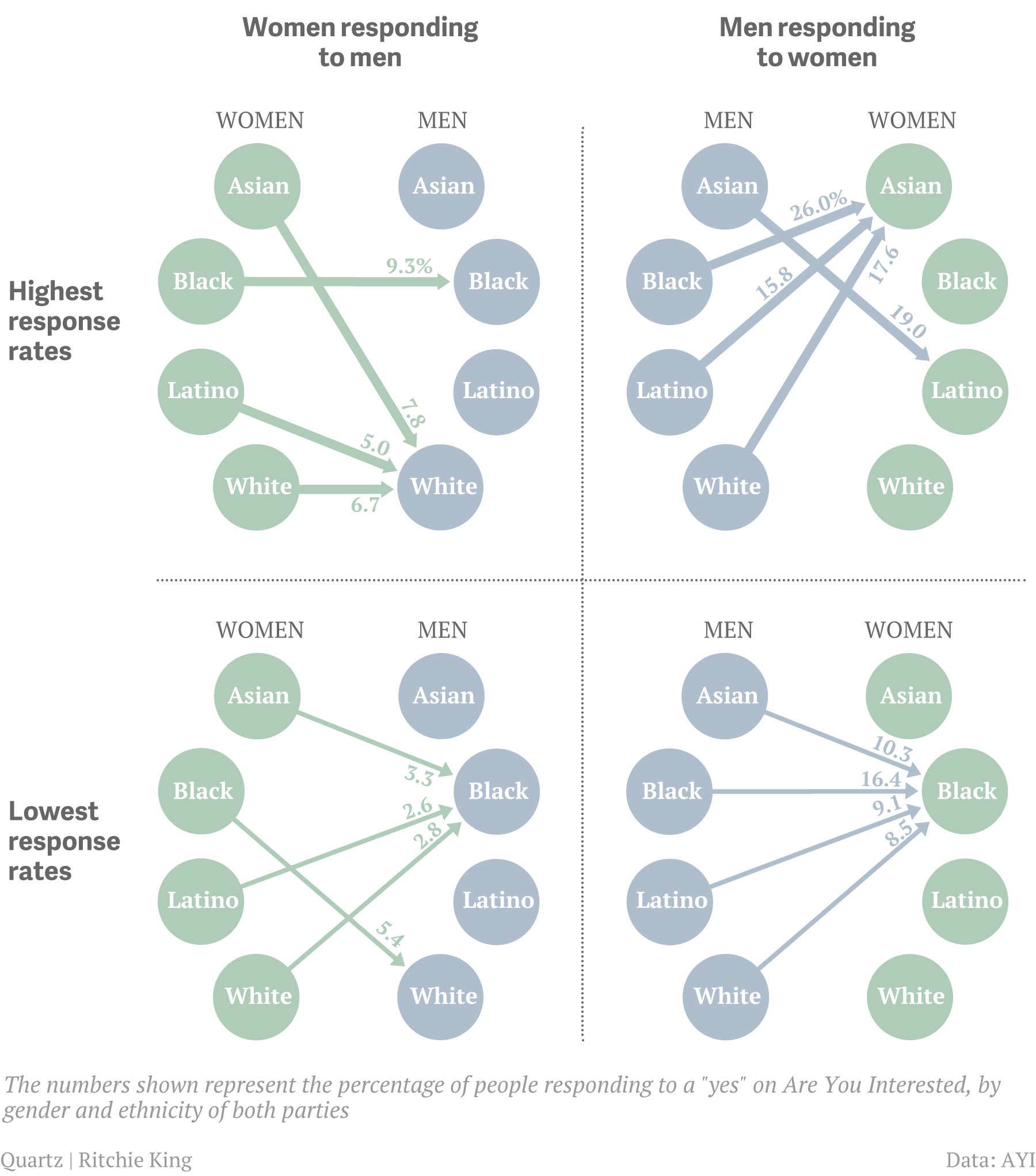
This graphic shows the racial preferences of heterosexual men and women using the Facebook $META dating app “Are You Interested,” based on how likely they are to respond to people who show an interest in them. Among the most notable findings is that men of all races are more likely to respond to women of a race other than their own. What, if anything, that signifies, is of course a much more complex question.—Herman Wong
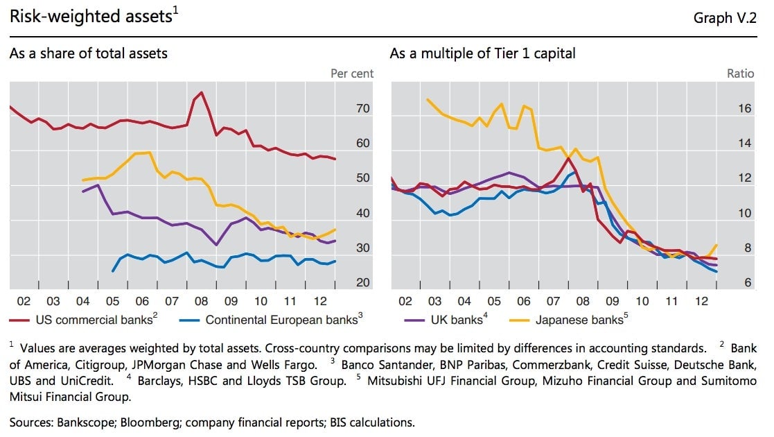
The world’s banking behemoths are as “too big to fail” today as they ever were. Global regulators now dub the largest “systemically important” and impose stricter rules on them, given the far-reaching havoc that they can cause when they run into trouble. But this exhibit, from the latest annual report of the Bank for International Settlements, shows how disjointed global regulation of banks remains.
In short, ostensibly similar large global banks take radically different approaches to applying risk weights to their assets, depending on where their headquarters are (left-hand chart). This, in turn, obscures the true size of the capital cushions that banks maintain to protect against losses (right-hand chart), making them all appear similar when in fact they vary greatly. Leverage is way down from the bad old days, but it is hard to say if the world’s largest lenders are significantly safer today, given the leeway they have to game the system and the reluctance of regulators to impose simpler, tougher standards on an industry that thrives on complexity. —Jason Karaian

This chart neatly encapsulates the bitter boardroom struggles that have characterized the social network’s short existence. It also shows how the coveted CEO position has changed hands over time, with Ev Williams initially wresting it away from Jack Dorsey, only to be ousted in a coup himself in favor of current boss Dick Costolo. Sensibly, Twitter $TWTR finally added a female director, former Pearson CEO Marjorie Scardino, to its board this month. —John McDuling
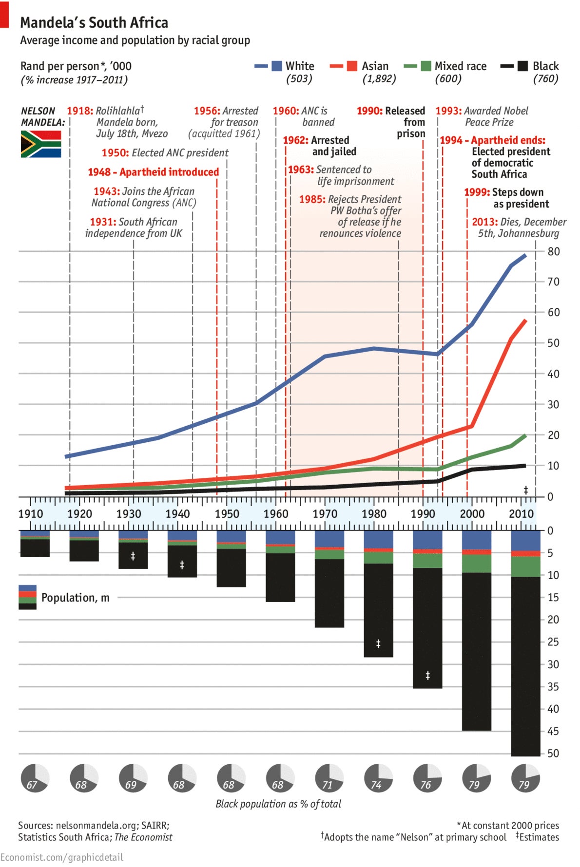
I like this chart on Mandela’s South Africa (paywall) by the Economist because it tells a complex story, which arguably could be well over 1,000 words in written form, in a single graphic. It couches the hopeful trajectory of Mandela’s life in the stark reality that blacks face massive economic dislocation in South Africa. While the end of apartheid, like slavery in the US, was a moral victory, income inequality along racial lines still abounds (as, indeed, it does in the US.) It’s also interesting to see the rise in the Asian population, and the surge in its income, as South Africa has become one of China’s biggest trading partners, following diplomatic relations between the two nations that were established during Mandela’s tenure as president.—Lauren Brown
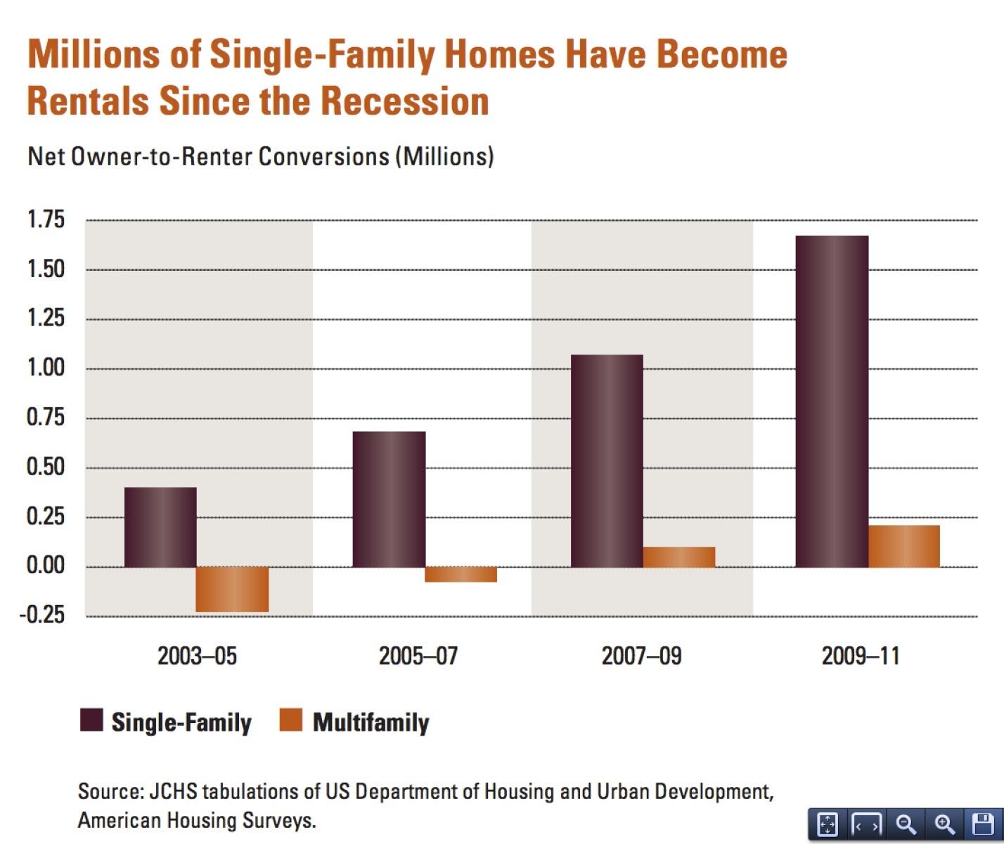
Homeowners in the US have been pushed out onto the rental market by foreclosures and rising rents. The number of renter households increased by 3.4 million from 2000-2007 and, as depicted in this chart (pdf), since the Great Recession, the number of single-family rentals has risen steadily. By 2011, about 35% of occupied US rentals were single-family homes, according to the American Housing Survey. Between 2009 and 2011 alone, 1.9 million owner-occupied homes became rentals. —Phil Stephenson

In January, New York Times reporter John Broder attempted to take the all-electric Tesla $TSLA Model S on a drive from Washington, DC to Boston. He didn’t make it. The chart above is from Elon Musk’s forceful rebuttal of Broder’s account of the failed drive. Musk claimed Broder maliciously circled a highway rest-stop’s parking area in an attempt to kill the battery and intentionally embarrass Tesla, using this chart to “prove” it. Broder admitted in his response to Musk that he circled the area for some time, but said it was because he couldn’t find the “unlighted and poorly marked” charging location. Regardless of who was right, the point is this: For all its lack of beauty and clarity, the chart represents a dramatic shift in the way companies—in this age of blogging, big data and branded content—can shape public opinion. —David Yanofsky
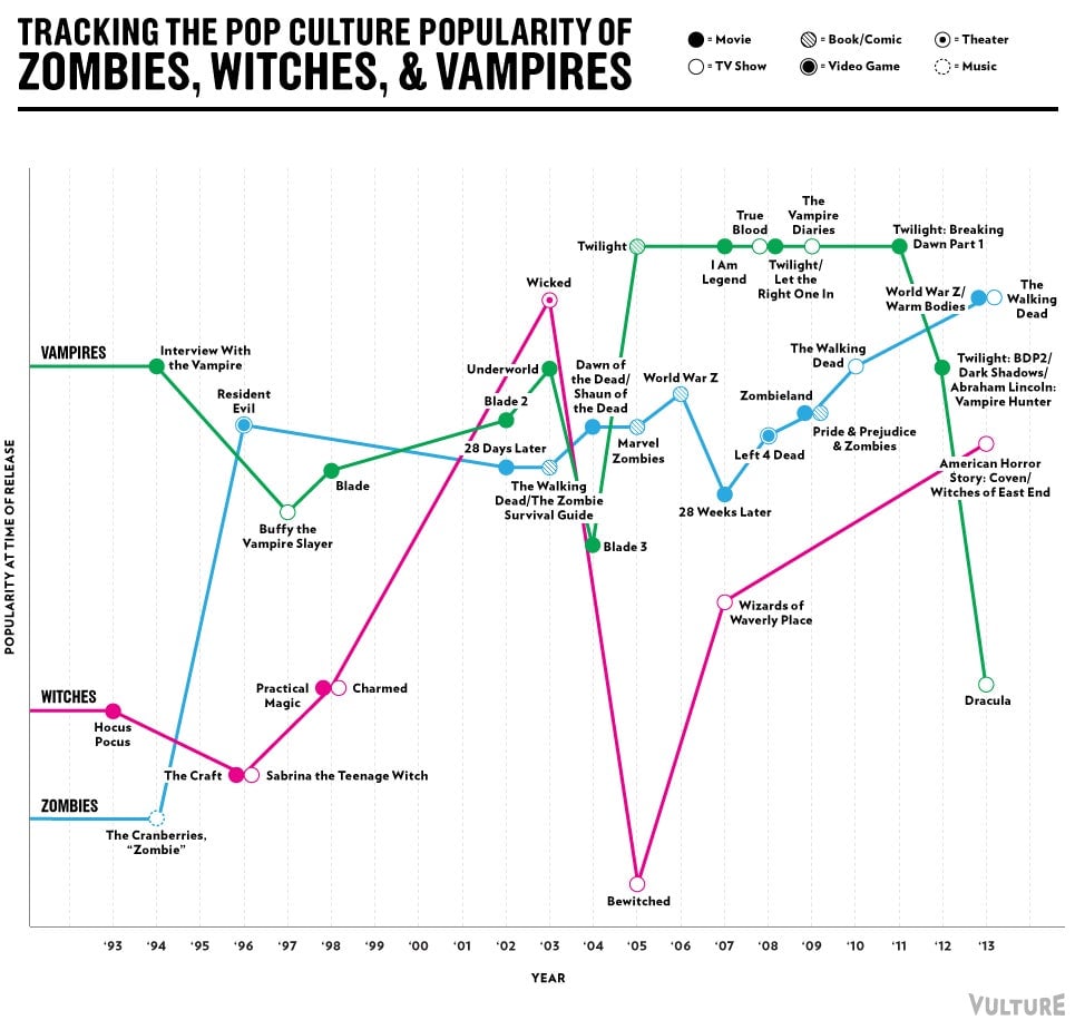
This is truly the year of the zombie. Two decades ago, the resuscitated corpses didn’t have much street cred—but in the last couple of years, zombies have become the horror figure of choice, pipping witches and the once-terrifying vampires to the top spot. This chart by New York magazine shows how the popularity of vampires plunged to an all-time low in 2013, weighed down by the final Twilight film and NBC’s television show Dracula. Scary stuff indeed. —Lauren Davidson
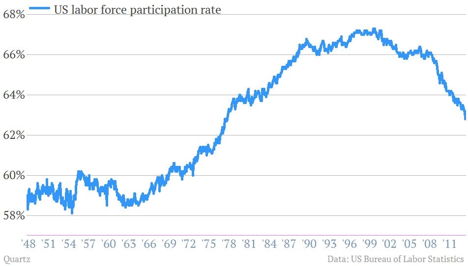
The American labor force is undergoing its largest shift since women began entering it en masse in the 1970s and 1980s. Their arrival pushed labor-force participation up to peaks seen previously only during the general mobilization of World War II. Now it is falling fast. Some point to years of deep recession and slow recovery, suggesting that long spells of unemployment and disconnection from the workplace may have left large swaths of the population unemployable. But in reality the bulk of the decline in participation appears to be demographic. Since older people tend to work less, participation tends to fall as a society ages. A recent study by the Federal Reserve Bank of Philadelphia found that rising retirement began to push the participation rate down significantly starting in 2010 (pdf). And between 2012 and the middle of 2013, the decline in participation has been “entirely due to retirement.” —Matt Phillips
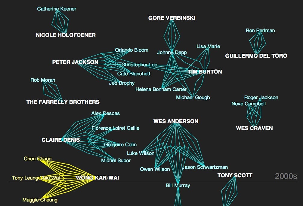
To anybody who watches a lot of movies, it’s obvious some directors have a stable of actors they depend on to bring their vision to life, film after film. This is especially true of directors with distinctive visual styles—the Wes Andersons and Tim Burtons of the world. To reveal these filmmaking cliques, the New York Times built a stellar interactive graphic, visualizing each one as a glowing constellation on a black timeline of a sky.
There are a lot of things to love about that graphic—the premise is only the first. The choice of constellations as a visual metaphor couldn’t be more perfect (we are talking about groups of stars, after all). And for web geeks, there’s also a subtle bit of really smart (and admirably restrained) design snuck into the whole thing. The sidebar with all of the annotations scrolls faster than the main part of the graphic, allowing the designers and reporters to add more text (and thus more context) without overcrowding the page or forcing users to click. It’s a completely functional use of “parallax scrolling,” something that was all too rare in 2013. —Ritchie King
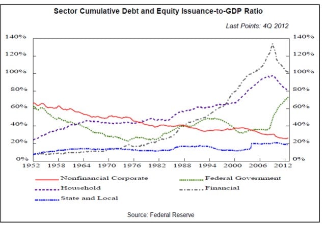
More pain to go. I think of this chart every time we get to the point where we wonder how far the US is into its recovery from recession. The economist A. Gary Schilling simply plotted the rise of debt from varied sources in the US. What’s clear from the chart is that there still has to be significant deleveraging—whether by force (i.e., foreclosures) or choice (frugality, bankruptcy) before we enter whatever the New Normal really is going to be. —S. Mitra Kalita
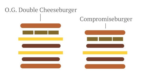
This “chart” from Quartz’s Ritchie King and Tim Fernholz, explaining the consequences of climate change for the McDonald’s “dollar menu”, is my favorite one of the year for two reasons. It is funny. And it gets the point across simply and visually, which is what informative illustration (or illustrative information) is meant to do. I wish I knew what O.G. meant, though. —Leo Mirani