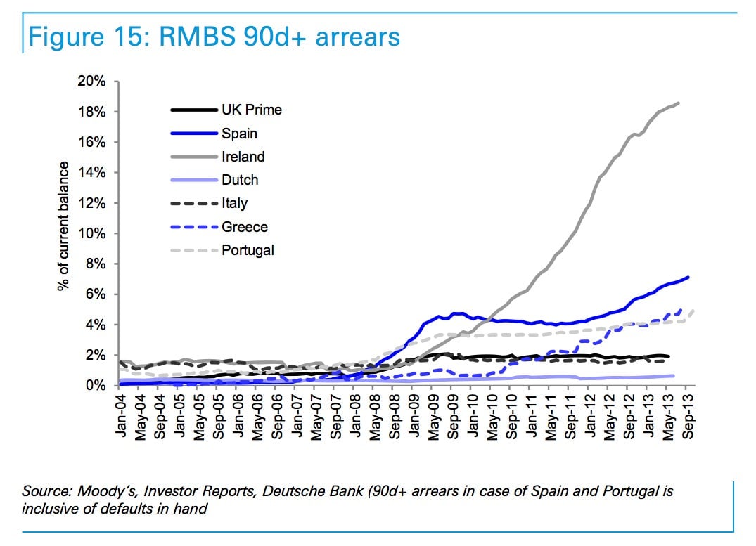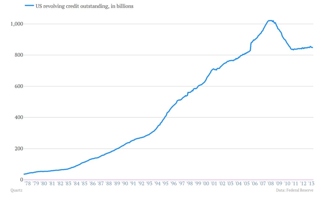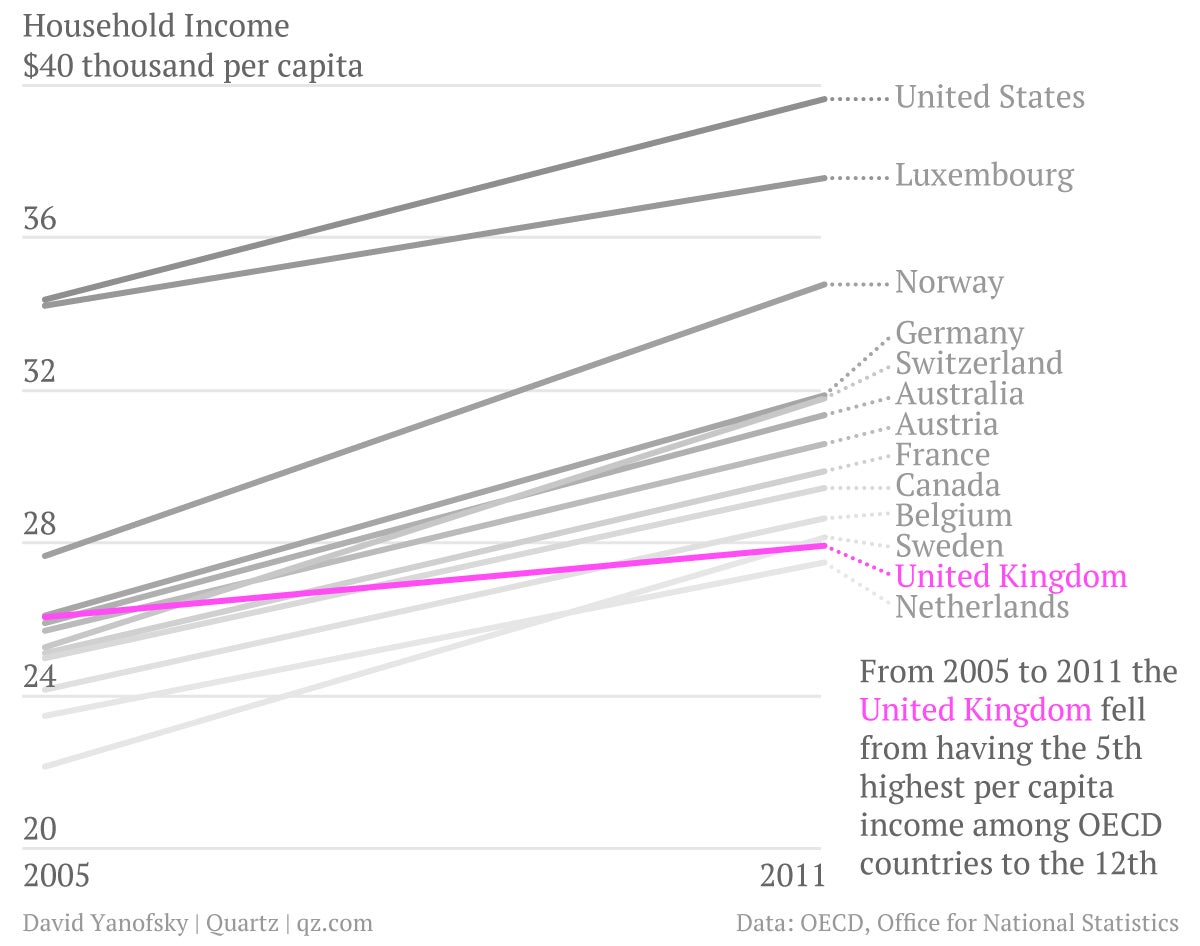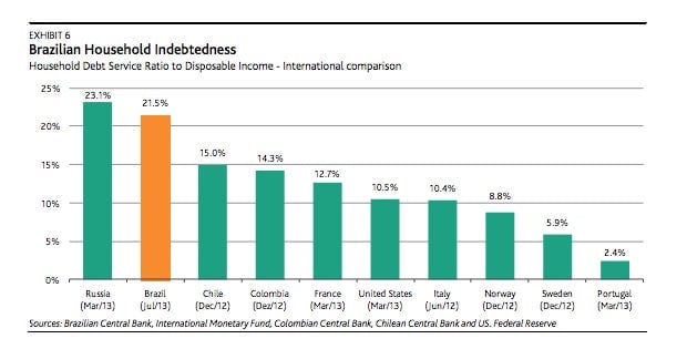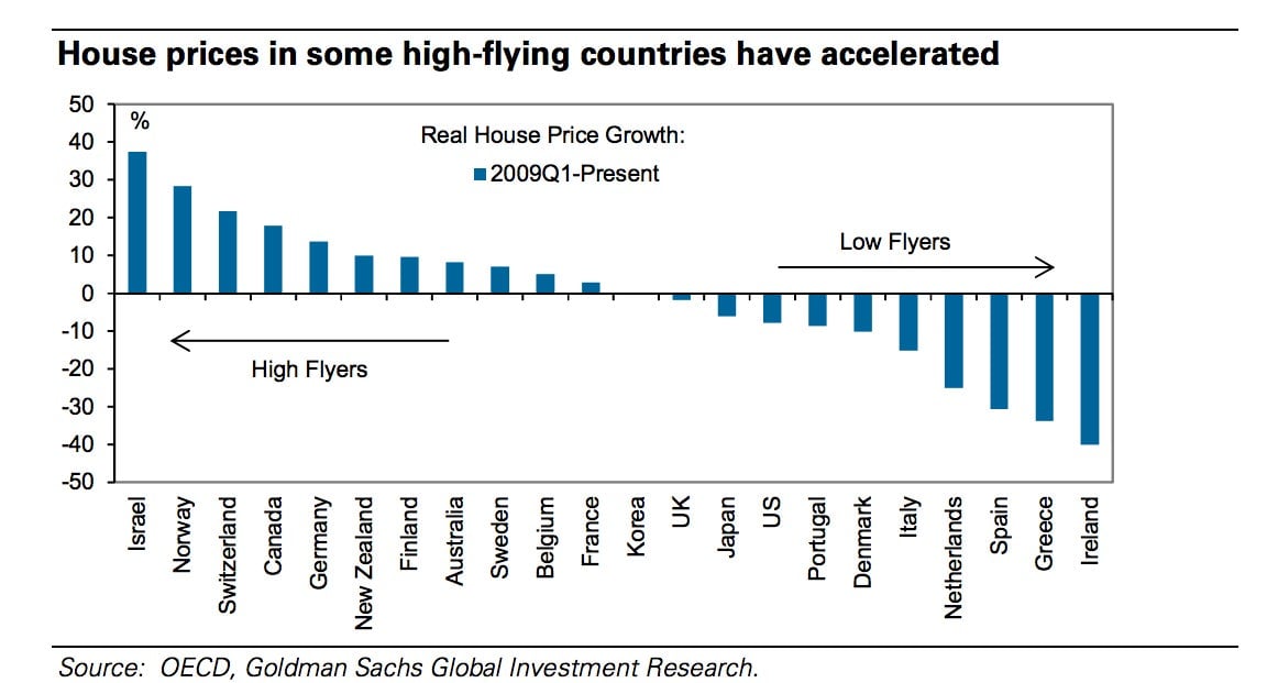
A chart is a powerful thing.
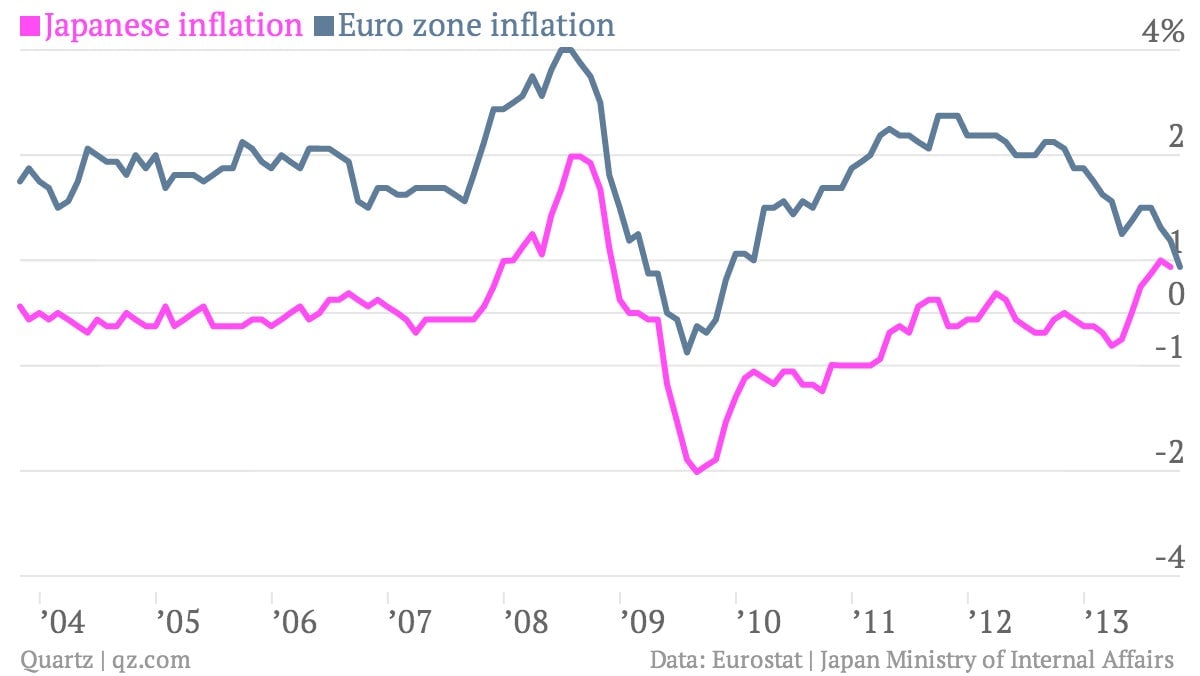
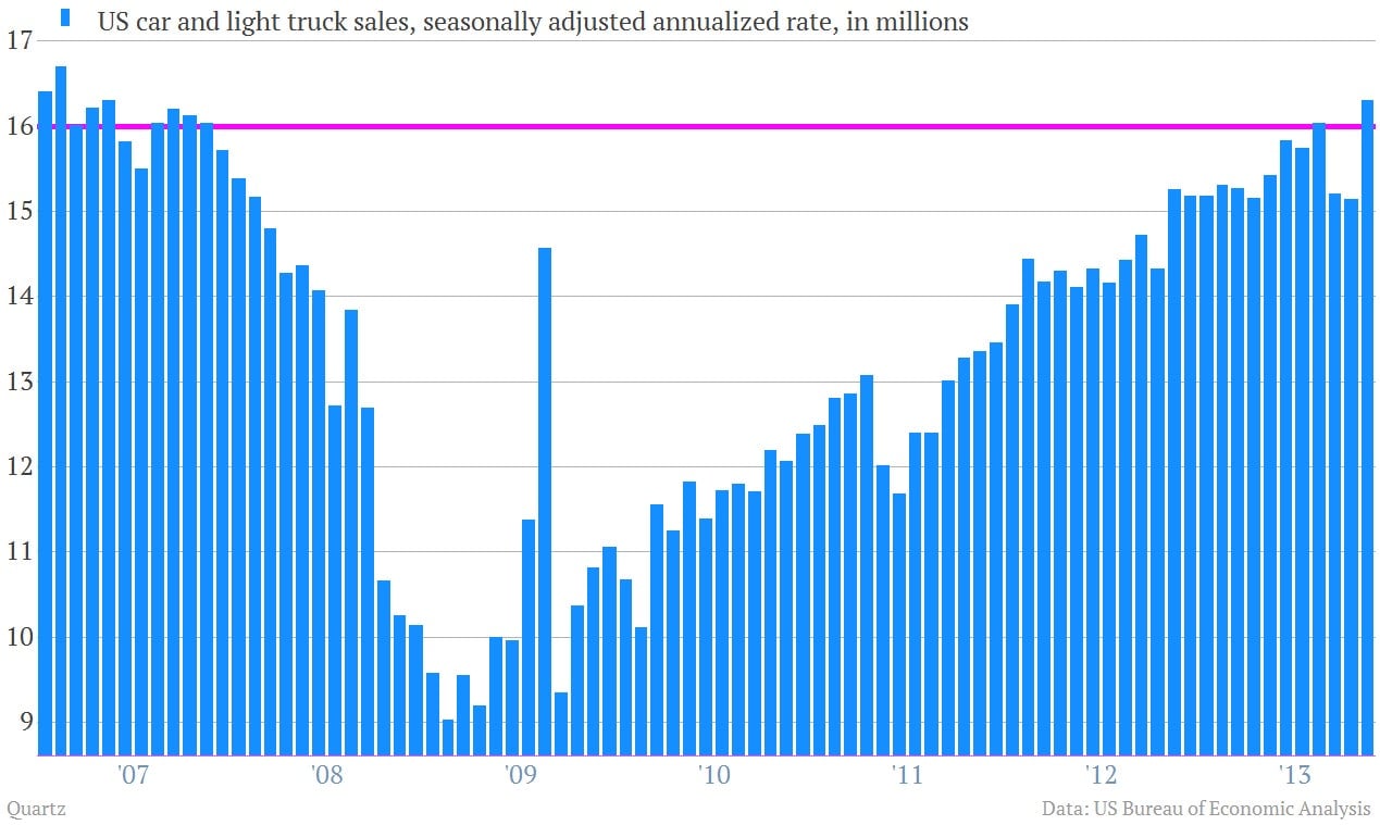
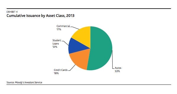
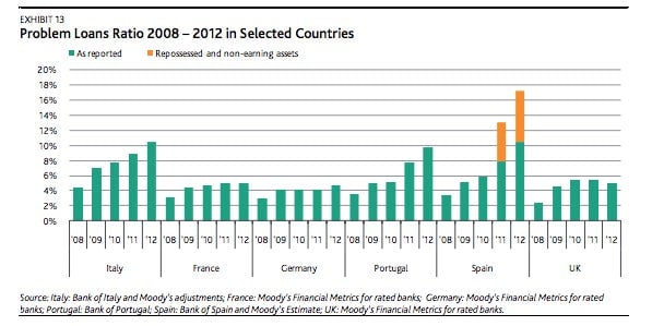
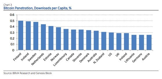
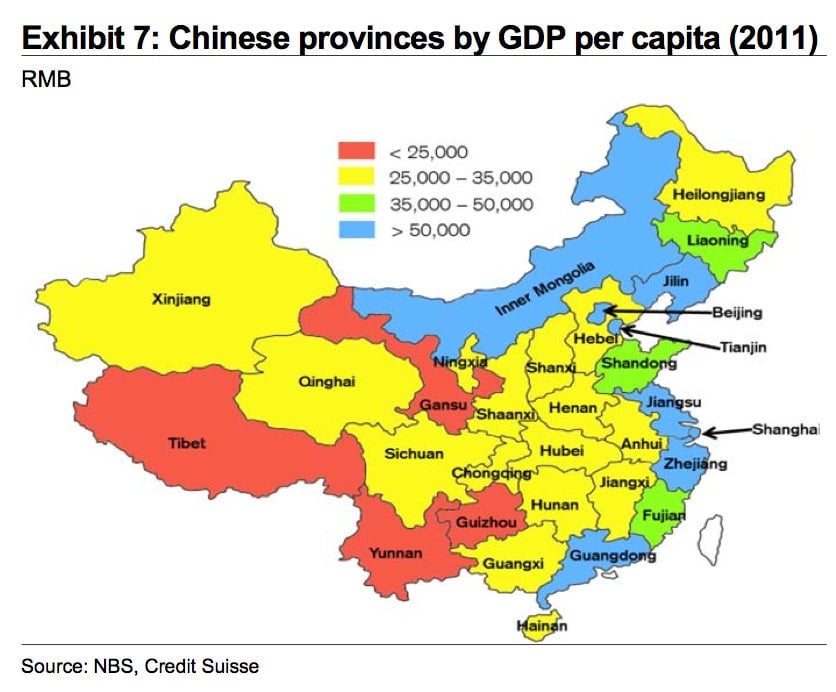
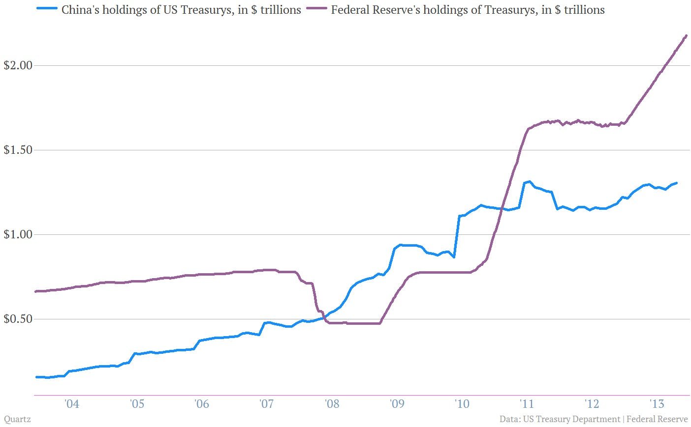
As perhaps the fastest way to make an argument backed by data, charts boast incredible capacity to explain and persuade. And while that also means they can be incredibly misleading, charts have clarified my thinking on a number of big issues this year.
Here, in no certain order, are some of the most important ones I’ve created, seen, tweeted, and retweeted. (I tweet a lot of charts. Follow me!)






Join 500,000+ readers who start their day with Quartz.
By subscribing, you agree to our Terms of Service and Privacy Policy.