It seems intuitive enough: Red means stop, amber means caution, green means go.
As Covid-19 levels fluctuate around the world, health officials are devising ways to quickly alert their constituents about the virus’s threat level. Predictably, most have turned to color and many have adopted the hues of traffic lights. After all, the three-color schema developed in Detroit in the 1920s based on a British system for railroad traffic, has been universally used for over a century.
This is where the problem arises. The thing is, our understanding of color is richer and more nuanced beyond its application in traffic management.
Covid-19 warning colors around the world
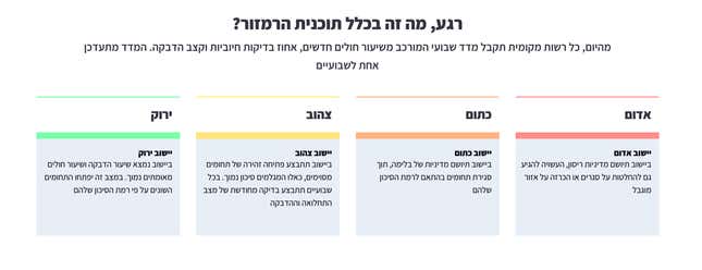
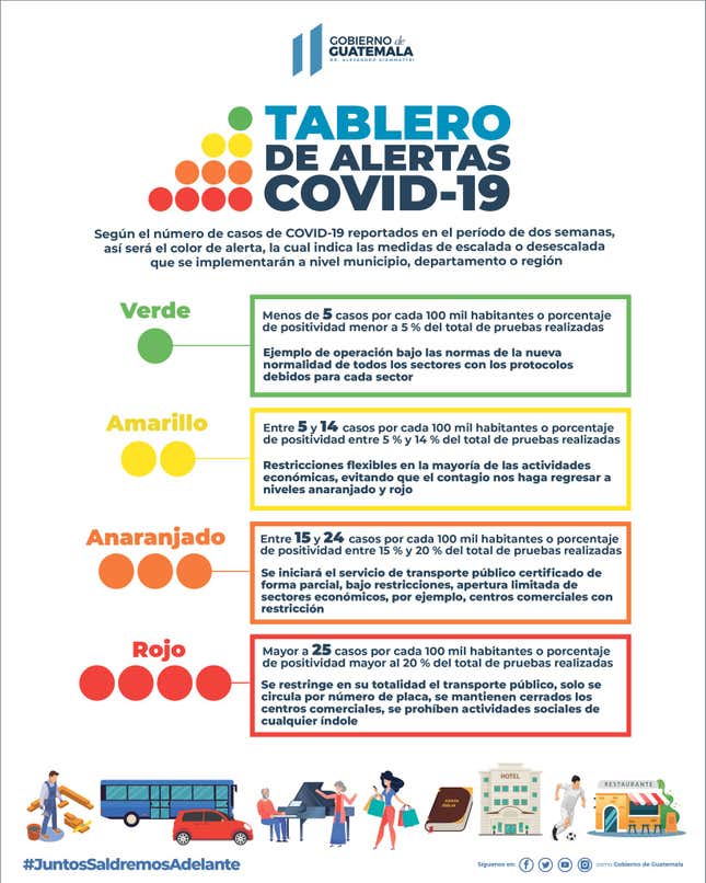
Our survey of 35 warning-status color palettes used around the world shows the range of how jurisdictions are using colors to denote danger.
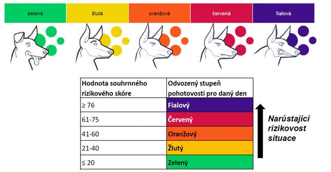
Most countries in our survey used a reddish shade to signal the highest alert, though not always. In the Czech Republic, purple is reserved for regions with the highest infection rates. In Peru, the color for the most critical zones is black. Ontario uses gray for most the dangerous conditions—when citizens must remain in lockdown.

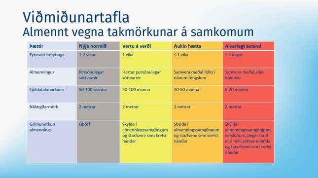
On the other end of the spectrum, many jurisdictions use green to indicate safety. Italy and the Philippines opted for white. Iceland purposely avoided using green because it “encouraged the public to let down their guard more than is desirable,” as the Iceland Review explained. Instead they chose a gray hue to signal to that everyone must continue to “practice disease prevention, pay attention to hygiene, and take care in social contact with strangers, despite low case numbers.”
The majority of regions in our survey used a four-color system. Most used shades of amber and orange, which can be challenging for people with color vision deficiencies to discern between. There are some anomalies. The Philippines uses blue for both levels 2 and 3 in its alert system. The US state of New Mexico chose turquoise—after its official gemstone—to indicate the safest zones. Responding to a query from the New York Times, Tripp Stelnicki, the state governor’s director of communications, explained that the blue-green hue was selected because it had “deep cultural resonance” to the region and “often associated with a certain authentic New Mexico-ness.”
The problem with traffic light-based color schemes
“Color is such a blunt tool,” observes Tim Fendley. founder and creative director of the London-based design practice Applied. Fendley has a particularly nuanced understanding of the context-specific dimension of color codes having developed maps and wayfinding systems around the world, from Copenhagen to Qatar. Last year, his team also developed an approach to creating effective public signage systems considering the unique conditions of the coronavirus.
Even a traffic-light scheme, as ubiquitous as it is, can sow misunderstanding, explains Fendley. He cites the UK’s disastrous experiment in using a traffic light system for food packaging to indicate a product’s nutrition content. Using the red-amber-green labels created shortcuts for time-crunched consumers but it eliminated the nuance required to discern if and how much of the product is suited for their particular diet. “These color codes are all shortcuts. The brain, which is an amazing shortcut device, loves them. But if you start messing up what they [colors] mean, the brain shuts down and we just tend to ignore them,” Fendley says.

The UK has been criticized for confusing its residents with differing warning schemes over the last few months. It switched from a five-level color-coded system in May, to a three-tier alert scheme in October. Labeled “medium, high, and very high,” it was Boris Johnson administration’s best attempt at “simplifying and standardizing” alerts across the country. But experts like Carina Fearnley, director of the University College London’s Warning Research Centre, are unconvinced. In an editorial published in The Conversation, she writes:
The new local alert system can’t last long: it is not designed to incorporate all levels of risk severity and it doesn’t include a fourth tier of “low risk”. This demonstrates that the system is purely responsive, designed for the moment, not for representing all possible scenarios in a clear and standardized manner that would enable people to be prepared.
A distinct lack of expertise from emergency management or civil protection experts is showing loud and clear.
The cultural dimension of color

Individual colors too, carry a spectrum of meaning depending on the context. Red for instance, connotes the political left in Europe, and represents the right in US politics. It’s the color of good fortune in parts of Asia. Red can be the bearer of good news and is used to indicate a rise in stock prices in China, Japan, Taiwan, and South Korea, but it’s also the color of death and mourning in some African cultures. It can mean love, passion, violence, fury, urgency, or danger.

Designers of color-coded warning systems should also pay close attention to local brands with strong color associations, says Fendley. Consider the National Health Service in the UK. “What’s the color of healthcare in Britain? There’s a very strong corporate identity for the NHS, which is blue and white and ambulances are predominantly yellow and green,” Fendley points out. “You need to keep your eyes open because it could have an impact on your system.”
The parody Twitter account Threat Update aptly skewers the peculiar ways we can read into certain shades.
The need for better communication when using color
Because color is laden with layers of meaning, the key to a successful color-based system lies in explicitly interpreting what hues mean for the audience. “It’s all communicating enough so people can get the code and understand the shortcut,” says Fendley. “Too many times I see people wanting to introduce a new code or a new way of doing things and I’m like, ‘do they have the millions to adequately communicate this to the public?’”
His tip echoes insights from a study presented at the Human Factors and Ergonomics Society that examined how warning colors and symbols were perceived by English and Spanish speakers. Red, yellow, orange, and black were found to most effective at communicating danger. One of the study’s authors, though, says that’s not enough. Captioning hues will make the message even clearer. “One way to disambiguate is to give additional graphic or text along with the color,” explains Michael S. Wogalter, emeritus professor of psychology at the North Carolina State University.
Wogalter adds that confusion often occurs in the middle of a color scale. “People do not distinguish much between orange and yellow or between the words “warning” or “caution”. But danger and red are fairly consistently interpreted as a higher amount of hazard than the others.”
“Maybe the alert system should have been just five shades of red light” muses Fendley. “And when it’s all over, it’s green space. I’m just making that up on the spot, but people will read into what these codes mean if you don’t really explain them.” New Zealand, a country lauded for effectively containing the pandemic, used a system like this. They used gradients of orange and most importantly, clearly and consistently outlined what each level meant.
