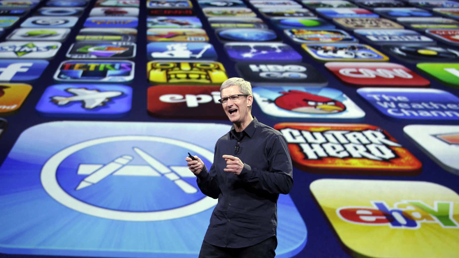
One question about Apple’s new, bigger iPhones—expected to be unveiled tomorrow—is how the 1+ million existing iPhone apps will look and work on them. Especially on the supposed 5.5-inch iPhone, which could have a display that’s nearly twice the surface area of today’s iPhone 5 series. (For more details than you ever thought you’d read about iPhone screen sizes, see John Gruber’s lengthy analysis at Daring Fireball.)
The takeaway: App developers may soon have some extra work to do. This could range from making sure everything looks right at the new sizes to potentially designing features that take advantage of the screen real estate for greater productivity.
Google Android app makers have always had to deal with many display shapes and sizes, but this hasn’t been much of an issue for iPhone developers. Over seven years, Apple has only ever sold three variations of the iPhone screen, and has taken pride in its simple product lineup.
Still, Apple has made enough changes over the years that this shouldn’t be too alarming to any iOS developer. Most should already feel prepared.
- In early 2010, Apple launched the iPad. It had a drastically larger screen than the iPhone—roughly 10 inches vs. 3.5 inches. This first got developers thinking about what a larger version of their app could look like and how it might work differently. Many have avoided it—Instagram, for example, still doesn’t have an iPad version of its app. Still, this experience may be helpful for those designing new things for the 5.5-inch iPhone.
- In mid-2010, Apple launched the iPhone 4. This had Apple’s first super-sharp ”retina” display, which included four times as many pixels in the same size screen. For app makers, this mostly meant creating larger, more detailed graphics. This may happen again now if Apple’s 5.5-inch iPhone has an even denser display.
- In 2012, Apple launched the iPhone 5. The iPhone 5 screen was taller—but not wider—than previous iPhones. This meant that app makers had to think about expanding their app in one direction—height, but not width. Most apps simply stretched out. But it got developers thinking about how to handle having users with different-sized iPhones. Now there will be even more of those.
- Also in 2012, Apple introduced a tool for app developers called Auto Layout. This followed up a previous system called “springs and struts.” Apps that use Auto Layout should adapt better to different screen sizes and orientations. This is about to come in handy.
- This year, Apple made its iPhone-screen-simulator tool for developers resizeable. This makes it easy to get an idea of what an app will look like on a bigger display—or a smaller one, like an iWatch. Of course, it’s not the same as seeing it on a real screen. But it’s a start.
One thing we’ll be looking out for now is whether iPhone and iPad apps will start to converge. If reports are correct, Apple will supposedly soon have iOS devices in the wild with 3.5-, 4-, 4.7-, 5.5-, 7.9-, and 9.7-inch screens. That’s a wide range of devices all running the same software—and using the same App Store—with very narrow differences in screen size. So much so that the concepts of an ”iPhone” and “iPad” seem to be blending together.
