At Quartz, we—and our readers—love charts.

At Quartz, we—and our readers—love charts.
We’re always on the hunt for a terrific fever line or bar graph that delivers deep insight at a single glance. We delve into data to churn out plenty of our own charts; heck, we’ve even built a cool tool that allows you to make them too.
Join 500,000+ readers who start their day with Quartz.
By subscribing, you agree to our Terms of Service and Privacy Policy.
Now we’re taking our obsession with charts to its logical conclusion: we’re launching a quest to find the best chart of the year. If you’re as chart-crazy as we are, we’re inviting you to help us select… [pause for imaginary drumroll]… the Quartz Chart of the Year™.
Send us the charts that made you go, “Whoa.” Tweet them (@matthewphillips) or email them ([email protected]) to us with the subject line “Chart of the year.”
We’re open to any type of chart: Ugly ones. Famous ones. Newsy ones. Idiosyncratic ones. They can be about anything, not just business and economics—so long as they have been published in calendar 2014.
Over the next few weeks we’ll parse your submissions and our own favorites, and roll out some posts spotlighting the potential contenders for crown.
We’ll announce the winner on Dec. 15.
Naturally, we’re recusing our own charts from the competition. But if you’ll forgive a little chest-thumping, we’re going to use some memorable Quartz charts to illustrate the attributes that we think make great charts—you might want to keep these in mind when nominating your favorites for … [egregious imaginary drumroll]…the Quartz Chart of the Year™.
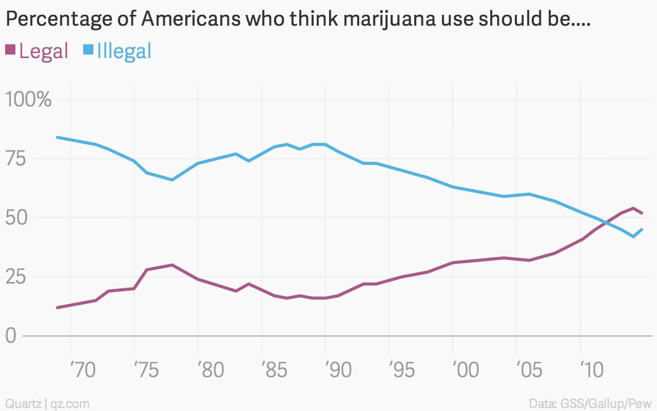
1. Great charts are simple…
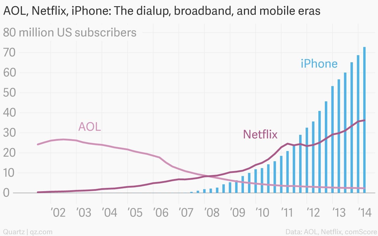
…In other words, they’ve got news.
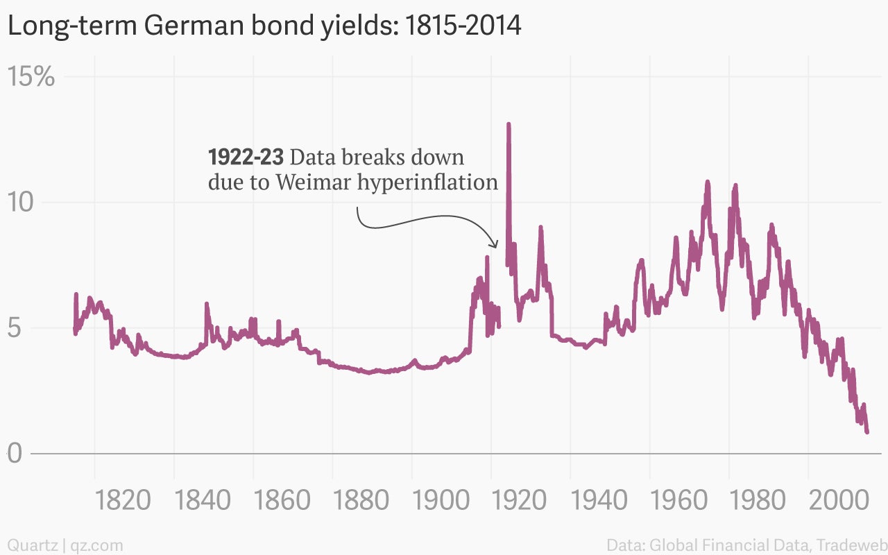
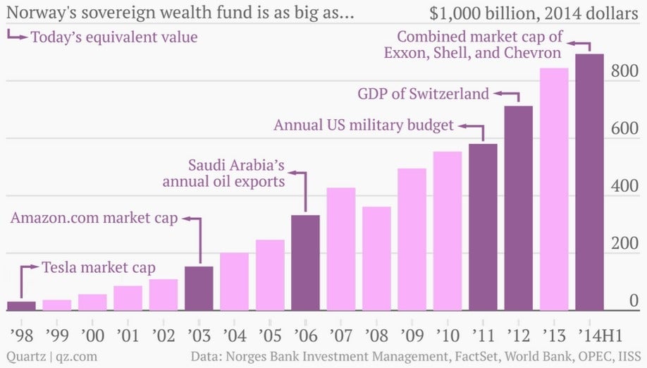
…like the size of Norway’s sovereign wealth fund.
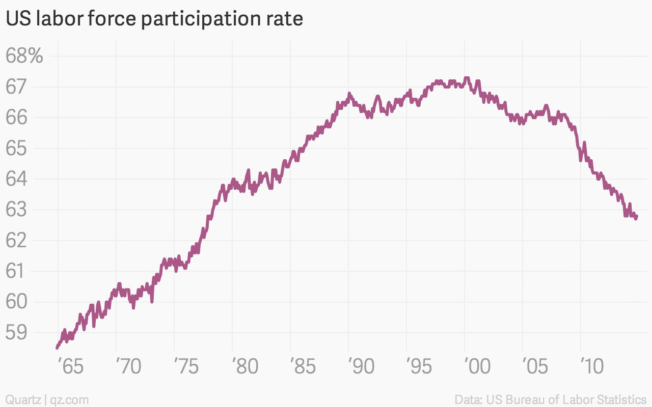
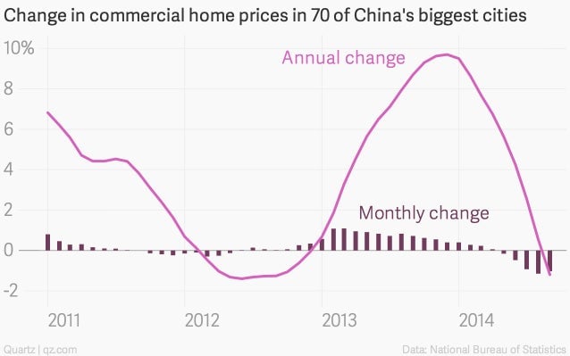
…like the unraveling of the world’s most-important housing market.