Woe to Britain’s fine tradition of typographers, calligraphers and graphic designers.
The UK’s new prime minister Theresa May revealed several names of outgoing ministers yesterday, July 14, with a rather regrettable piece of official government stationery. Inserted under the dignified royal coat of arms is a blue bar with an off-centered white text box bearing the words “press release.” An image tweeted by Buzzfeed editor Jim Waterson appears to be a slapdash digital version of the letterhead from 10 Downing Street.
There are many typographic crimes in the short bulletin: The useless solid bar across the page, the redundant white box, the gratuitous use of blue, the fuzzy jpeg image of the UK seal, and of course, the bolding on the Times New Roman heading.
Any designer worth their pica ruler knows that faux bolding on large, serif typefaces is bad form. As type designer and practical typography evangelist Matthew Butterick explains, one must aim “to use bold and italic as little as possible. They are tools for emphasis. But if everything is emphasized, then nothing is emphasized.”
A later version of the bulletin template shows the white box floating in another spot and a headline that’s in all caps, bolded, and underlined—the trifecta of needless overemphasis and telltale touches of an overzealous layout artist.
Beyond a little font snobbery, why does this all matter? It matters because the way we present information shapes the way people receive it—especially as a first impression. As every job hunter fussing over the layout of their résumé knows, a well-formatted dossier connotes competence, thoughtfulness, and confidence.
And what seems like a minor graphic gaffe is perhaps more troubling in the context of a design-literate nation with a storied history in graphic design and typography. Many seminal type designers are British—John Baskerville, Eric Gill, William Caslon, and Matthew Carter, to name a few.
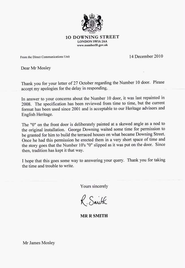
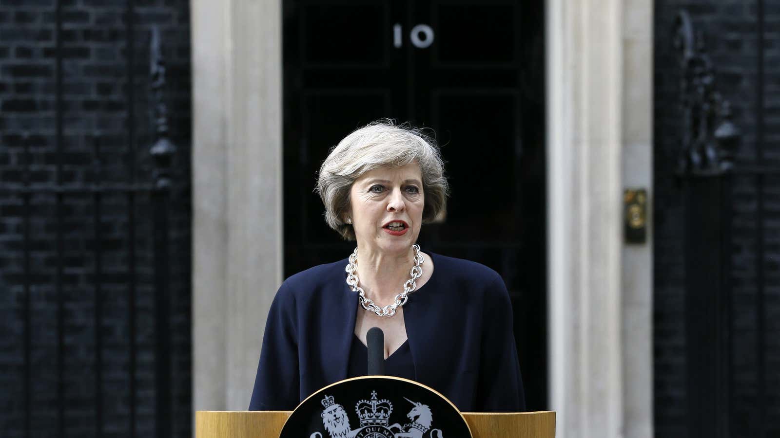
As testament to the British acuity for type in their surroundings, eagle-eyed font observers have even fussed that the zero on the numerals of the actual door of 10 Downing Street appears to be a capital letter O. In response to librarian and University of Reading professor James Moseley‘s inquiry about the sketchy “O”, he was sent an explanation on official letterhead.

Beyond stationery and ill-formed letters, the UK government has also invested in and championed design-driven projects to improve public sector services in profound and meaningful ways—from designing safer streets, to bringing joy to subway wayfinding signs, to promoting the value of design in business, on a scale that few other nations in the world have achieved.
Quartz called 10 Downing to inquire if the regrettable blue-bar design will be the official template for public announcements moving forward, but did not hear back. We also reached out the UK cabinet office to see if they will follow the new format from Theresa May’s office and a spokesperson replied: “The answer to your question for the Cabinet Office is no.”
