The companies that sell airline tickets, hotel rooms, and car rentals face an uphill battle to get customers to actually complete the purchase. You’re always a step away from opening just one more tab.
Hotel rates aren’t increasing much and airfares have dropped, so the competition is on for traveler dollars. Your favorite aggregators and travel sites are trying out lots of small tweaks to make you take out your credit card and actually buy something.

Earlier this year, travel search site Kayak swapped out the word “Select” when listing flight options to “View Deal” and said a 1% bump in revenue followed. For its Europe site, Kayak highlighted a recent price decline using a bright green font, which also led to a 1% increase in sales.
It gets higher commissions from hotel bookings than from airlines, so it also sets hotels as the default search on its site, even though some customers may have other preferences for their lodging.
Kayak told Quartz it conducts some 30 experiments a month, testing out new designs and language. Many users may not even notice anything has changed on the site. (Google this summer also added a “deal” label that pops up when a hotel’s price is below historical rates for certain dates.)
Where you book may not seem like a big deal, but it is to a hotel company, which doesn’t want to pay out a commission to third-party online travel agents like Kayak. So they’re trying to make life easier.
Some hotel companies are getting the message that potential guests hate to fill out forms. Marriott in April stripped down the number of fields from nine to five for customers to sign up for its rewards program, removing requests for their street addresses. A spokesman said that led to an increase in rooms booked on the company’s site afterward, but declined to say by how much.
Other companies are going big. Virgin America is testing out a new app that will launch in the next few weeks that acts as a sort of virtual concierge for the customer, accompanying him or her from booking to check-in to possible gate changes and available upgrades. A Spotify playlist featuring artists from the passenger’s arrival city is also integrated into the app.
In 2014, the company relaunched its website. The flight-booking function dominates the page, unlike the busy websites of many airlines whose home pages also feature vacation packages, frequent-flyer programs, and credit-card offers. ”One of the core goals was to reduce cognitive load,” said Mohan Ramaswamy, a partner at Work & Co., which designed the Virgin America website and the new app. The idea was “fewer decisions, fewer distractions.”
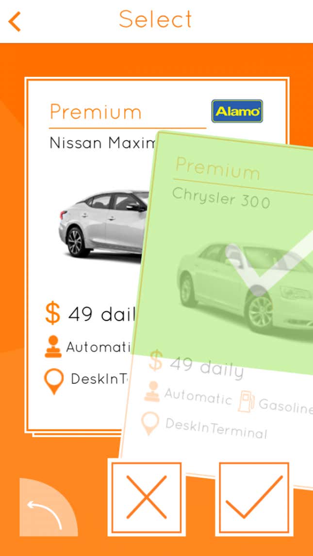
Car-rental app Carla, which launched in January, has taken a cue from dating app Tinder. Carla users can swipe right or left available cars, an effort to get customers to book by telling them exactly the model they will get.
All these tiny tweaks, these companies hope, will add up. Subtlety works, says Rohit Deshpande, a professor of marketing at Harvard Business School. ”Hitting people over the head with something, you get potential backlash,” he says. “You want to nudge people into changing their behavior.”
