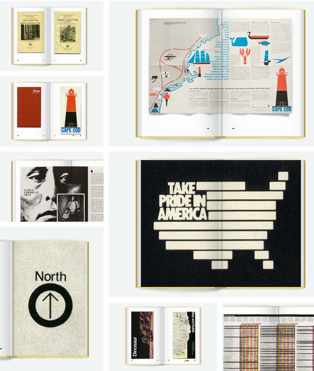
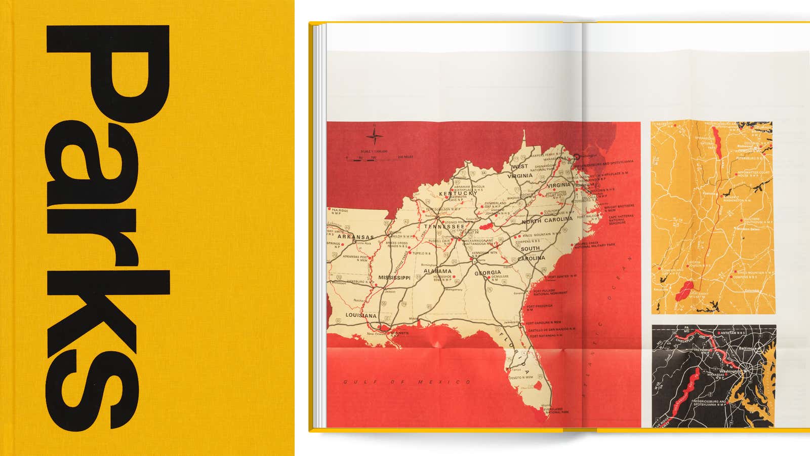
For many travelers who venture into the United States’ national parks, the free orientation brochure distributed at the entrance gate serves as a one-of-a-kind memento of the splendor of America’s federally protected nature reserves. Produced by the National Park Service since its founding years, the pamphlets—containing maps, trail routes, and safety information—have become highly collectible and are now the subject of a new coffee-table book titled Parks (Standards Manual, October 2019).
Starting with the seminal National Parks Portfolio first printed in 1916, Parks features a gallery of more than 300 printed materials amassed by Brian Kelley, a 31-year old, Brooklyn-based photographer. As the founder of a photography project called the Gathering Growth Archive, Kelley has been spending a lot of time exploring deep forests in search of the country’s largest tree species.

A delightful 1960s brochure about the Grand Canyon inspired Kelley’s obsession with park-related memorabilia. “I think nostalgia is a very big part [of why I collect them],” he says. “I’m obsessed with educating myself [about] more of the past. Being able to use these maps and brochures to see the birth and evolution of the National Park Service is amazing.”
Seen in chronological order, Kelley’s collection offers readers a loose, visual timeline of the evolution of the American park system. Beginning with Yellowstone in 1872, the US government has claimed 84 million acres for public recreation. Of the 419 federally protected parklands, monuments, and cultural venues across 29 states and two US territories, 61 have been designated as “national parks.”

Graphic design as gateway to history
It’s regretful that the beautifully reproduced images in Parks—mostly flat scans of brochure covers and a few layout spreads—aren’t accompanied with captions, credits, or any substantial historical clues. Flipping through the abundance of graphic material will make any attentive reader wonder about the context. These brochures, all of which can be accessed in full on the National Park Service website—in fact, reflect the heroic and often murky creation story of the US national park system.
The book’s first entry, the National Parks Portfolio, offers a telling case study about the creative fund management that has been central to the narrative of the national parks. With a mug of the majestic bighorn sheep on the cover, the first edition of the portfolio, printed in 1916, was presented as a collection of 24-page pamphlets to introduce the country’s first nine nature reserves: Yellowstone, Yosemite, Sequoia, Mount Rainier, Crater Lake, Mesa Verde, Glacier, Rocky Mountains, and the Grand Canyon.
Though the the US Department of the Interior is listed on the cover, the publication was actually funded largely by railroad companies that worked with the National Park Service’s first director, Stephen Mather.
QT Luong, a computer scientist turned landscape photographer, who has also written several books on the topic of America’s parks, offers details about the Portfolio’s provenance on his blog:
The financing model deployed by Mather was the same as some of today’s self-published photography books: fund part of it out of his own pocket and look for corporate sponsorship for the rest. Except that at more than one million of today’s dollars ($48,000 in 1916), amounting to $3.80 per copy with a first printing of 275,000, that was an ambitious project by any measure, dwarfing any self-publication project that I know. The “sponsors” turned out to be the Western railroads—there was no Eastern national park yet. Over time, Mather would partner with them to bring more attention to the parks, and more customers to them, a win-win situation.
The back of each 6 x 9 inch brochure, Luong notes, even lists the addresses of 17 railroad companies that paid for the printing.
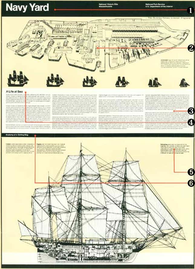
The Unigrid System, a design template developed in the late 1970s with celebrated graphic designer Massimo Vignelli, tells the story of how the National Park Service found a way to significantly cut design and printing costs by implementing standards that allowed paper and ink to be purchased in bulk while allowing for flexibility in the look of each brochure. Vignelli’s original design featured his favorite Helvetica font (changed to more legible Adobe Frutiger in the 2000s) and a layout grid that graphic designers of varying abilities can follow.

Toward the end of the book, a full-page spread features a leaflet from 1976 titled “Native American Arts.” It hints at the fraught history of Native Americans being kicked out state parks to create “untouched” wilderness reserves for tourists. The Yellowstone Act of 1872 for example, branded the region’s 26 tribes as “trespassers” in their own ancestral land. The National Park Service changed its tune about early settlers over time, but the system’s violent history of displacement isn’t a fact to be glossed over.

“Our goal is to preserve graphic design history and we’re trying to do the best job that we can to do that,” explains Jesse Reed, who co-founded the book imprint Standards Manual with fellow graphic designer Hamish Smyth five years ago. Parks is their second title with Kelley. Reed notes that the photography reproduces each featured material unaltered and intentionally keeps the signs of age, and the odd pencil inscription, contained in some examples.
Like the editorial approach of Standard Manual’s previous titles, the ultimate goal is to make visually interesting, historical materials easily accessible. “We’re just kind of nerding out about this stuff,” says Smyth. “We can’t preserve every piece of design…but we’re trying to do our little part to save some of the stuff that we really enjoy that we think others will too.”
If a $55, lavishly printed book inspires more readers to dig beyond the brochure covers, all the better.
