Coronavirus: One data at a time
Hello Quartz readers,

Hello Quartz readers,
Coronavirus has caused a data deluge. Everywhere we look, statistics abound, including the rising counts of tests administered, cases confirmed, jobs lost, stimulus money spent, and Crocs purchased.
We think a lot about data here, and even we’re confused. Are the numbers on the virus’s trajectory meaningful if there are so many asymptomatic cases? Can we measure the impact of coronavirus on the job market if fewer people are answering surveys at the moment? Can we actually get oil for free now?
Of course, interpreting statistics is always challenging. But understanding the strengths and weaknesses of data feels particularly important right now, when the stakes are people’s lives or livelihoods. So whenever you come across a statistic, we suggest you examine it through the prism of three concepts: bias, variability, and lag.
Let’s get started.
1️⃣
Bias
Statistical bias is the idea that a figure may be an overestimate or underestimate due to one group being disproportionately likely to be part of a study. It’s the most important data concept to think about right now.
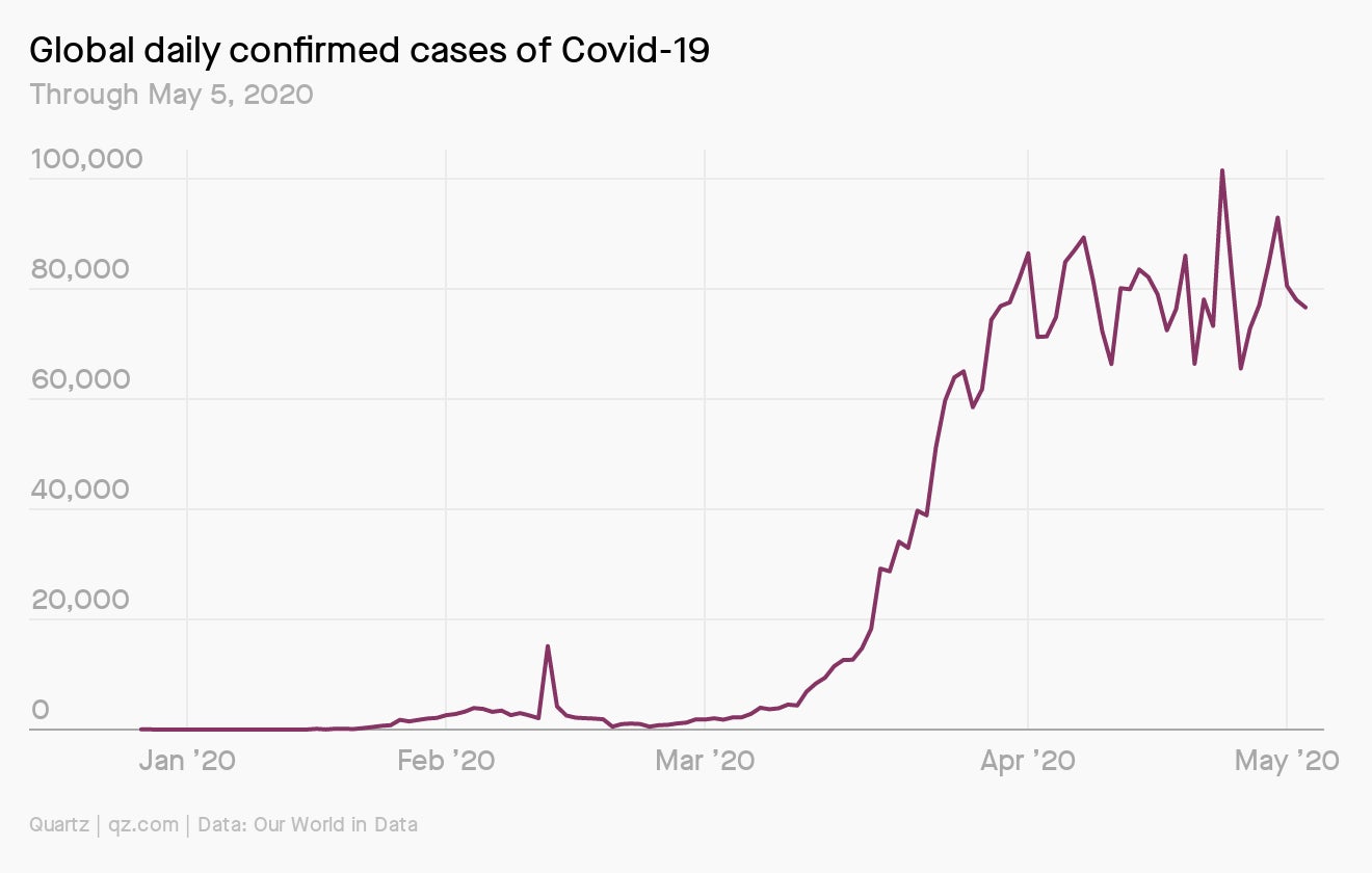
For example: On May 8, there were about 3.8 million confirmed cases of coronavirus worldwide, according to the New York Times, meaning about 50 out of every 100,000 people in the world have had a confirmed case. But the number of confirmed cases is almost certainly biased to be an underestimate. With a lack of testing in many countries, and many asymptomatic cases, we know there are probably many more cases than have been reported, perhaps millions more.

That doesn’t mean tallies of confirmed cases are useless. It just means they should be used with caution. If the number of cases appears to be falling, might it be because there was less testing? Or because the kinds of people getting tested were less likely to have the virus?
How to be careful: Almost no estimate can avoid some type of bias. When reading a study or story with statistics, it’s more trustworthy if there is discussion of why the numbers might be biased up or down. As a data consumer, your goal should be to think about the effect that bias may have.
2️⃣ Variability
Many statistics are calculated using a randomly selected share of the population. For example, the UK unemployment rate is calculated by surveying just over 80,000 people every month, less than 1.5% of the population. That 80,000 is enough to get a very accurate estimate, but a survey’s sample size isn’t always so large, or its estimate so precise.
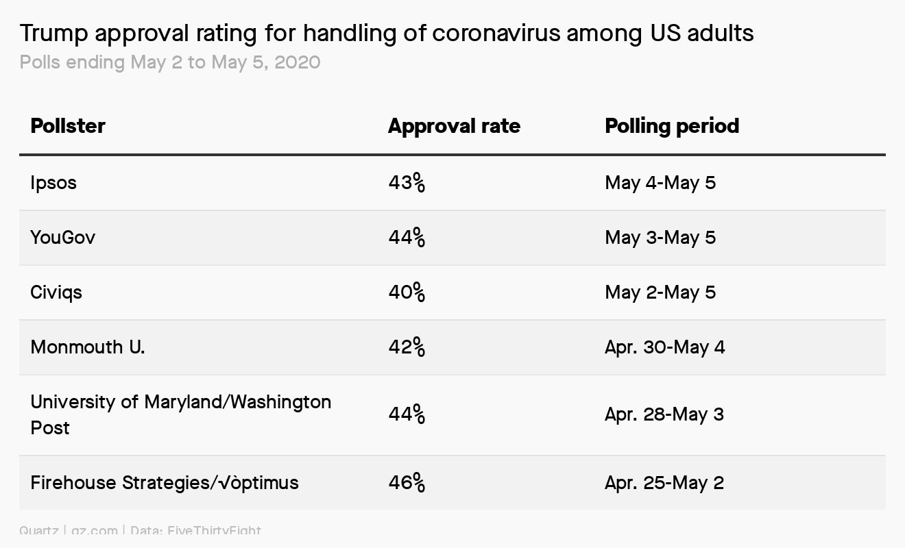
For example: Many polling organizations are conducting surveys on how Americans view president Donald Trump’s handling of coronavirus. A poll run from April 19-20 by The Hill and HarrisX found that 51% of registered voters approved of his actions. But this poll is based on just 958 people. Sampling variability tells us that if a different 958 people were surveyed, that number could have easily been 47% or 55%.
How to be careful: When looking at poll results, it’s best to look at multiple polls rather than one. The website FiveThirtyEight averages poll results on Trump’s handling of coronavirus, and so is a better source for tracking those numbers than any poll on its own. (As of April 23, it found an approval rating of 46%.)

With any statistic, it’s important to check the size of the population it’s based on, and whether multiple people have tried to measure it. And for any result that is far outside what others have found, it’s good to be suspicious.
3️⃣ Lag
Data is sometimes hard to collect and slow to be released, meaning it can be weeks or months before we know the answer to an essential question. Lag is particularly important during coronavirus: One key metric that tends to lag is the number of coronavirus-caused deaths, which can lead people to underestimate the deadliness of the virus.
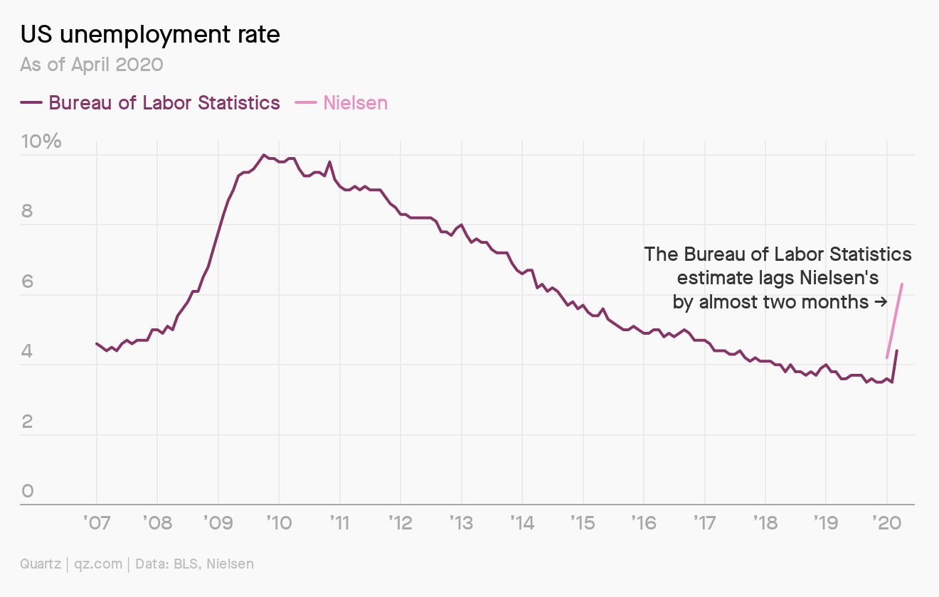
For example: In the US, job-market data collected by the Bureau of Labor Statistics is released on a three-week lag. This typically isn’t a big problem. Most economic downturns don’t happen in just a few weeks. But in this case, job losses were precipitous. It wasn’t until today, when data was reported for April, that the BLS data actually reflected the economic devastation of the virus. To get more recent updates, people have been turning to unemployment insurance claims, which have only a five-day lag.

How to be careful: The answer to dealing with lag as a data consumer is pretty simple. Make sure to check the date of the estimate, and whether it is likely to be updated.
You asked
Marilyn Waring once noted that the economy was the cake, and the GDP was the icing. Lately I’ve been wondering: How do we measure what is happening in the cake at this time? When restaurants are switching to new ways of operating, farmers and millers are providing food to food banks directly, so many firms are switching to mask-making or ventilator-making, the homeless are put in hotels, restaurants are making meals for first responders….It just seems to me that GDP is a very blunt and ineffective way to track what is happening. Is there something better?
Great question, Rosemary. Waring isn’t the only one who doubts the use of GDP; many economists believe it’s an antiquated metric.
GDP was built for the manufacturing age, and doesn’t do a particularly good job of accounting for the value of free digital goods, like Wikipedia and Facebook. GDP also isn’t that great at predicting happiness. While it is correlated with the reported life-satisfaction of a country’s people, GDP only explains about 25% of the difference between countries, according to one study. Other important factors are life expectancy and the level of government social support.
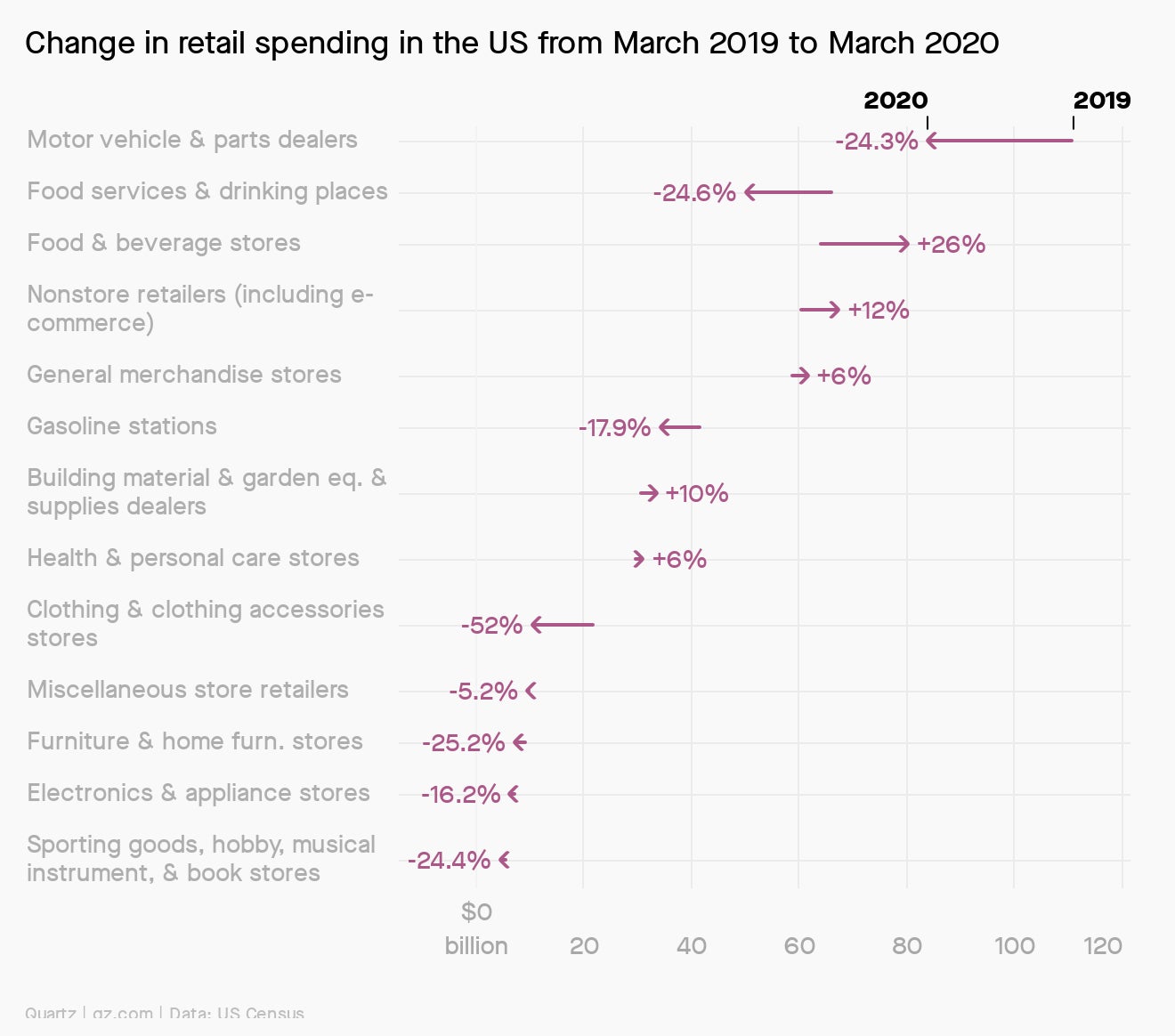
If you’re trying to understand what’s happening to the US economy in this moment, you might turn to the Census bureau’s monthly retail trade data. It shows how people are spending their money differently than in the past. For example, March spending at “food services and drinking places” (bars and restaurants) was down almost 25% compared to March 2019, while spending at “food and beverage stores” was up about 26%. This data shows, at a granular level, just how much coronavirus is disrupting the US economy.

GDP, by the way, isn’t the only economic indicator in need of side-eyeing these days. The US unemployment rate is pretty unhelpful right now, since it excludes people who aren’t looking for work (during a lockdown, that’s a lot of people). And the US consumer price index (CPI), which gauges inflation, is also misleading.
Make a data of it
All these caveats can be discouraging. But even with bias, variability, and lag issues, a statistic can be meaningful. Flaws and all, the reported number of daily confirmed coronavirus cases is certainly better than nothing. And if we understand that it’s likely an underestimate reported on a lag, that makes it even more valuable. The age of coronavirus is not the time to ignore statistics, but to examine them even more closely.
If you’re yearning to dig deeper into stats, we suggest The Cartoon Introduction to Statistics by Grady Klein and Alan Dabney. Don’t underestimate this book because of its playful cover. It is chock full of deep lessons about how to approach data.

Essential reading
- The latest 🌏 figures: 3,907,055 confirmed cases; 1,305,888 classified as “recovered.”
- Making medicine: Some African countries are boosting traditional cures.
- Talking heads: Video conferencing is a secret equalizer for women.
- By land or by sea: Coronavirus restrictions are making it harder to traffic drugs.
- Game delay: Nintendo said future releases could be delayed by coronavirus.
Our best wishes for a healthy day. Get in touch with us at [email protected], and live your best Quartz life by downloading our app and becoming a member. Today’s newsletter was brought to you by Dan Kopf and Kira Bindrim.