This is a story about how Reddit can rewrite history.
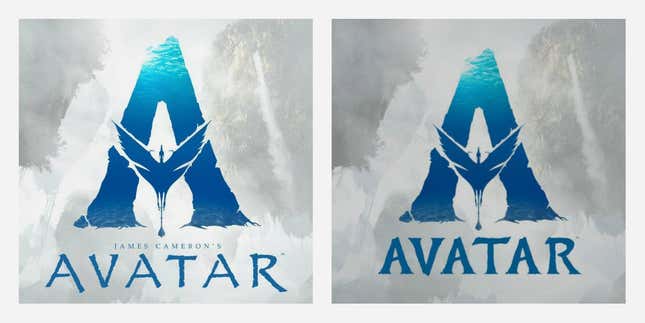
In the wee hours of Monday (Oct. 29), Redditor Dizagaox posted an image of Avatar’s logo with the caption: “Lightstorm / Fox reveal new Avatar logo, no more Papyrus font.” The post quickly rose to the top of the social news aggregation website yesterday, with more than 10,000 upvotes from concerned and righteous font nerds. Nearly 3,000 Redditors upvoted a theory that the film studio ceded to Saturday Night Live’s 2017 Papyrus parody starring a deliciously tormented Ryan Gosling. In the three-minute video, Gosling inhabits the role of an angst-ridden graphic designer who cannot get over the fact that the international franchise thoughtlessly picked a font associated with hookah bars.
But the logo isn’t actually new. In fact, it even makes a brief appearance on the SNL skit.
Film director James Cameron introduced the franchise’s updated monogram at CinemaCon in 2016 when he announced his intention to produce four sequels to the science fiction movie featuring blue humanoids. The change that piqued Redditors yesterday lay in the tweak to the lettering under the symbol. Avatar’s new emblem also curiously eliminates the words “James Cameron’s” above the title—a grandiose but barely legible flourish.
Technically speaking, a font update doesn’t qualify as a new logo. But this distinction between a redesign and a tweak isn’t exclusive to casual Reddit commenters—it also escapes many corporations that publicize every minutia of their corporate logo’s shape.

Changing a logo isn’t a frivolous matter. It’s an expensive and time-consuming project that requires scrubbing all communications materials for the sake of consistency—a hell with which graphic designers are familiar.
Twentieth Century Fox hasn’t replied to Quartz’s inquiry as to why it decided to update the typeface, but fast media outlets wasted no time in publishing “breaking news” articles about the font change yesterday, propagating the SNL theory floated by Redditors. Most articles reference a Sept. 30 tweet from Avatar that mentions Gosling’s parody as though it were conclusive evidence that the Hollywood franchise had capitulated to SNL’s mockery. In reality, there are many sensible reasons for updating a logo: improving legibility, creating distinctiveness from a competitor, signaling a change in creative direction.
As compelling as Gosling’s portrayal was, it’s unlikely and unwise to change a logo based on internet barbs. Logo bashing is a certain corner of the internet’s favorite sport, after all.
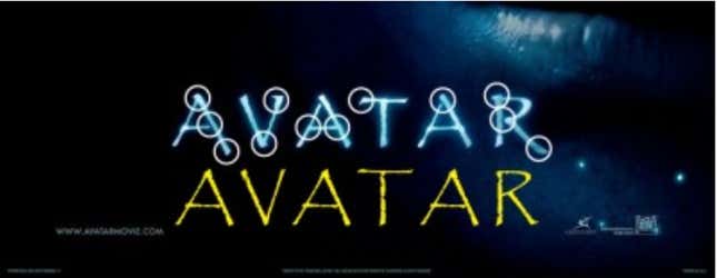
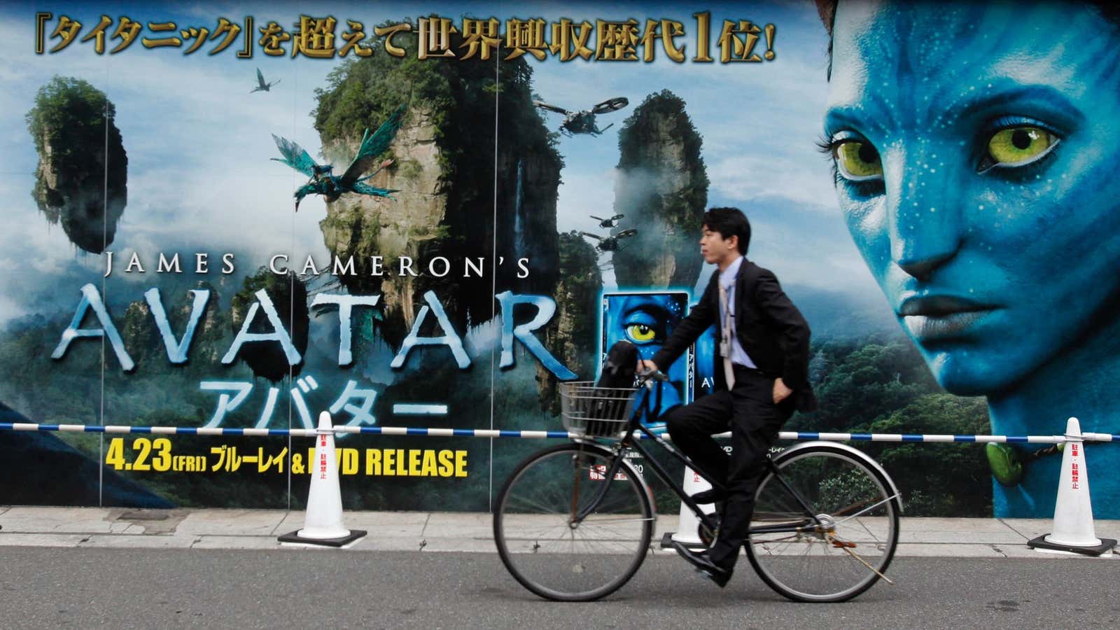
Which brings us to a more fundamental question: Why all the hate toward one font in the first place, if not for the purposes of parody? For type sticklers, the typeface used in Avatar’s original marquee and all promotional materials is actually a modified version of Papyrus, as Shea Lewis pointed out in a 2010 blog post. ”The problem isn’t really Papyrus itself,” Lewis writes, which he argues represents the movie’s theme adequately. “The real problem is that is also represents Italian restaurants, coffee shops, massage parlors, and churches. As a standard default font found on PCs and Macs worldwide, the typeface has found its way into countless designs and lost the intent it was created.”

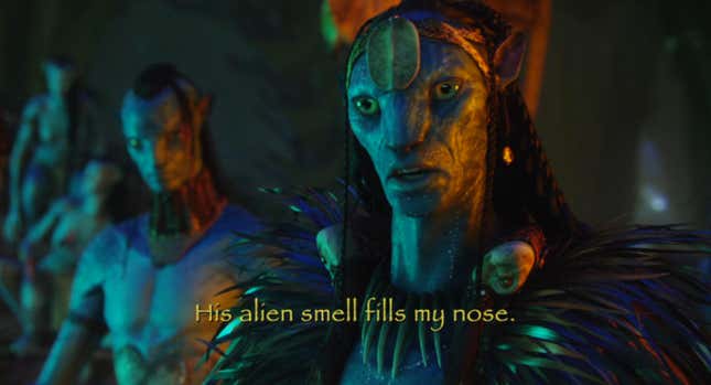
The newest lettering that replaced Papyrus on Avatar’s newest emblem isn’t great. It’s a bolder, more compact variation of the original maligned typeface. The new logo looks like a Christian Rock band’s clip art avatar. But hey, that’s a matter of taste. The greater crime lies in barely legible movie captions rendered in the flimsy font.

The Avatar font fiasco matters less than taking the time to get the facts straight. Making cheap jokes about design is easy—and dangerous. If design is indeed this vital, game-changing force, isn’t it about time we take its history seriously?
