Cool things by Quartz Things in 2017
In addition to being a crazy year on the planet, 2017 was my first full year as editor of the Quartz Things team. And while I don’t believe in New Year’s resolutions, I do find it useful to look backward in order to move forward thoughtfully.
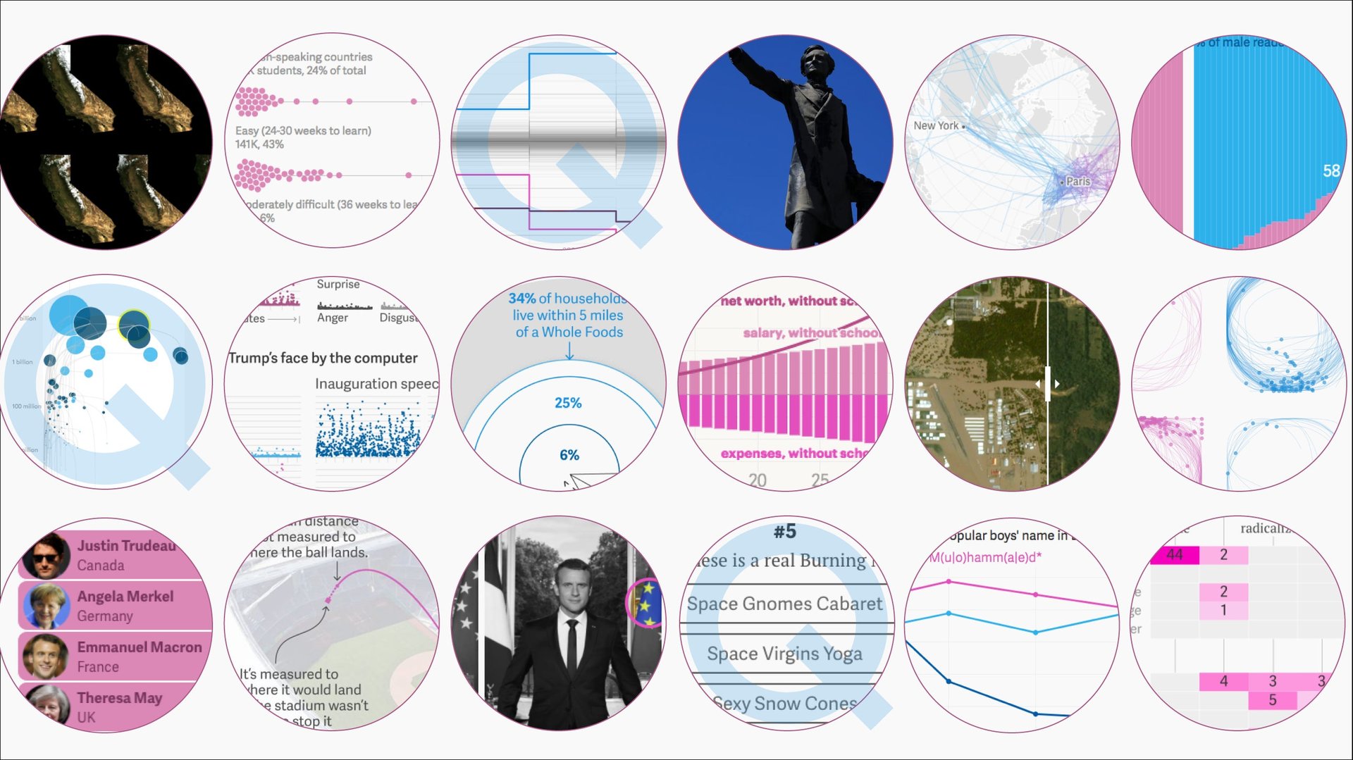

In addition to being a crazy year on the planet, 2017 was my first full year as editor of the Quartz Things team. And while I don’t believe in New Year’s resolutions, I do find it useful to look backward in order to move forward thoughtfully.
So with that in mind, here is a collection of some of the cool work the Things team did this year, organized by the different ways we approach our storytelling. Reviewing and gathering this work–to say nothing of making the work over the course of this year–has been my pleasure and my privilege. Thank you to my stellar team and my amazing colleagues, and to you, the Quartz readers who keep meeting us at our distinct corner of the internet.
If you look closely, there’s a story behind the story
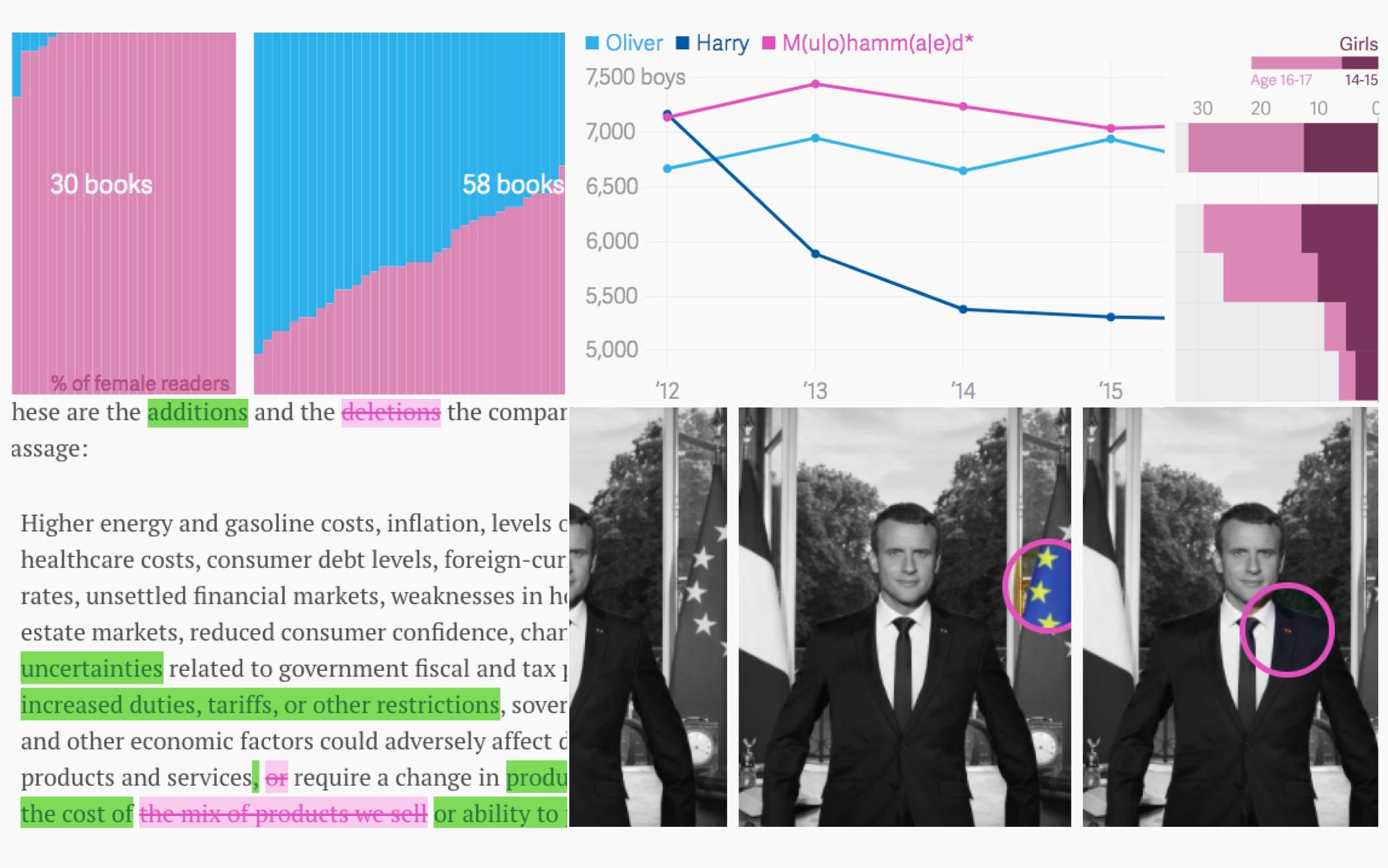
When you accept conventional wisdom, you get a conventional answer. But if you actually question data, documents, or even photos, you’ll find the unexpected. Like: (1) Men don’t want to read self-help books, but they write them, and for a mainly female audience. Or (2) The difference between two annual reports showing that Costco has officially raised the alarm on US tariffs. How about (3) Emmanuel Macron’s official portrait is a symbolic celebration of centrism, or (4) England says Oliver is the most popular boys’ name, but it’s actually Muhammad. Finally (5) You may have read that teens are having less sex, but don’t buy that idea until you take a closer look at the data.
What’s next door matters
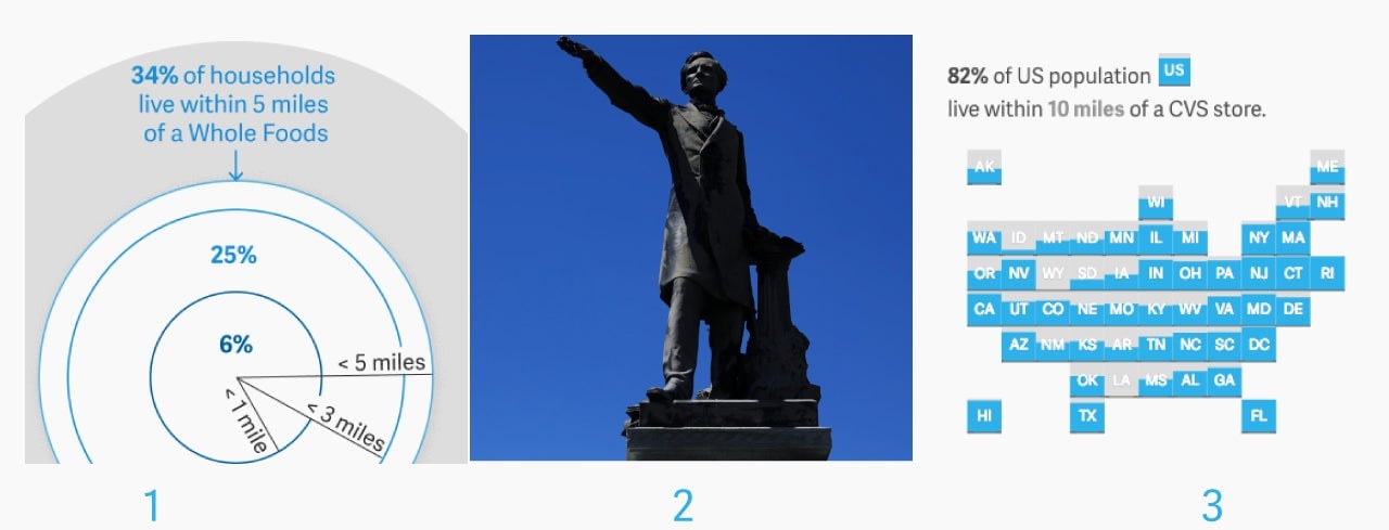
There are patterns in what we consume, what we build, and in the fallout from business transactions that touch how we live. These patterns manifest in physical ways, and in our everyday lives: A favorite store closes, or the statue in the town square is toppled. When Amazon bought Whole Foods it (1) put itself right next to one-third of America’s richest households. As Confederate Monuments started to be brought down this year, we made a (2) tool to find the Confederate monument closest to you. Why did Aetna move to acquire CVS? (3) Eight out of 10 Americans are within 10 miles of one.
Everything changes when you look down from space
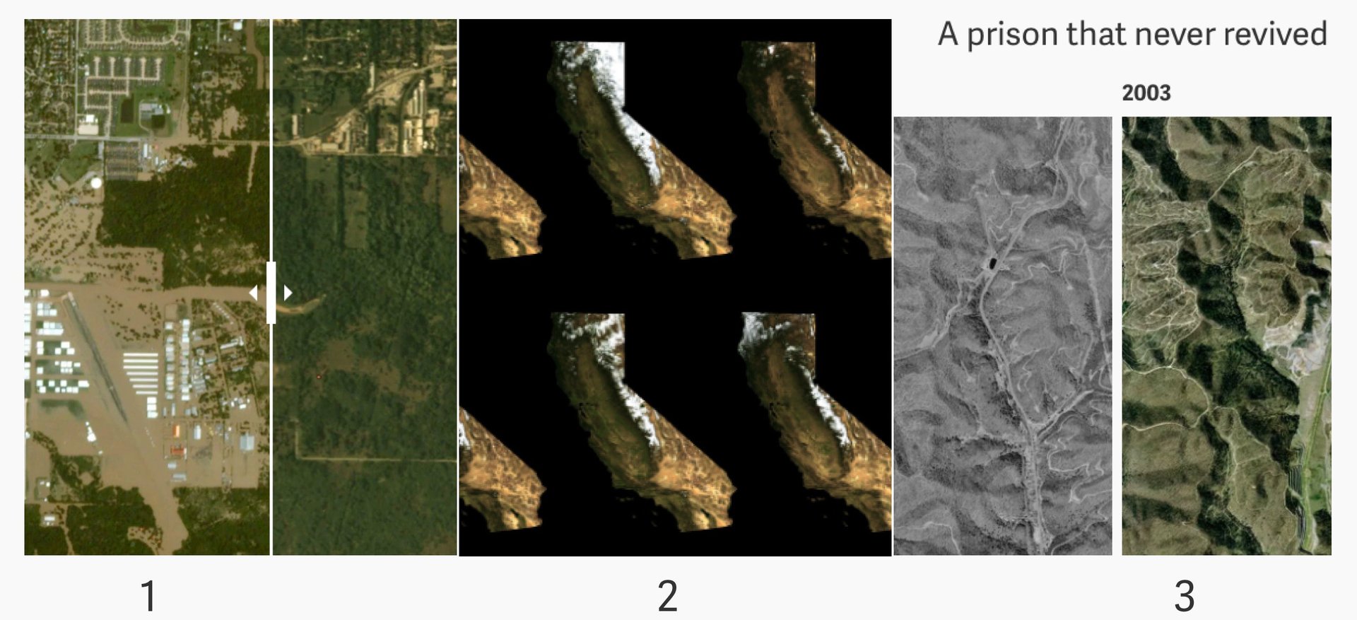
This year, images captured from satellites allowed us to explain impact in new and innovative ways. David Yanofsky brought you (1) Incredible before and after images of Houston neighborhoods hit by Hurricane Harvey. When the drought in California ended, he looked at (2) What the six-year drought did to California in 93 maps and two charts. And in one of the most moving uses of satellite imagery, Yanofsky partnered with Akshat Rathi to make this excellent piece: (3) The visual story of what humans sacrifice in our relentless hunt for coal
Polls and quizzes are stories in disguise
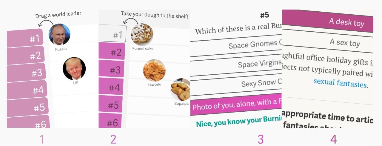
Not all news is dark and stormy. There are ways to capture a moment in time with a wink and a nod, and Quartz loves to highlight everyday juxtapositions. If you didn’t get a chance to play with these this year, we hope you will join us in (1) ranking world leaders or perhaps (2) fried dough. We’d like you to consider testing your knowledge of (3) Burning Man and making sure you’re ready for (4) this year’s holiday party.
Doing the math (properly) makes a huge difference

Over at Quartz, we’re a bit obsessive about numbers, calculations, and accurate representations. To that end, we post stories in response to tweets, like (1) A simple math lesson for Donald Trump Jr. We feel the need to explain, for example (2) Why calculating home run distances is like measuring sea level. And we’ll also correct the record, especially on a poor representation of a very opaque dataset: (3) The misleading chart showing Google searches for “my eyes hurt” after the eclipse, fixed.
Being able to play with data drives a point home
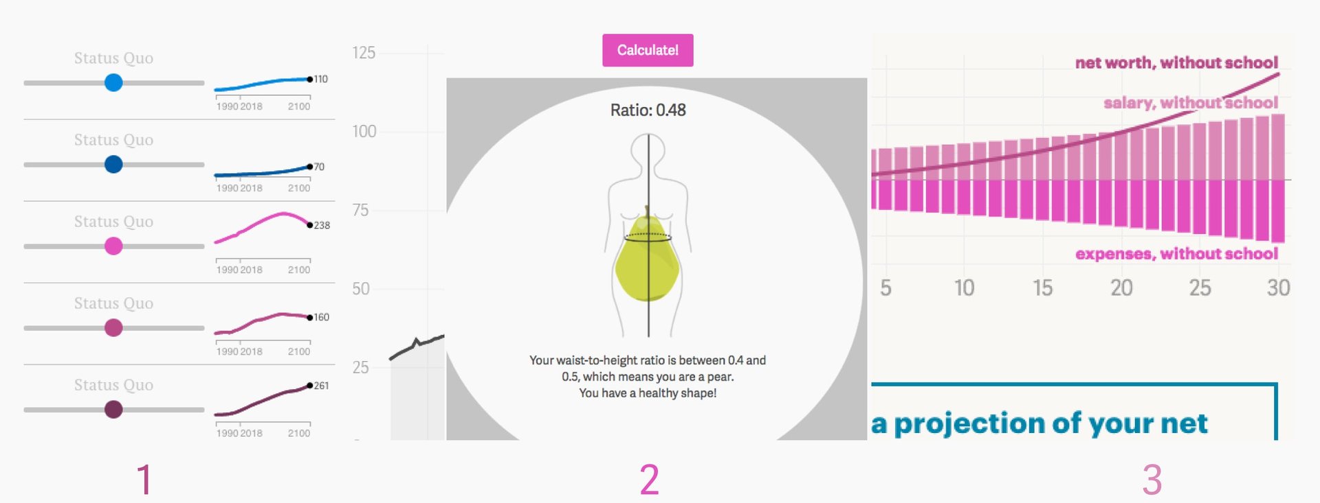
You can write a sentence or make data visual, but one of the best reasons to add interactivity is to invite readers to discover what that data means. Especially when there is data that can be calculated to reach an outcome. For example, try to (1) get carbon emissions under control (yes, it is impossible). Did you know BMI calculators aren’t accurate? (2) Our body fat calculator is. Have you been contemplating grad school? (3) Use our calculator to see if it would really make you wealthier.
To unearth the unexpected, always be analyzing
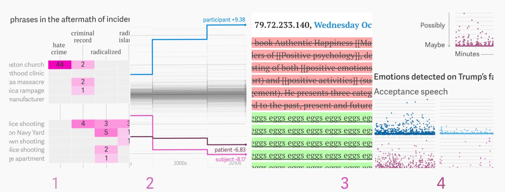
Sometimes large datasets offer windows into things we’re fascinated with. And often, we find ourselves collecting information so that we can unearth the truth. After the Las Vegas shooting, a fascination with biased language spurred YouYou Zhou to write an (1) Analysis of 141 hours of cable news that reveals how mass killers are really portrayed. Zhou, Christopher Groskopf (our former data editor), and Katherine Ellen Foley also got a hold of (2) Five decades of sex research, which showed an evolving spectrum of sexual norms. Nihil Sonnad analyzed user edits to deliver (3) Wikipedia’s great experiment: Finding a definition of “happiness” we can all agree on. And tiring of all the divisive arguing about US politics, we asked (4) a robot to watch Trump’s inauguration speech and tell us what it saw.
Data well-visualized is a beautiful thing
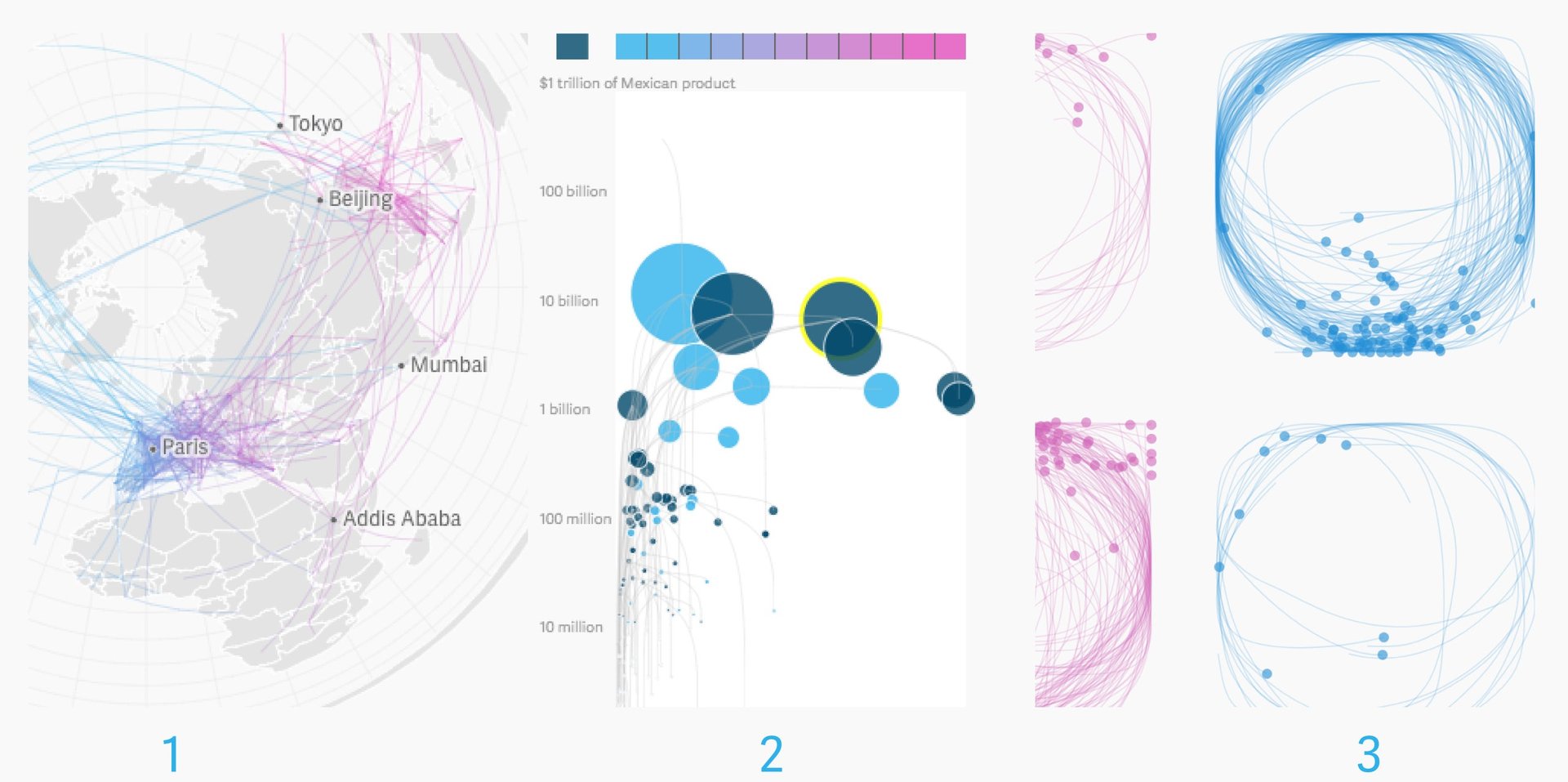
The arc of a line, the shape of circle, how data clusters together—sometimes all these elements come together in a lovely way. Every data point has its beginnings with human beings, and making the places people go or what they trade or how they draw visual is one way the Things team delivers stories that have a visceral impact. If you didn’t see the maps in (1) 1,310 direct flights created in 2017 that you can now take, here they are. To look at the massive amount of trade that crosses to Mexico in incredible detail, you can (2) Explore all $304.6 billion in goods that the US imports from Mexico in a year. And finally, spend some time discovering this: (3) How do you draw a circle? We analyzed 100,000 drawings to show how culture shapes our instincts.
This, is only some of the work we did this year; we hope you’ll join us for more in 2018. While I won’t make a New Year’s resolution to do anything differently, I will promise you that this year will not be the same. 🍾