Hi Quartz members,
When it comes to communicating trends, charts can often do what words or photos simply cannot. We love them at Quartz.
But there are also a lot of really bad charts out there. And just like Tolstoy said of families, good charts are all alike (in that they are clear); every bad chart is bad in its own way.
Here’s some advice on how to make your charts not just good, but great.
Know what you want to say
A chart should be like a sentence—it should say one thing clearly. And the viewer shouldn’t have to work to understand that one thing, either.
That may mean you don’t know what the chart is before you start working with the data—charting can be a way to explore it. Like writing, the process can be iterative. A way to ensure your chart says something: give context. Sometimes the context is already in the data, sometimes you need to augment it with new data.
Get the data and understand its limitations
“Good charts start with good data,” says Amanda Shendruk, Things reporter at Quartz. We live in a chaotic world; while data can often feel objective and factual, the manner it was collected and the methodology of aggregating it often leaves human fingerprints in results. Be sure to understand the limits and quirks of your data.
What does “good data” look like? It isn’t just one thing. Data cleaning and formatting can happen at all steps of the charting process. When it happens close to collection it can be 90% of the work, but when it happens close to charting it’s usually minor formatting.
Beware of bias, variability, and lag in the raw data itself.
Some next-level skills include:
Read more: The Quartz guide to bad data
Choose your chart
Most kinds of charting software make it easy to present your data in different ways, from a line chart to a bar graph to a scatter plot. But which format is right for you? Here are a few guidelines.
Line charts are best for data presented over time. Time is always on the x axis.
Bar charts work best for comparing things by category. Make sure to order them sensibly, though (That typically means largest to smallest, and is rarely alphabetically)
Scatter plots are useful for comparing the correlation of data across two dimensions. They’re powerful tools for understanding the relationship between many disparate-seeming data points.
Don’t forget about tables—they’re great for structured information that isn’t directly comparable, or for numbers that are large and not all that different.
All other charts—including stacked column, stacked bar and split bar charts—are less often the correct choice. And pie charts? It’s almost always best to pick something else.
Overall, don’t worry so much about being cute as communicating your point clearly and effectively to your reader.
🖼 A guide for your wall: Journalists at the Financial Times have a poster-sized rubric for choosing an appropriate chart type.
Formatting dos and don’ts
DO:
- Make sure your chart looks good in all the dimensions it might be seen (if it’s published on a website site or a blog, for example, be sure to make sure it’s legible when viewed on a phone)
- Round displayed numbers to a useful precision (i.e. 57, not 57.03)
- Add labels and annotations to emphasize important points
- Give your chart a title that clearly explains what it’s showing
DON’T:
- Use the same colors for overlapping data
- Forget to label your axes
- Necessarily use the default labels for your axes
- Accept mediocre charts made by big organizations—download the data and make your own better version!
Quartz’s advice for great charts
“Keep it simple and think about your audience.”—Amanda Shendruk, Things reporter
“The chart should be enough to make your point.”—Niharika Sharma, Quartz India reporter
“If your chart looks funky, try transposing the data.”—Courtney Vinopal, breaking news reporter
“If your chart looks a little ‘too much,’ reduce the number of things you are including in one chart.”—Tripti Lahiri, Asia bureau chief
”Check to see when the data was collected, and if it’s revised over time. Preliminary data can be smoothed out by finding a weekly, monthly, or annual average.”—Nate DiCamillo, economics reporter
“Make more charts than you need! Sometimes your dataset can answer questions you didn’t even think to ask or show you trends you didn’t set out looking for. Try charting the data in different ways (on different time scales, comparing different variables, etc.). You might spot something that didn’t pop out at you when you were just looking at rows of cells on an Excel sheet.” —Nico Rivero, reporter
“Don’t assume everyone can see what you see—check the chart for accessibility, including color blindness.”—Clarisa Diaz, Things reporter
“See if you can inject some fun into the chart without breaking the overall format.”—Adario Strange, media and entertainment reporter
“Show what you’re making to someone else and have them explain it back to you to ensure it shows what you’re trying to show.” —David Yanofsky, Things editor
Some great chart tools
- 8 tips to improve your charts
- Datawrapper: This is the charting tool we currently use for most of Quartz’s charts.
- Flourish: Another great charting tool.
- Fundamentals of Data Visualization: A comprehensive, free online guidebook.
- The Wall Street Journal Guide to Information Graphics: A terrific beginners guide to charting dos and don’ts.
- The Visual Display of Quantitative Information: This classic book on charting aesthetics is a must read for serious data visualizers.
- Visualize This: This practical guide to modern data visualization rules and techniques is fun and instructive.
Hope your weekend is off the charts,
—David Yanofsky, Things editor (knows most things are better as a bar chart)
with Quartz Staff
Compiled by Alex Ossola, membership editor
One 📈 thing
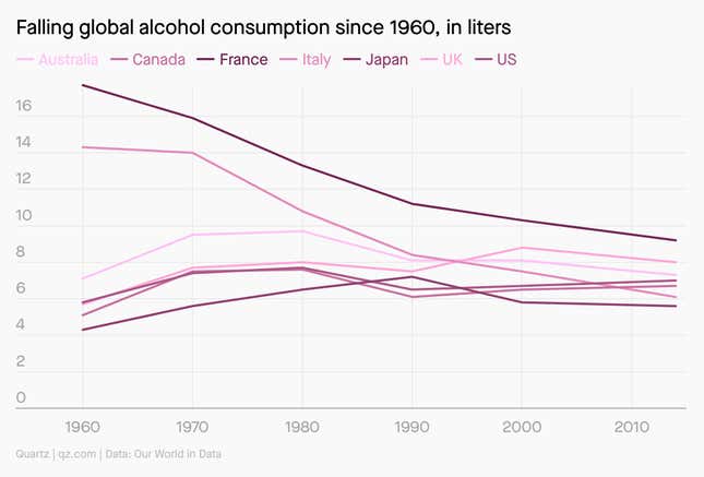
The following chart has at least 5 elements that can be improved. Can you guess what they are?

Here’s what they are, from top to bottom:
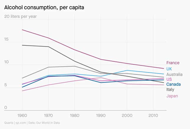
- The title is inaccurate—not all countries had declining rates of alcohol consumption over the stated timeframe. And it doesn’t say what the liters apply to—per person per year? per person per month? per country? Unclear.
- The data’s unit is best on or near the y axis, not in the title.
- The number of ticks on the y axis can be reduced so that the grid lines are easier to follow.
- The colors of the lines are too similar, making them hard to differentiate.
- The labels are clearer if they’re next to the lines, in order, not alphabetized at the top of the chart.
Here’s a better version of that same chart:

