Microsoft’s font library just got a high fashion makeover, courtesy of the luxury label and notorious maker of ugly things, Balenciaga. Creative director Demna Gvasalia debuted a collection of dresses during the Kering-owned brand’s SS19 fashion show, two of which were fully covered in the san serif fonts of your nightmares, from Impact to Garamond to, yes, Comic Sans.

Microsoft $MSFT’s font library just got a high fashion makeover, courtesy of the luxury label and notorious maker of ugly things, Balenciaga. Creative director Demna Gvasalia debuted a collection of dresses during the Kering-owned brand’s SS19 fashion show, two of which were fully covered in the san serif fonts of your nightmares, from Impact to Garamond to, yes, Comic Sans.
Balenciaga’s Paris fashion week show took place this weekend inside an art installation created by Jon Rafman, whose work centers on the social and existential impact of technology. Before the show began, Windows 2000-era programming code was projected onto the ceilings and floors of the installation, presumably to create the feeling of being trapped inside a desktop computer from 1999.
Join 500,000+ readers who start their day with Quartz.
By subscribing, you agree to our Terms of Service and Privacy Policy.
The collection itself—a wave of boxy blazers, sculptural suits, and sharp shoulders—appeared similarly tech-inspired.
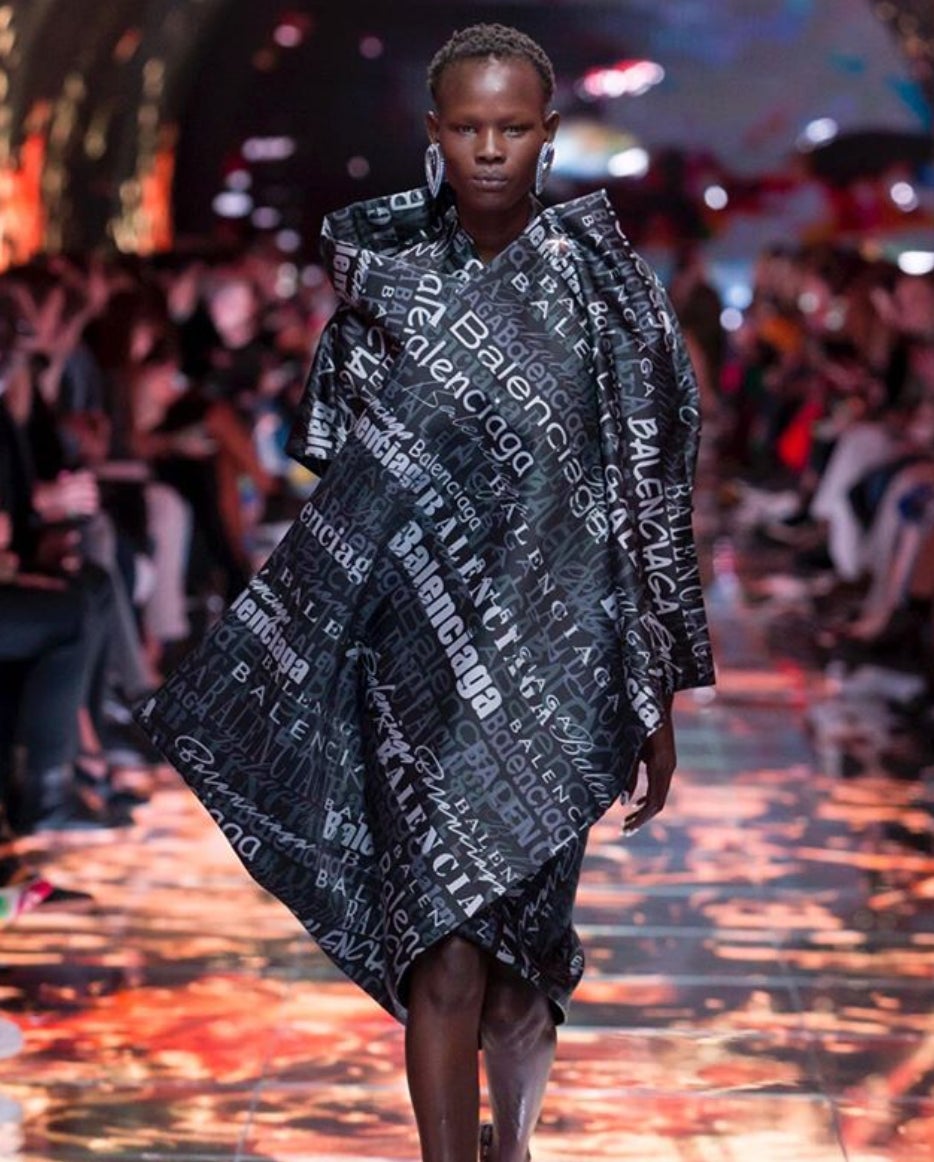
But perhaps the most buzzed about pieces were the ones printed fully in the word “Balenciaga” in various Microsoft Word fonts. Indeed, the show’s closing look (above), a beautifully structured black number, seemed at once a testament to Balenciaga’s masterful tailoring and an earnest love letter to clip art.
The collection is unusually good press for Comic Sans MS, arguably the world’s most hated typeface. As Anne Quito wrote last year for Quartz, the font—which was designed in 1994 for a children’s computer program—is considered “the old punching bag of font jokes,” and has been roundly mocked for being hideous since its inception 23 years ago.
It’s appropriate then that the undisputed Regent of Ugly has claimed the font as its own. Balenciaga has spent the last year rejoicing in ugliness. Indeed, the label can probably take some credit for fashion’s current love affair with ugly footwear: Its take on the “dad shoe,” the $895 Triple S, continues to be a massive success, paving the way for the revival of other clunky sneakers, such as Fila’s Disruptor. Balenciaga’s $900 platform Croc also sold out upon its debut.
The question of whether Balenciaga is trolling us has sometimes come up—for example, when it released a $1,300 “t-shirt shirt” (a dress shirt attached to the front of a t-shirt) and a $10,000 “parka jacket,” (seven jackets stacked on top of each other). But trolling or not, Balenciaga is the fastest-growing brand in Kering’s luxury portfolio. Clearly, its subversive embrace of all things ugly—amid all fashion’s glamor and good taste—is tapping into something essential.
A wholehearted embrace of the world’s ugliest font may be pushing it—font enthusiasts are very serious about their fonts, after all. But if anyone can give Comic Sans a second chance at life, it’s Balenciaga.